Editorial Serif Anchor

Ez Biscuit + Kernova
Anchors Ez Biscuit's fluid strokes with crisp Roman proportions on wedding suites, headers and packaging.
Inspect Kernova specimenDisclosure: MakerFileHub may earn a commission from qualifying purchases via paid links on this page. How our links work.
Open rounded everyday handwriting with tall ascenders and a wide fit
Ez Biscuit is open rounded handwriting with tall ascenders, wide spacing and a level baseline, drawn so a short phrase reads as something written quickly but neatly.
Paid link
Get this fontProject & layout blueprintsAt-a-glance maker compatibility
Weld or Unite overlapping script joins into one continuous vector path before sending to the blade.
Visual anatomy & craft review
The letters stand separately with generous space between them: the E keeps three even arms, the z closes its diagonal cleanly, the B holds two unequal bowls and the i and the s stay narrow. The ascenders on the b, the i and the t rise well above the x-height while the x-height itself stays small, which is what gives the phrase its airy look, and the weight is a consistent medium with fully rounded ends. Nothing connects, nothing tapers and the baseline holds level, so the phrase reads as a clear everyday hand rather than a calligraphic performance. Counters are open and the fit is wide enough to set at 14 pt without tracking. The brown ground, the scattered cookie shapes and the three small captions are presentation; the lettering is the words.
Rounded · Open · Everyday
Two-font hierarchy recipes
Tested contrast partners — pairing Ez Biscuit with grounded secondary typography.
Ez Biscuit + Kernova
Anchors Ez Biscuit's fluid strokes with crisp Roman proportions on wedding suites, headers and packaging.
Inspect Kernova specimen
Ez Biscuit + Noar
Keeps small-scale dates, URLs, nutrition facts and care instructions crisp and legible below script titles.
Inspect Noar specimenPractical applications
Concrete hierarchy, scale and production guidance tailored to Ez Biscuit’s stroke geometry.
The neat everyday hand reads as a note from a person rather than a brand, and the open letters stay legible at the small size of a bag card.
Hierarchy & layout recipe
Set the message at 16 pt on a 90 by 55 mm card, keep the order details in a 6 pt sans, and leave 8 mm at the base so the descenders clear the card edge.
Pre-production check
Cards that ride in a bakery bag crease; print on a heavier stock and check that the rounded strokes do not crack along the fold.
A plain rounded hand keeps a homemade favour from looking manufactured, and the open spacing stays readable at the small size of a jar label.
Hierarchy & layout recipe
Set the greeting at 12 pt on a 45 mm square jar label, keep both names in a 6 pt sans beneath it, and leave 5 mm inside the die so the rounded ends are not clipped.
Pre-production check
Jar labels lift when chilled; check one applied label after a day in the fridge and move the text away from the lid edge.
The airy hand reads across a counter at arm's length, and the tall ascenders keep a short line visible above a till or a display.
Hierarchy & layout recipe
Set the message at 24 pt on a 148 by 105 mm counter card, keep the opening hours in a 9 pt sans, and leave 12 mm of margin so the letters stay clear of the frame.
Pre-production check
Counter cards sit behind glass and pick up reflections; check the card in place and darken the ink rather than enlarging the lettering.
Technical & licence verification
Confirm included OTF/TTF/WOFF formats, full glyph tables and licence coverage on the live store page before batch production.
Closest visual alternatives
Matched across letterform anatomy, stroke behaviour and craft applications.
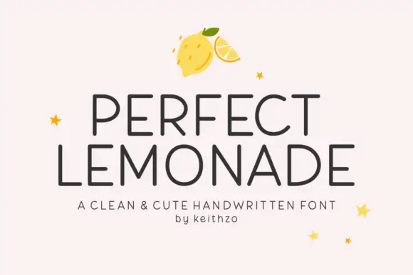
Clean cute handwritten caps
Perfect Lemonade is a clean handwritten display in charcoal on pink: light even strokes, tall open caps with rounded corners, a slightly irregular rhythm and a small star or lemon ornament, set in two lines with a tracked caption beneath, so the plate reads as a cheerful label rather than a script.
Ideas for this font
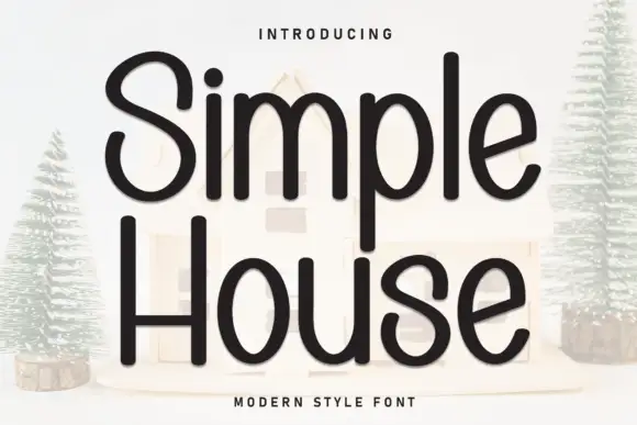
Rounded monoline handwritten sans
Simple House is a rounded monoline handwritten sans in near-black on a pale ground: wide geometric letters with fully rounded ends, an open counters and a light bounce that keeps a plain phrase from looking mechanical.
Ideas for this font
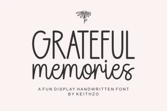
Tall handwritten capitals over a rounded script with a bouncing baseline
Grateful Memories is a handwritten display alphabet in which tall rounded capitals sit above a bouncy connected script, with even weights and fully rounded ends throughout.
Ideas for this font
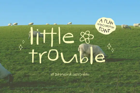
Thin quirky handwriting
Little Trouble is a thin handwritten face in cream over a green hillside: tall narrow lowercase letters with uneven heights, an open e and a hooked t, a drifting baseline, and a small drawn flower between the words, with a curved note in a soft shape at the upper right.
Ideas for this font
Same independent foundry
Allow optional Google Analytics to measure visits and catalogue actions. Your search words and notes are not included. Privacy & storage