Editorial Serif Anchor

Earth Tone + Cervelique
Anchors Earth Tone's fluid strokes with crisp Roman proportions on wedding suites, headers and packaging.
Inspect Cervelique specimenDisclosure: MakerFileHub may earn a commission from qualifying purchases via paid links on this page. How our links work.
Uneven mixed case with softly squared curves and a broad open ampersand
Earth Tone sets a pale uneven handwritten line over a ceramics photograph, where the curves square off softly, the e bowls stay open, the t bars wander and a wide ampersand joins the two words of the name.
Paid link
Get this fontProject & layout blueprintsAt-a-glance maker compatibility
Weld or Unite overlapping script joins into one continuous vector path before sending to the blade.
Visual anatomy & craft review
The squaring is soft rather than sharp, the weight sits between light and regular, the a closes a squared loop and the ampersand opens wide between the words. The soft square is the character: the letters look drawn with a flat brush rather than a pen, which is why the sample keeps one pale line over still life. Because the stroke varies, keep 8 mm of air around the line from 24 pt and check the weight on the final surface, since the light, regular and bold cuts promised in the caption are not shown side by side.
Uneven · Softly squared · Open
Two-font hierarchy recipes
Tested contrast partners — pairing Earth Tone with grounded secondary typography.
Earth Tone + Cervelique
Anchors Earth Tone's fluid strokes with crisp Roman proportions on wedding suites, headers and packaging.
Inspect Cervelique specimen
Earth Tone + Furion
Keeps small-scale dates, URLs, nutrition facts and care instructions crisp and legible below script titles.
Inspect Furion specimenPractical applications
Concrete hierarchy, scale and production guidance tailored to Earth Tone’s stroke geometry.
The brush-drawn squaring suits a pottery label, and the even weight holds a two-word name at 22 pt on a 60 mm panel, where the open ampersand takes the middle without crowding either word.
Hierarchy & layout recipe
Print a 60 by 40 mm label: set the studio name at 22 pt with the ampersand between the words, keep 6 mm of clear ground beneath for a 7 pt town line, and keep 5 mm of border on each side.
Pre-production check
The varying stroke printed on uncoated stock widens; check the proof and hold the name at 20 pt or above.
The quiet hand sets an invitation tone, and the open ampersand fills a short line at 26 pt on an A6 card, so the studio name reads as written rather than typeset.
Hierarchy & layout recipe
Print an A6 card: set the invitation at 26 pt across the upper half, keep 10 mm of clear ground beneath for the date at 11 pt, and keep 16 mm of margin so the wandering t bars stay inside.
Pre-production check
Two uneven lines stacked at 18 pt look like a printing fault; check the card and keep the second line in a plain sans.
The brush lettering suits a rustic table sign, and the squared bowls stay clear at 36 pt on a printed card, which is the size that keeps the softened corners visible at arm's length.
Hierarchy & layout recipe
Print a 105 by 74 mm sign: set the couple's names at 36 pt with the ampersand between them, keep 12 mm of clear ground beneath, and set the date in a 10 pt caps at the foot.
Pre-production check
An ampersand at display size between two short names needs even spacing; check the card and set equal gaps on both sides.
Technical & licence verification
Confirm included OTF/TTF/WOFF formats, full glyph tables and licence coverage on the live store page before batch production.
Closest visual alternatives
Matched across letterform anatomy, stroke behaviour and craft applications.
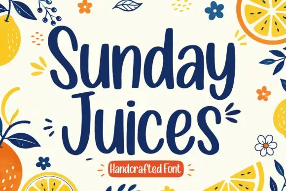
Tall rounded handcrafted print
Sunday Juices is a tall rounded handcrafted print in deep navy on cream: narrow letters with blunt ends, a light bounce, and a field of drawn citrus, leaves and flowers around them.
Ideas for this font
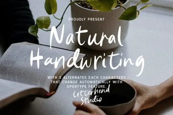
Lightly rough casual brush lettering
Natural Handwriting is a light casually rough brush lettering in white over a photograph: uneven stroke widths, open bowls and a warm slant, sold with three automatic alternates for each character so a repeated letter never looks repeated.
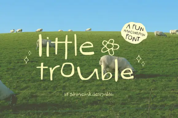
Thin quirky handwriting
Little Trouble is a thin handwritten face in cream over a green hillside: tall narrow lowercase letters with uneven heights, an open e and a hooked t, a drifting baseline, and a small drawn flower between the words, with a curved note in a soft shape at the upper right.
Ideas for this font
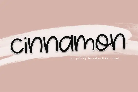
Low rounded handwriting with uneven arches and a playful tilt
Cinnamon is low rounded handwriting in which the letters squat close to the baseline, the arches vary in height and the whole word tilts a little as it goes.
Ideas for this font
Same independent foundry
Allow optional Google Analytics to measure visits and catalogue actions. Your search words and notes are not included. Privacy & storage