Editorial Serif Anchor

Natural Handwriting + Marquis - Elegant Modern Serif
Anchors Natural Handwriting's fluid strokes with crisp Roman proportions on wedding suites, headers and packaging.
Inspect Marquis - Elegant Modern Serif specimenDisclosure: MakerFileHub may earn a commission from qualifying purchases via paid links on this page. How our links work.
Lightly rough casual brush lettering
Natural Handwriting is a light casually rough brush lettering in white over a photograph: uneven stroke widths, open bowls and a warm slant, sold with three automatic alternates for each character so a repeated letter never looks repeated.
Paid link
Get this fontProject & layout blueprintsAt-a-glance maker compatibility
Weld or Unite overlapping script joins into one continuous vector path before sending to the blade.
Visual anatomy & craft review
The two words are stacked and set on one line each, and the face is a casual brush hand: the N opens with a narrow stem, the a and the t are open, the r is a short arm and the l and the g carry light ascenders and descenders, while the stroke thins on the upstrokes and thickens on the downstrokes as a small brush would. The letters are loosely connected, the slant is warm and the edges are slightly rough, so the line reads as written rather than set. A tracked block of small caps in the middle of the image explains that three alternates per character change automatically through an OpenType feature, which is what stops a long paragraph of handwriting from showing the same letter twice. The ground is a photograph of someone reading, and the studio signs at the foot. Natural Handwriting is a hand for cards, packaging and editorial.
A soft brush hand with automatic alternates
Two-font hierarchy recipes
Tested contrast partners — pairing Natural Handwriting with grounded secondary typography.
Natural Handwriting + Marquis - Elegant Modern Serif
Anchors Natural Handwriting's fluid strokes with crisp Roman proportions on wedding suites, headers and packaging.
Inspect Marquis - Elegant Modern Serif specimen
Natural Handwriting + Lemon Milk Pro FTR
Keeps small-scale dates, URLs, nutrition facts and care instructions crisp and legible below script titles.
Inspect Lemon Milk Pro FTR specimenPractical applications
Concrete hierarchy, scale and production guidance tailored to Natural Handwriting’s stroke geometry.
Automatic alternates keep a list of addressed envelopes from showing identical letters, and the light brush stroke prints over a printed return address.
Hierarchy & layout recipe
Print a C6 envelope front: set the name at 16 pt and the address at 9.5 pt, keep 4 mm of leading between lines, and hold 18 mm of clear space from the right edge so the stamp is not crowded.
Pre-production check
Envelope stock varies and a light stroke can skip; print one envelope on the real material and check the joins before the batch.
A casual brush hand reads as the baker's writing on a bag, and the alternates let a longer product name look genuinely hand written.
Hierarchy & layout recipe
Print a 70 by 45 mm label: set the shop name at 15 pt on one row, keep 5 mm of clear ground beneath before the address at 5.5 pt, and hold 4 mm of margin on all four sides.
Pre-production check
A rough edge fills in on a coated label; print one on the real material and check the texture before the order.
The hand keeps a menu from feeling formal, and the automatic alternates stop a long list of courses from looking like a repeated word.
Hierarchy & layout recipe
Print a 120 by 200 mm menu: set the heading at 26 pt, set the courses at 10 pt with 6 mm between blocks, and hold 14 mm of margin on all four sides of the card.
Pre-production check
At ten points the brush texture turns to noise; keep the face for the heading and print one menu to check before the run.
Technical & licence verification
Confirm included OTF/TTF/WOFF formats, full glyph tables and licence coverage on the live store page before batch production.
Closest visual alternatives
Matched across letterform anatomy, stroke behaviour and craft applications.
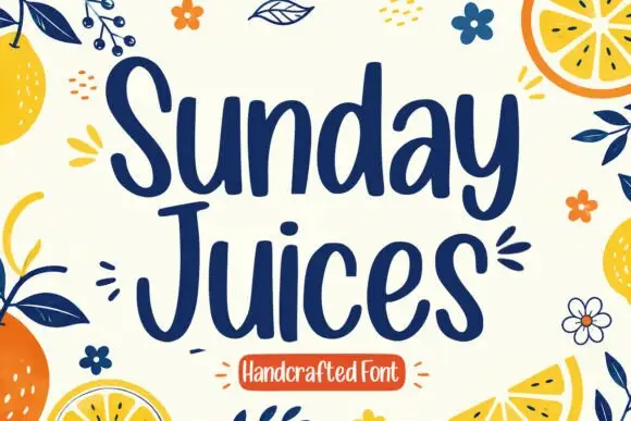
Tall rounded handcrafted print
Sunday Juices is a tall rounded handcrafted print in deep navy on cream: narrow letters with blunt ends, a light bounce, and a field of drawn citrus, leaves and flowers around them.
Ideas for this font
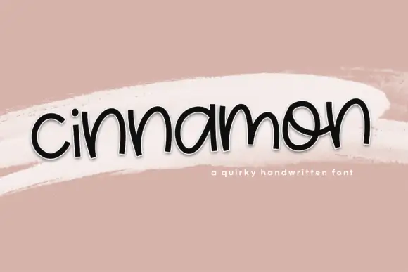
Low rounded handwriting with uneven arches and a playful tilt
Cinnamon is low rounded handwriting in which the letters squat close to the baseline, the arches vary in height and the whole word tilts a little as it goes.
Ideas for this font
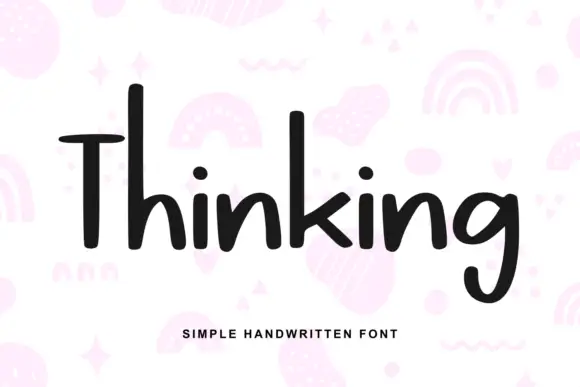
Heavy irregular mixed-case print
Thinking is a heavy hand-drawn print in near-black on pale pink: tall narrow letters, a very tall T with a wide arm, and a light irregular rhythm, over a scatter of drawn pastel doodles.
Ideas for this font
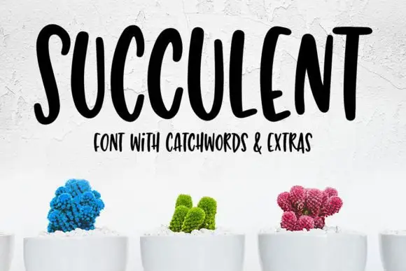
Tall bouncy uppercase handwriting
Succulent is a tall bouncy uppercase handwriting in black on white: narrow letters with uneven heights, a strong bounce across the line and a small companion line in the same face beneath.
Ideas for this font
Same independent foundry
Allow optional Google Analytics to measure visits and catalogue actions. Your search words and notes are not included. Privacy & storage



