Neutral Sans Workhorse

Black Raven + Cultivo
Lets Black Raven own the focal silhouette while handling secondary copy, sizing and subheads cleanly.
Inspect Cultivo specimenDisclosure: MakerFileHub may earn a commission from qualifying purchases via paid links on this page. How our links work.
Solid blackletter with angular B and R bowls and pointed feet
Black Raven is a bold blackletter display face with wide stems, tight spacing and a flat black contour, drawn to print solid at large sizes on a light ground.
Paid link
Get this fontProject & layout blueprintsAt-a-glance maker compatibility
Sturdy stroke walls and open counters weed cleanly on adhesive vinyl, HTV apparel film, and cut cardstock.
Visual anatomy & craft review
BLACK RAVEN fills the middle of an aged parchment card in solid black, and the letters are the heavy end of the blackletter range: the stems are thick bars, the shoulders square off into sharp corners, and the feet end in flat diamonds. The word is set in mixed case with large capitals, so the rhythm is that of a masthead rather than a book title. A fine double rule with a central fleuron divides the title from a line of spaced caps that describes the face and names the uses, and two outlined capitals sit at the lower corners as ornaments. A drawn raven stands at the foot of the card. The lettering is legible at a distance because the counters stay open, which is what separates it from a textura, and it prints cleanly because there is no texture in the fill.
Solid blackletter with angular B and R bowls and pointed feet
Two-font hierarchy recipes
Tested contrast partners — pairing Black Raven with grounded secondary typography.
Black Raven + Cultivo
Lets Black Raven own the focal silhouette while handling secondary copy, sizing and subheads cleanly.
Inspect Cultivo specimen
Black Raven + Bulgary
Grounds bold display lettering with classic typographic authority on posters, badges and apparel.
Inspect Bulgary specimenPractical applications
Concrete hierarchy, scale and production guidance tailored to Black Raven’s stroke geometry.
The clean heavy contour holds at a small book trim, and the wide capitals give a plain title page the weight of a printed plate.
Hierarchy & layout recipe
Print a 152 by 229 mm title page: set the title at 40 pt across one row, keep 30 mm of clear ground beneath before the imprint at 9 pt, and hold 20 mm of margin left and right of the block.
Pre-production check
Dense black fills go glossy on coated paper; print one page on the intended stock and check the counters before the run.
The lettering sets the tone of the evening, and the heavy strokes stay readable at the door of a dim venue on a wet November night.
Hierarchy & layout recipe
Print a 600 by 400 mm sign: set the event name at 90 pt across two rows, keep 26 mm of clear ground beneath before the times at 14 pt, and hold 26 mm of border on all four sides.
Pre-production check
Painted signs thicken the fine joins; print one sign on the intended material and check the diamonds at the feet.
The face gives a bottle a period character, and the wide letters keep a short brewery name heavy enough to read on a crowded shelf.
Hierarchy & layout recipe
Print a 65 by 100 mm label: set the brewery name at 22 pt on one row, keep 8 mm of clear ground beneath before the strength at 5 pt, and hold 6 mm from the lowest diamond to the die line.
Pre-production check
Small labels close the counters; print one label on the real stock and check the e and the o before the batch.
Technical & licence verification
Confirm included OTF/TTF/WOFF formats, full glyph tables and licence coverage on the live store page before batch production.
Closest visual alternatives
Matched across letterform anatomy, stroke behaviour and craft applications.
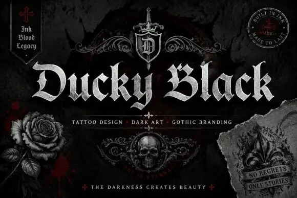
Wide blackletter with sweeping D and a densely split B
Ducky Black is a tattoo and dark-art blackletter with wide stems, sharp spurs and a distressed silver fill, framed by drawn roses, a skull and a fleur.
Ideas for this font
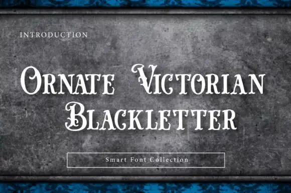
Ornamental blackletter
Ornate Victorian Blackletter is an ornamental blackletter in white on a mottled dark plate: narrow letters with curling capitals, pointed ends and inner hairlines, set on three lines with a small caps line at the head and a boxed label at the foot.
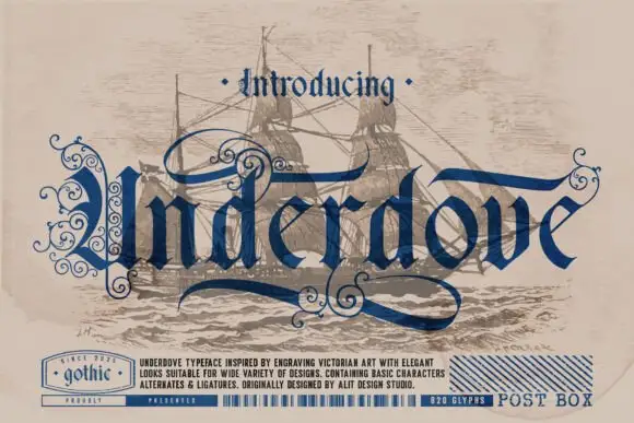
Engraved blackletter with loops
Underdove is a thin blackletter in navy on a faded sepia print of a sailing ship: narrow letters with extended loops and internal curls, a long sweeping swash under the word, and small engraved details, framed by a bottom band that lists the features and a small gothic stamp at the left.
Ideas for this font
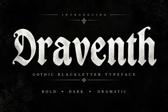
Broad rounded blackletter with curled D and pointed lower joins
Draventh is a wide gothic blackletter display face with heavy stems, sharp hooked shoulders and a weathered silver fill that reads as rubbed metal.
Ideas for this font
Same independent foundry
Allow optional Google Analytics to measure visits and catalogue actions. Your search words and notes are not included. Privacy & storage



