High-Contrast Display Serif

Avocado Family + Mewah
Pairs sculptural editorial warmth with Avocado Family's clean modern geometry.
Inspect Mewah specimenDisclosure: MakerFileHub may earn a commission from qualifying purchases via paid links on this page. How our links work.
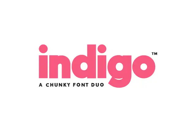
Heavy rounded mixed case with broad circular bowls and softly cut ends
Avocado is a bold geometric sans built on near-circular bowls, set in white on charcoal so the family reads as a clean modern voice rather than a decorative display face.
Paid link
Get this fontProject & layout blueprintsAt-a-glance maker compatibility
Sturdy stroke walls and open counters weed cleanly on adhesive vinyl, HTV apparel film, and cut cardstock.
Visual anatomy & craft review
The name runs as one line of mixed case, the a and the o almost perfect circles, the c and the d opening wide and the v ending in a sharp point. Weights stay even across the word, the joins are cut flat and the counters are generous, so nothing pinches. A tracked caption above names it as a new sans family, and the cover leaves the rest of the page empty apart from a faint diagonal texture. The sample only shows one weight, which is the usual limit of a cover; the family claim needs checking in the actual files before a design depends on several cuts.
Heavy rounded mixed case with broad circular bowls and softly cut ends
Two-font hierarchy recipes
Tested contrast partners — pairing Avocado Family with grounded secondary typography.
Avocado Family + Mewah
Pairs sculptural editorial warmth with Avocado Family's clean modern geometry.
Inspect Mewah specimen
Avocado Family + Abigail
Introduces organic movement on pull-quotes, signatures and gift tags.
Inspect Abigail specimenPractical applications
Concrete hierarchy, scale and production guidance tailored to Avocado Family’s stroke geometry.
The round geometric forms suit a young food brand, and the bold weight holds on packaging where a lighter sans would thin out.
Hierarchy & layout recipe
Print a 70 by 100 mm pack face: set the brand at 24 pt on one row, keep 10 mm of clear ground beneath before the flavour at 8 pt, and keep 8 mm of margin so the round bowls are not trimmed.
Pre-production check
The family may ship limited weights; check the licence list before planning a full identity.
The even weight holds a heading over a busy spread, and the circular counters stay open at the sizes a feature opener uses.
Hierarchy & layout recipe
Print a 210 by 280 mm page: set the heading at 52 pt across two lines, keep 16 mm of clear ground beneath before the standfirst at 10 pt, and keep 16 mm of margin from the text block.
Pre-production check
Wide settings eat line length; check the longest heading at final size before the page is set.
The plain geometric forms read clearly on a cover handled in a classroom, and the bold weight survives a black-and-white photocopy.
Hierarchy & layout recipe
Print an A4 cover: set the subject at 40 pt across one row, keep 16 mm of clear ground beneath before the year at 12 pt, and keep 18 mm of margin from the trim edge.
Pre-production check
Bold strokes can fill on a cheap copier; check a copy before printing a class set of covers.
Technical & licence verification
Confirm included OTF/TTF/WOFF formats, full glyph tables and licence coverage on the live store page before batch production.
Closest visual alternatives
Matched across letterform anatomy, stroke behaviour and craft applications.
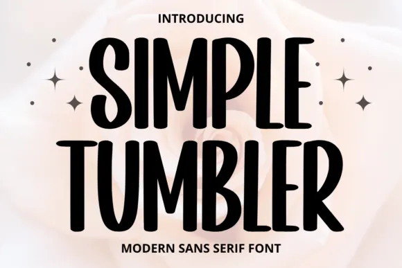
Tall informal sans
Simple Tumbler is a tall informal sans in black over a pale rose photograph: condensed capitals with rounded ends, uneven bowl widths and a slight bounce, with four sparkles at the sides and tracked lines above and beneath.
Ideas for this font
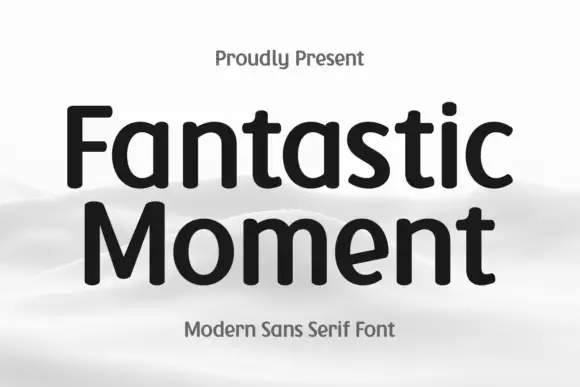
Soft-ended upright mixed case with broad bowls and a compact t crossbar
Fantastic Moment sets a rounded sans in black on a soft grey scene, its bowls open, its stems slightly flared and its weight even enough to read as a neutral modern voice.
Ideas for this font
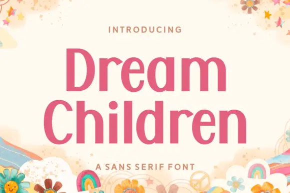
Upright contrast mixed case with oval bowls and a round i dot
Dream Children sets a bold pink grotesque in two stacked rows on a cream card, its bowls open, its terminals flat and its spacing tight enough that the pair reads as one block of colour.
Ideas for this font

Heavy round lowercase forms with a long K leg and deep j hook
Kohilo shows pale yellow heavy lettering against vivid red, where the dotted descending letter appears in a brighter yellow, the opening K sends a broad curved leg beneath the first round bowl and the central descender turns into a deep rounded hook.
Same independent foundry
Allow optional Google Analytics to measure visits and catalogue actions. Your search words and notes are not included. Privacy & storage