Neutral Sans Workhorse

Adventure + Corven
Lets Adventure own the focal silhouette while handling secondary copy, sizing and subheads cleanly.
Inspect Corven specimenDisclosure: MakerFileHub may earn a commission from qualifying purchases via paid links on this page. How our links work.
Uneven tall capitals with oversized V and T and a curved R leg
Adventure shows yellow capitals rising and falling across a dark teal field, where tall narrow bodies vary strongly in height, the V grows oversized, the T carries a broad top and the R leg curves below its neighbours.
Paid link
Get this fontProject & layout blueprintsAt-a-glance maker compatibility
Sturdy stroke walls and open counters weed cleanly on adhesive vinyl, HTV apparel film, and cut cardstock.
Visual anatomy & craft review
The heights jump letter to letter, the widths stay narrow, the T top spreads and the R leg drops out of the line. That bouncy baseline is the character: the word looks stacked by hand rather than justified, which is why the sample adds a small THE above the middle of the title. Because the line is deliberately uneven, leave room for the tallest and the lowest letter before adding a second row, and keep 44 pt so the narrow bodies stay solid.
Uneven heights · Tall caps · Curved leg
Two-font hierarchy recipes
Tested contrast partners — pairing Adventure with grounded secondary typography.
Adventure + Corven
Lets Adventure own the focal silhouette while handling secondary copy, sizing and subheads cleanly.
Inspect Corven specimen
Adventure + Aureline
Grounds bold display lettering with classic typographic authority on posters, badges and apparel.
Inspect Aureline specimenPractical applications
Concrete hierarchy, scale and production guidance tailored to Adventure’s stroke geometry.
The uneven caps give a party banner movement, and the narrow bodies read at 56 pt across an A3 sheet, where the jumping heights keep a short word from looking flat.
Hierarchy & layout recipe
Print an A3 banner: set the party word at 56 pt on one row, keep 26 mm beneath before the details at 14 pt, and keep 24 mm of clear margin so the R leg stays inside.
Pre-production check
Uneven letters printed next to a straight line look misaligned; check the sheet and keep the second row in a plain sans.
The tall uneven caps suit a club poster, and the heavy bodies hold a two-word title at 50 pt on an A4 sheet, big enough that the varied heights stay deliberate rather than accidental.
Hierarchy & layout recipe
Print an A4 poster: set the title at 50 pt on one row, keep 22 mm of clear ground beneath before the meeting details at 12 pt, and keep 18 mm of margin all round so the lowest leg stays inside the sheet.
Pre-production check
Narrow bodies at 28 pt lose their weight; check the proof and keep the title at 44 pt or above.
The bouncing caps read from a track, and the thick forms hold a short name at 64 mm on a painted board, where the oversized letters stand out against the weather.
Hierarchy & layout recipe
Paint a 600 by 300 mm board: set the trail name at 64 mm on one row, keep 28 mm of clear ground beneath before the distance marker at 16 pt, and keep 26 mm of border for weather sealing.
Pre-production check
Outdoor paint on narrow strokes thins the edge; check the mounted board and keep the bodies heavy.
Technical & licence verification
Confirm included OTF/TTF/WOFF formats, full glyph tables and licence coverage on the live store page before batch production.
Closest visual alternatives
Matched across letterform anatomy, stroke behaviour and craft applications.
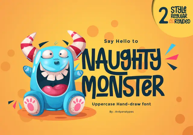
Tall eccentric cartoon capitals
Naughty Monster stretches cartoon letterforms into tall narrow capitals whose cross-strokes run out past their neighbouring letters and whose tops refuse to line up.
Ideas for this font

Inflated graffiti letters with hanging drips
Mila is an inflated graffiti display face in black on a dark wall: fat rounded letters with a glossy highlight, a neon green and pink outline, and paint drips hanging from the bottom of each stroke, with a crown splat and a spray can at the edges.
Ideas for this font
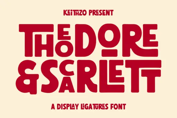
Fat geometric ligature display with nested letters
Theodore and Scarlett is a display ligature face in deep red on cream: fat geometric letters where small letters nest inside the counters of large ones, the two words interlocking so the block reads as one shape with two lines inside it.
Ideas for this font
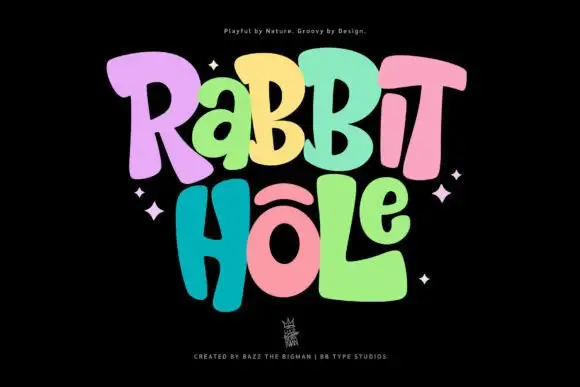
Groovy multicolour display
Rabbit Hole is a groovy multicolour display in pastel tones on a black ground: chunky rounded letters with soft corners and uneven widths, a bounce across both lines, four-point sparkles at the sides and a small crest at the foot.
Ideas for this font
Same independent foundry
Allow optional Google Analytics to measure visits and catalogue actions. Your search words and notes are not included. Privacy & storage