Modern Grotesque Body

Dreadthorn + Cultivo
Creates crisp high-hierarchy contrast beneath Dreadthorn headlines across menus, websites and labels.
Inspect Cultivo specimenDisclosure: MakerFileHub may earn a commission from qualifying purchases via paid links on this page. How our links work.
Gothic-influenced mixed case with long hooked D and narrowed waists
Dreadthorn is a gothic display blackletter with wide letters, flared stems, sharp spurs and a clean flat contour, drawn to print white on a dark ground without any texture.
Paid link
Get this fontProject & layout blueprintsAt-a-glance maker compatibility
Sturdy stroke walls and open counters weed cleanly on adhesive vinyl, HTV apparel film, and cut cardstock.
Visual anatomy & craft review
Dreadthorn spans the frame in a pale bone white on a dark stone wall, and the letters are broad and even: the stems flare slightly at the foot, the shoulders curl into small hooks, and the diamonds at the base are cut clean rather than weathered. The face keeps the blackletter rhythm without the density of a textura, so the word reads at a distance as a designed title rather than a block of texture. Beneath the word three spaced lines sit between fine rules with small fleurons, naming the style, the source and the collection. The composition is symmetrical, with a fleuron at the top and another at the foot of the card. Because the contour is flat and clean, the face prints well at moderate sizes and holds up on both paper and fabric, which makes it more practical than the textured gothic cuts for anything that has to be reproduced many times.
Gothic-influenced mixed case with long hooked D and narrowed waists
Two-font hierarchy recipes
Tested contrast partners — pairing Dreadthorn with grounded secondary typography.
Dreadthorn + Cultivo
Creates crisp high-hierarchy contrast beneath Dreadthorn headlines across menus, websites and labels.
Inspect Cultivo specimen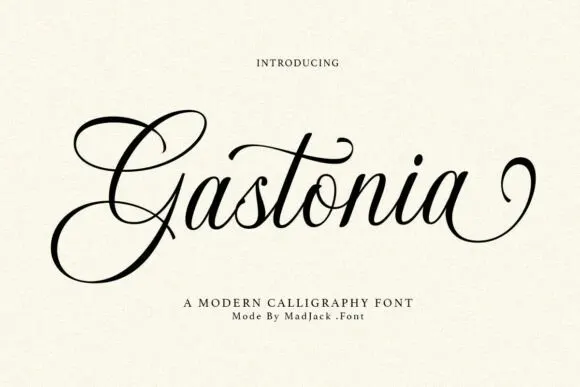
Dreadthorn + Gastonia Script
Adds a warm human signature touch for 1-to-3-word callouts without competing against structured serif capitals.
Inspect Gastonia Script specimenPractical applications
Concrete hierarchy, scale and production guidance tailored to Dreadthorn’s stroke geometry.
The clean contour keeps the lettering legible at a small book trim, and the flared stems give a plain title page the weight of a printed plate.
Hierarchy & layout recipe
Print a 135 by 216 mm title page: set the title at 40 pt across one row, keep 28 mm of clear ground beneath before the author at 11 pt, and hold 18 mm of margin left and right of the block.
Pre-production check
Fine hooks fill in on absorbent paper; print one page on the actual stock and check the shoulders before the signatures.
The wide letters read from the end of a dark corridor, and the clean white contour holds against stone where a textured fill would go muddy.
Hierarchy & layout recipe
Print a 700 by 450 mm sign: set the venue name at 100 pt across two rows, keep 28 mm of clear ground beneath before the opening times at 14 pt, and hold 26 mm of border on all four sides.
Pre-production check
Painted signage thickens the fine joins on every shoulder; print one sign on the intended material and check the diamonds at the feet.
The face gives a bottle a period character without a texture, and the wide letters stay readable on a label seen across a bar counter.
Hierarchy & layout recipe
Print a 65 by 100 mm label: set the beer name at 22 pt on one row, keep 8 mm of clear ground beneath before the strength at 5 pt, and hold 6 mm from the lowest diamond to the die line.
Pre-production check
Small labels close the counters on the e and the o; print one label on the real stock and open them up before the batch is run.
Technical & licence verification
Confirm included OTF/TTF/WOFF formats, full glyph tables and licence coverage on the live store page before batch production.
Closest visual alternatives
Matched across letterform anatomy, stroke behaviour and craft applications.
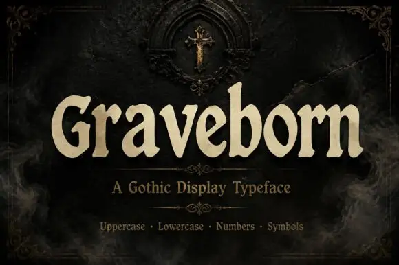
Softly flared Gothic display with broad rounded lowercase
Graveborn is a gothic display face that mixes a blackletter skeleton with a sturdy serif, giving spiky terminals, a tall x-height and a weight heavy enough to sit on a dark ground.
Ideas for this font
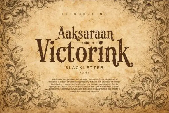
Distressed Victorian serif
Victorink is a narrow ornamental serif printed on aged parchment: uneven spurs, curled ends, chipped edges and a heavy printing texture, set in two stacked lines with a small descriptor beneath and a paragraph of description at the foot, framed by engraved acanthus leaves.
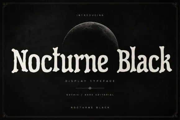
Soft uneven serif display
Nocturne Black is a soft uneven serif in cream on a black ground: rounded bowls, flared ends, slightly irregular widths and a wide fitting, set as one long line beneath a small introducing line and a half moon, with a descriptor and two credit lines at the foot inside a fine frame.
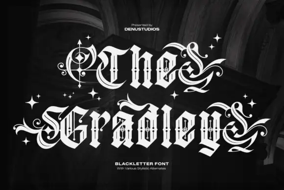
Ornate blackletter with hairline inner strokes and long curling swashes
The Gradley is an ornate blackletter display face: heavy letters with a fine inline running through the stems, long swashes on several capitals, and stars scattered between the words.
Ideas for this font
Same independent foundry
Allow optional Google Analytics to measure visits and catalogue actions. Your search words and notes are not included. Privacy & storage



