Neutral Sans Workhorse

Happy Doodle + Bielchon
Lets Happy Doodle own the focal silhouette while handling secondary copy, sizing and subheads cleanly.
Inspect Bielchon specimenDisclosure: MakerFileHub may earn a commission from qualifying purchases via paid links on this page. How our links work.
Black comic-style emphasis marks, arrows and outlined speech shapes
Happy Doodle is a dingbat set of marker-style marks: arrows, sparkles, suns, clouds, speech bubbles, exclamation marks, hatching and small stars, all drawn in one even black line.
Paid link
Get this fontProject & layout blueprintsAt-a-glance maker compatibility
Sturdy stroke walls and open counters weed cleanly on adhesive vinyl, HTV apparel film, and cut cardstock.
Visual anatomy & craft review
The cover scatters the marks around a pink circle that carries the set name, and the range is obvious at a glance: movement arrows, a lightbulb, a spiral, blood-drop shapes, question marks, a radiating sun. Every mark shares the same weight and the same rounded drawing style, so a handful can be combined without one looking borrowed from another set. As glyphs they set like type, which means spacing is controlled by the character count rather than by hand. They are decoration for a layout that needs to feel annotated, and they are not illustrations: each one makes a point rather than describing a thing.
Black comic-style emphasis marks, arrows and outlined speech shapes
Two-font hierarchy recipes
Tested contrast partners — pairing Happy Doodle with grounded secondary typography.
Happy Doodle + Bielchon
Lets Happy Doodle own the focal silhouette while handling secondary copy, sizing and subheads cleanly.
Inspect Bielchon specimen
Happy Doodle + Auretha
Grounds bold display lettering with classic typographic authority on posters, badges and apparel.
Inspect Auretha specimenPractical applications
Concrete hierarchy, scale and production guidance tailored to Happy Doodle’s stroke geometry.
A few arrows and sparkles give a plain card the annotated feel of a notebook page, and the marks stay clear at small sizes.
Hierarchy & layout recipe
Print a 105 by 148 mm card: set the greeting at 26 pt, place three doodle marks around it with 8 mm of clear space each, keep 12 mm of clear ground beneath before the details at 9 pt, and keep 12 mm of margin.
Pre-production check
Marker strokes print heavier than they look; check a proof at final size before the batch.
The arrows and brackets point at steps without a drawn diagram, and the even line sits beside body text without competing with it.
Hierarchy & layout recipe
Print a 170 by 240 mm page: place six marks beside the steps at 8 mm each, keep 5 mm of clear space around every mark, keep 10 mm of clear ground beneath before the caption at 9 pt, and keep 14 mm from the text block.
Pre-production check
Small marks can look like specks; check the printed page before the issue goes to press. Approve only after seeing it printed at the final size.
The marks tell children where to look, and the simple shapes stay legible on a photocopied sheet where colour would not.
Hierarchy & layout recipe
Print an A4 worksheet: place four marks at 10 mm beside the questions, keep 6 mm of clear space around each, keep 12 mm of clear ground beneath before the answer lines at 12 pt, and keep 16 mm of margin.
Pre-production check
Cheap copiers thicken fine strokes; check a copy before running a class set. Compare a printed copy with the file before ordering.
Technical & licence verification
Confirm included OTF/TTF/WOFF formats, full glyph tables and licence coverage on the live store page before batch production.
Closest visual alternatives
Matched across letterform anatomy, stroke behaviour and craft applications.
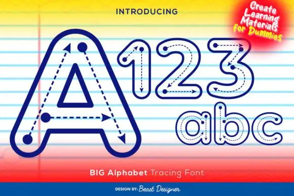
Outlined tracing letters with directional paths
Big Alphabet Tracing shows a large outlined A with dotted paths and arrowheads, and the sample also displays outlined numerals and rounded lowercase letters for practice sheets rather than display use.
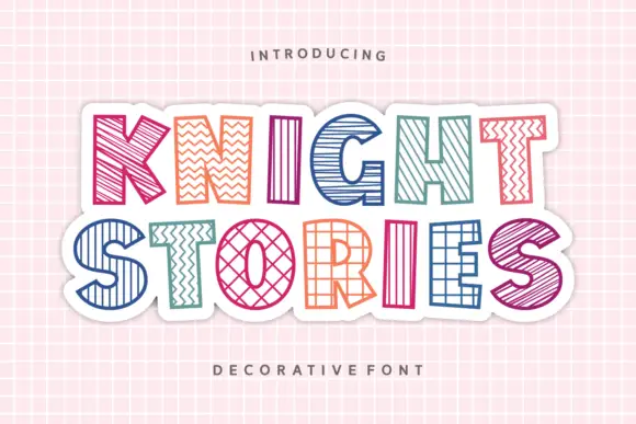
Outlined block capitals filled with varied stripes, zigzags, grids and crosshatching
Knight Stories places two colourful uppercase rows on a white sticker-like shape over a pink grid, where the broad outlined letters contain different linear patterns, from diagonals and zigzags to grids and crosshatching, one pattern per glyph.
Ideas for this font
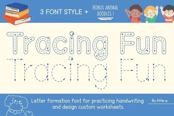
Tracing letter-formation display
Tracing Fun is a letter-formation display in blue on cream: outlined letters with dashed centre lines, arrows marking the stroke direction, and a second lower-case set with the same construction, sold with animal doodles, so the plate reads as a classroom worksheet rather than a typeface.
Ideas for this font
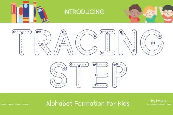
Tracing outline display
Tracing Step is an outlined display in navy on white: rounded capitals drawn as hollow shapes with a dashed path running inside each stroke and small numbered dots at the start points of the strokes, set in two lines between a plain intro line and a plain caption beneath.
Ideas for this font
Same independent foundry
Allow optional Google Analytics to measure visits and catalogue actions. Your search words and notes are not included. Privacy & storage