Neutral Sans Workhorse

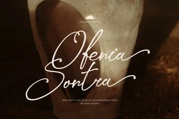
Nerova + Swaraga
Lets Nerova own the focal silhouette while handling secondary copy, sizing and subheads cleanly.
Inspect Swaraga specimenDisclosure: MakerFileHub may earn a commission from qualifying purchases via paid links on this page. How our links work.
Fine extended contrast display
Nerova is a fine extended contrast display in white over a photograph of a woman by the sea: wide capitals with hairline uprights, heavy round bowls and an R leg that sweeps beneath the following letter, set as one word with two small credits beneath.
Paid link
Get this fontProject & layout blueprintsAt-a-glance maker compatibility
Sturdy stroke walls and open counters weed cleanly on adhesive vinyl, HTV apparel film, and cut cardstock.
Visual anatomy & craft review
The word spans the image and the drawing is an extended contrast display: the uprights are hairlines, the bowls are heavy and round, and the R leg sweeps under the O beside it, which is the detail that gives the face its fashion character and its main risk, because the leg needs room. That construction sets a size floor and interacts with tracking, and the plate shows the leg crossing into the next letter, which is a useful warning about the spacing. The photograph behind it is staging, and the placement across a moving subject shows that the heavy bowls hold while the hairlines thin out. The two credits beneath are small and plain. Because the contrast is extreme, the face belongs on coated stock or a screen at display sizes.
Display, contrast, extended, elegant
Two-font hierarchy recipes
Tested contrast partners — pairing Nerova with grounded secondary typography.
Nerova + Swaraga
Lets Nerova own the focal silhouette while handling secondary copy, sizing and subheads cleanly.
Inspect Swaraga specimen
Nerova + Amor Hadena
Grounds bold display lettering with classic typographic authority on posters, badges and apparel.
Inspect Amor Hadena specimenPractical applications
Concrete hierarchy, scale and production guidance tailored to Nerova’s stroke geometry.
An extended contrast face gives a masthead couture width, and the heavy bowls keep the name legible over a cover photograph.
Hierarchy & layout recipe
Set the masthead at 100 mm cap height across 210 mm, the cover lines in an 8 pt sans, and the issue at 7 pt. Print one ink on a coated stock and keep the masthead off the model's face.
Pre-production check
Check the masthead at 100 mm, where the swept R leg can collide with the O; set that pair apart. Confirm the 7 pt issue survives lamination and that the hairlines stay open.
A contrast display sets a formal invitation with a modern silhouette, and the heavy bowls hold a long couple's name at 26 pt.
Hierarchy & layout recipe
A5 invitation: the names at 26 pt, the request in a 9.5 pt serif, and the date at 8.5 pt caps. Keep 24 mm margins and letterpress one ink on a cotton card.
Pre-production check
Check the 26 pt names in letterpress, where a hairline upright can sink into the cotton; proof the plate first. Confirm the request reads at arm's length and that the R leg clears the next letter.
A fine extended display gives a cosmetics label a couture mark, and the heavy bowls stay legible on a small tube. A tube is the smallest surface it survives.
Hierarchy & layout recipe
Print a 40 by 60 mm label: the brand at 11 pt, the product at 7 pt, and the volume at 6 pt. Keep 4 mm inside the die and keep the finest upright above 0.25 mm.
Pre-production check
Check the 11 pt brand on a tube, where a hairline can fill; keep it above 0.25 mm. Confirm the 6 pt volume reads on the shelf and that the label holds in a warm bathroom.
Technical & licence verification
Confirm included OTF/TTF/WOFF formats, full glyph tables and licence coverage on the live store page before batch production.
Closest visual alternatives
Matched across letterform anatomy, stroke behaviour and craft applications.

Bold sans with ligature alternates
Think Loved is a bold sans in orange on a pale ground: wide geometric caps with flat terminals, a very high waist and tight spacing, with a ligature that fuses two letters into a single drawn shape, set in two lines with a small tracked note beneath naming the alternate.
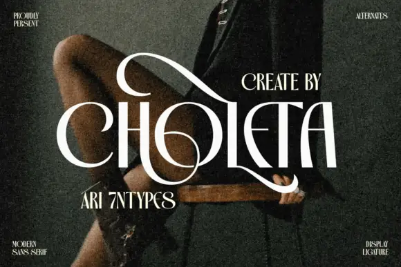
Contrasting capitals woven through a large upper loop and low circular sweep
Choleta builds tall white capitals and then lets thin strokes cross through them, so the counters open into slashes and the whole line reads as one sculpted ligature rather than six separate letters.
Ideas for this font
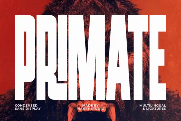
Ultra condensed display sans
Primate is an ultra condensed sans display in white on a red-tinted portrait: very tall narrow caps with flat terminals, a high waist and thin counters, set edge to edge so the letters nearly touch, with three small tracked labels along the foot.
Ideas for this font
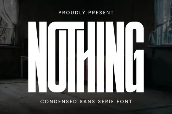
Very tall condensed display
Nothing is an extremely tall condensed display in white on a dark, peeling interior: narrow capitals whose tops join a shared bar, with a central diagonal joint across the middle of the word, flat terminals and hairline counters, and tracked caps above and beneath that name the style.
Ideas for this font
Same independent foundry
Allow optional Google Analytics to measure visits and catalogue actions. Your search words and notes are not included. Privacy & storage