Neutral Sans Workhorse

David + Montreal
Lets David own the focal silhouette while handling secondary copy, sizing and subheads cleanly.
Inspect Montreal specimenDisclosure: MakerFileHub may earn a commission from qualifying purchases via paid links on this page. How our links work.
Heavy uppercase letters with rounded liquid drips hanging from the baseline
David shows glossy black capitals on a pale grey field, where broad D bowls and straight A, V and I strokes terminate in narrow hanging drops and further drips sit inside the D counters.
Paid link
Get this fontProject & layout blueprintsAt-a-glance maker compatibility
Sturdy stroke walls and open counters weed cleanly on adhesive vinyl, HTV apparel film, and cut cardstock.
Visual anatomy & craft review
The weight stays heavy, the terminals turn into hanging drops, the bowl interiors carry their own drips and the gloss sits on top as a surface treatment. That liquid end is the character: the word looks poured rather than printed, which is why the sample keeps one short focal word on a plain ground. The gloss and shadows are not proof of intrinsic colour or three-dimensional font data, so confirm the real contours, keep 24 mm beneath the baseline for the drops and avoid setting a subtitle too close.
Heavy caps · Liquid drips · Glossy
Two-font hierarchy recipes
Tested contrast partners — pairing David with grounded secondary typography.
David + Montreal
Lets David own the focal silhouette while handling secondary copy, sizing and subheads cleanly.
Inspect Montreal specimen
David + Flowsky Editorial
Grounds bold display lettering with classic typographic authority on posters, badges and apparel.
Inspect Flowsky Editorial specimenPractical applications
Concrete hierarchy, scale and production guidance tailored to David’s stroke geometry.
The dripping caps set a horror-flavoured poster, and the heavy bowls carry at 56 pt on an A3 sheet, where the hanging drops give the title its menace.
Hierarchy & layout recipe
Print an A3 poster: set the title at 56 pt on one row, keep 24 mm of clear ground beneath for the hanging drops, and keep 22 mm of margin so the outer contours stay inside the trim.
Pre-production check
Drips printed at 30 pt read as smudges; check the proof and hold the title at 48 pt or above.
The liquid lettering gives a bar label a theme, and the heavy strokes stay solid at 28 pt on a 55 mm panel, with the drops kept inside the border.
Hierarchy & layout recipe
Print a 55 by 45 mm label: set the name at 28 pt, keep 12 mm of clear ground beneath for the drops, and set the street at 6 pt in a plain caps at the foot.
Pre-production check
Hanging drops cut by the panel edge look like damage; check the artwork and keep 8 mm of clear panel.
The drips suit a costume card, and the rounded bowls keep a short phrase readable at 32 pt on an A6 sheet, where the drops read as costume rather than damage.
Hierarchy & layout recipe
Print an A6 card: set the phrase at 32 pt on one row, keep 20 mm of clear ground beneath for the drops, and set the date at 11 pt in a plain sans at the foot.
Pre-production check
Two dripping rows on one small card compete; check the card and keep the second line in a plain face.
Technical & licence verification
Confirm included OTF/TTF/WOFF formats, full glyph tables and licence coverage on the live store page before batch production.
Closest visual alternatives
Matched across letterform anatomy, stroke behaviour and craft applications.
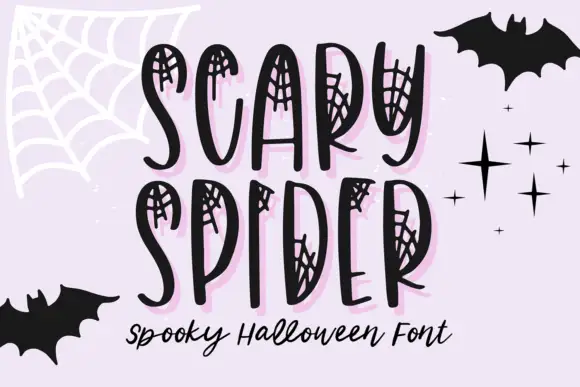
Web-inset tall narrow display
Scary Spider is a display face on a lilac ground: tall uneven narrow capitals with small spiderweb networks drawn inside their upper and side openings, a pale pink offset shadow, bats and stars around the frame, and a script line beneath in black.
Ideas for this font
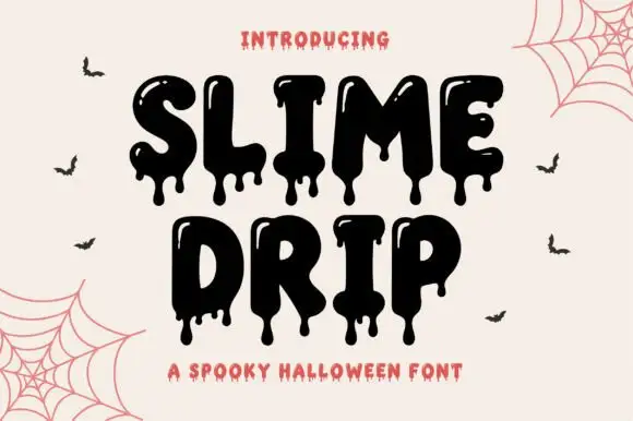
Dripping slime display
Slime Drip is a dripping display in black on a cream ground: fat rounded letters with long viscous drips running from the baseline and from inside the counters, a bouncy baseline, and a tracked caption beneath in a rough sans, with bats and cobwebs in the corners.
Ideas for this font

Sharp angular blackletter with fractured serifs and kept lowercase counters
Blade Gothic is a blackletter display in which the strokes break into sharp angles, the serifs fracture and the vertical rhythm stays clean, so a title reads as medieval lettering that still resolves at headline scale.
Ideas for this font
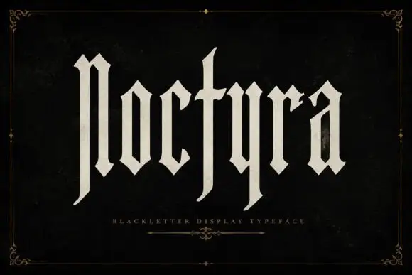
Extremely tall blackletter with blade-like lower extensions
Noctyra is a tall blackletter display face with narrow letters, needle-sharp spurs and thinner stems than a textura, set inside a hairline frame of corner flourishes.
Ideas for this font
Same independent foundry
Allow optional Google Analytics to measure visits and catalogue actions. Your search words and notes are not included. Privacy & storage