Neutral Sans Workhorse

Slime Drip + Bargain Condensed
Lets Slime Drip own the focal silhouette while handling secondary copy, sizing and subheads cleanly.
Inspect Bargain Condensed specimenDisclosure: MakerFileHub may earn a commission from qualifying purchases via paid links on this page. How our links work.
Dripping slime display
Slime Drip is a dripping display in black on a cream ground: fat rounded letters with long viscous drips running from the baseline and from inside the counters, a bouncy baseline, and a tracked caption beneath in a rough sans, with bats and cobwebs in the corners.
Paid link
Get this fontProject & layout blueprintsAt-a-glance maker compatibility
Sturdy stroke walls and open counters weed cleanly on adhesive vinyl, HTV apparel film, and cut cardstock.
Visual anatomy & craft review
The two words are stacked and each letter is a fat form with drips: the strokes swell, the counters pinch, and the drips hang at irregular lengths, which turns the block into an image of liquid rather than a text line. The drips are drawn as part of the skeleton, so the word keeps its rhythm, and the bounce keeps the pair playful rather than monstrous. Because the drips extend below the baseline, the pair needs vertical room, and the specimen leaves the plate empty around the words. The caption beneath is set in a rough sans with a slight texture, and the bats and cobwebs at the corners are period decoration rather than part of the letterforms. The palette is two colours on cream, which keeps a seasonal face light rather than heavy.
Slime, dripping, seasonal, playful
Two-font hierarchy recipes
Tested contrast partners — pairing Slime Drip with grounded secondary typography.
Slime Drip + Bargain Condensed
Lets Slime Drip own the focal silhouette while handling secondary copy, sizing and subheads cleanly.
Inspect Bargain Condensed specimen
Slime Drip + Orvelia
Grounds bold display lettering with classic typographic authority on posters, badges and apparel.
Inspect Orvelia specimenPractical applications
Concrete hierarchy, scale and production guidance tailored to Slime Drip’s stroke geometry.
A dripping face keeps a seasonal card playful rather than frightening, and the fat strokes stay legible at A6 where a textured display would clot.
Hierarchy & layout recipe
A6 card: the greeting at 30 pt, the details in a 9 pt sans, and one bat. Keep 12 mm margins, leave 10 mm below the drips, and print two colours on a pale card.
Pre-production check
Check the 30 pt greeting, where a drip can touch the border; pull the block up by 5 mm. Confirm the 9 pt details keep a 4.5:1 contrast and that the bat clears the trim.
A drip sticker reads as a seasonal treat, and the fat silhouette cuts cleanly at 40 mm where a fine display would tear at the weeding stage.
Hierarchy & layout recipe
Die-cut 45 mm stickers: the phrases at 12 pt, the name at 8 pt, and 2 mm clear to the die. Keep the smallest drip at 2.5 mm so the vinyl holds and print two colours on white stock.
Pre-production check
Check the die cut at 45 mm, where a drip can snap at the edge; thicken it. Confirm the stickers peel cleanly and that the drips stay inside the die.
A seasonal display attracts children to a notice on a busy board, and the simple shapes reproduce in one colour on a school copier without losing the drips.
Hierarchy & layout recipe
A4 print: the headline at 46 mm cap height, the times in a 10 mm sans, and the stalls in 9 mm. Keep 20 mm margins and print one colour on a light stock so the drips stay open.
Pre-production check
Check the A4 after a copier pass, where a thin drip can fill; keep the drips above 2 mm. Confirm the 9 mm stalls read at arm's length and that the headline fits the sheet.
Technical & licence verification
Confirm included OTF/TTF/WOFF formats, full glyph tables and licence coverage on the live store page before batch production.
Closest visual alternatives
Matched across letterform anatomy, stroke behaviour and craft applications.
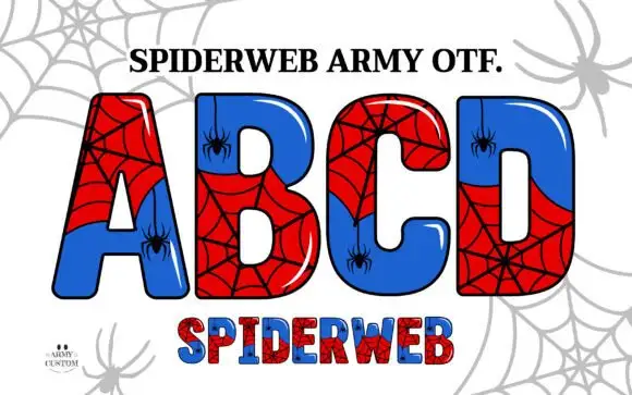
Broad glossy capitals split into red webs and blue fields
Spiderweb Army draws fat comic capitals, splits each letter into two colour fields and covers the halves with drawn spiderwebs, then hangs a small spider from a thread inside the counters.
Ideas for this font
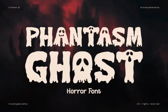
Dripping horror display with cut faces
Phantasm Ghost is a dripping horror display in cream on a dark scene: heavy rounded caps with long drips running from the baseline, faces cut into the counters of the A and the O, and rounded terminals, so the pair reads as a friendly haunted-house sign rather than a brutal metal logo.
Ideas for this font
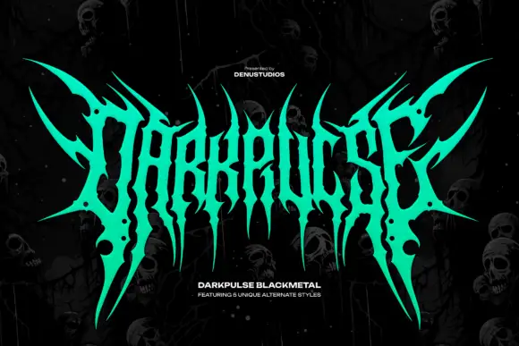
Spiked metal-style lettering with branching tips and hanging points
Darkpulse is black metal logo lettering: tall spiked strokes, mirrored symmetry, thin blade terminals that reach above and below the baseline, and five alternate versions of the wordmark.
Ideas for this font
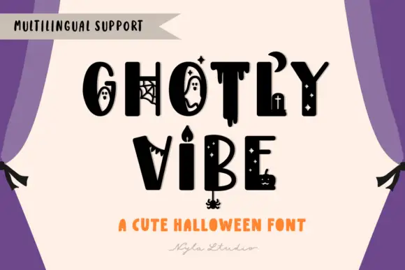
Mixed heavy capitals with distinct ghosts, webs, drips, crescent and candle details
Ghostly Vibe is a cute Halloween display face in which the caps carry little scenes inside them: a ghost in the counter of the O, a spider web in the G, a dripping stroke under the T, and a candelabra between two words.
Ideas for this font
Same independent foundry
Allow optional Google Analytics to measure visits and catalogue actions. Your search words and notes are not included. Privacy & storage