Neutral Sans Workhorse

Myra + Furion
Lets Myra own the focal silhouette while handling secondary copy, sizing and subheads cleanly.
Inspect Furion specimenDisclosure: MakerFileHub may earn a commission from qualifying purchases via paid links on this page. How our links work.
Metallic bevel gothic blackletter
Myra is a gothic blackletter in gold relief on a starry night scene: tall narrow letters with diamond-shaped finials, sharp ascending spurs and a heavy embossed bevel, so the word reads as a carved sign lit from one side rather than as a flat alphabet.
Paid link
Get this fontProject & layout blueprintsAt-a-glance maker compatibility
Sturdy stroke walls and open counters weed cleanly on adhesive vinyl, HTV apparel film, and cut cardstock.
Visual anatomy & craft review
The word is set once across the plate, and the drawing is a true blackletter: the letters are built from vertical strokes joined by thin diagonals, the tops break into fork-and-diamond shapes, and the caps carry long spurs that rise well above the x-height. The treatment is what the specimen sells: each stroke has a highlight along one edge and a shadow along the other, which builds a bevel with two flat colours rather than a photograph of metal. Because the letters are narrow and tall, the word packs into a wide band, and the spacing stays tight without merging because the spurs give each letter an outline to read against. The ground is a night sky with sparks and a faint gothic window, with a tracked caption above and below and thin corner ornaments to close the frame.
Blackletter, gothic, metallic, dramatic
Two-font hierarchy recipes
Tested contrast partners — pairing Myra with grounded secondary typography.
Myra + Furion
Lets Myra own the focal silhouette while handling secondary copy, sizing and subheads cleanly.
Inspect Furion specimen
Myra + Kernova
Grounds bold display lettering with classic typographic authority on posters, badges and apparel.
Inspect Kernova specimenPractical applications
Concrete hierarchy, scale and production guidance tailored to Myra’s stroke geometry.
A beveled blackletter reads as a carved invitation to a formal masquerade, and the gothic skeleton suits the theme better than a horror face, which would pull the event toward a party rather than a ball.
Hierarchy & layout recipe
A2 portrait: the event name at 110 mm cap height, the date in a 16 mm roman, and the venue at 12 mm. Keep 30 mm margins, print gold with a single highlight ink on a deep ground, and reserve the bevel for the name only.
Pre-production check
Check the bevel at full size, where the highlight can break below 0.5 mm; thicken the edge for the print. Confirm the 12 mm venue reads at three metres and that the spurs do not collide with the frame ornaments.
A gothic mark on a bottle reads as heritage without a crest, and the narrow letterforms fit a long product name onto a curved label where a wide serif would wrap.
Hierarchy & layout recipe
Print a 70 by 95 mm label: the brand at 20 pt, the expression in a 7 pt roman, and the strength at 6 pt. Keep 6 mm clear inside the die so the spurs are never cut, and print gold on a dark uncoated stock.
Pre-production check
Check the 20 pt brand on uncoated stock, where the thin diagonals can fill; keep the size above 16 pt. Confirm the 6 pt strength reads on the shelf and that the bevel highlight holds on the curve of the bottle.
A blackletter title signals genre before the reader has read the subtitle, and the beveled treatment gives a cover the look of a foil stamp without the cost of actual foil.
Hierarchy & layout recipe
Set the title at 100 mm cap height across 230 mm, the author in a 12 pt roman, and the imprint at 7 pt. Print two inks on a dark matte stock with a single spot highlight and keep the ornament to one hairline frame.
Pre-production check
Check the title at thumbnail size, where the thin diagonals can blur into the ground; raise the highlight contrast. Confirm the 7 pt imprint survives lamination and that the title clears the trim by 15 mm.
Technical & licence verification
Confirm included OTF/TTF/WOFF formats, full glyph tables and licence coverage on the live store page before batch production.
Closest visual alternatives
Matched across letterform anatomy, stroke behaviour and craft applications.
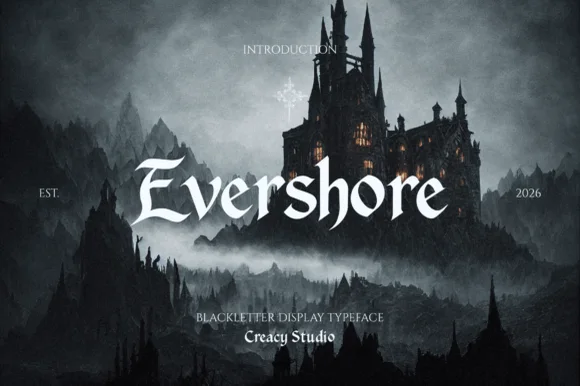
Windswept fantasy calligraphic blackletter (Multilingual)
Evershore is a romantic dark-fantasy blackletter with windswept 'E/h/s' calligraphic plumes and full multilingual character support.
Ideas for this font
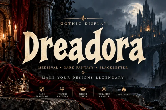
Stately broad-nib medieval manuscript blackletter
Dreadora is a stately medieval blackletter pairing classic broad-nib manuscript rhythm with smooth, highly legible lowercase bowls.
Ideas for this font
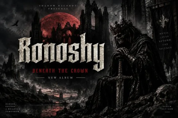
Sharp blackletter with stone texture
Ronoshy is a blackletter display in bone white on a dark gothic scene: tall spiked capitals with hairline joins and sharp terminals, textured like carved stone, set above a red subtitle in a small rounded capital face.
Ideas for this font
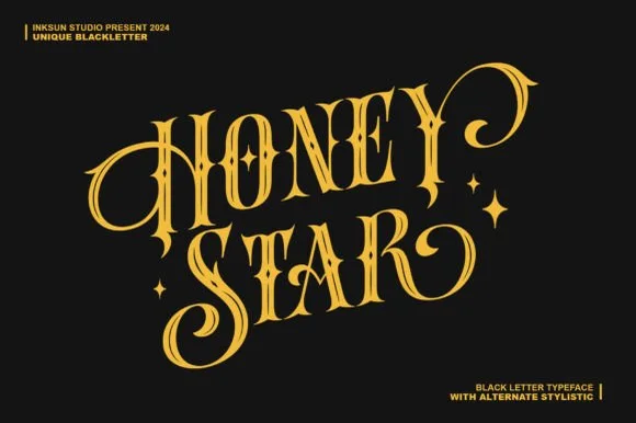
Swashed Victorian-psychedelic ornamental blackletter
Honey Star is a whimsical, medium-bold ornamental blackletter blending diamond gothic stems with sweeping celestial spiral curls.
Ideas for this font
Same independent foundry
Allow optional Google Analytics to measure visits and catalogue actions. Your search words and notes are not included. Privacy & storage