Neutral Sans Workhorse

Cutes Handmade + Corven
Lets Cutes Handmade own the focal silhouette while handling secondary copy, sizing and subheads cleanly.
Inspect Corven specimenDisclosure: MakerFileHub may earn a commission from qualifying purchases via paid links on this page. How our links work.
Padded letter shapes with stitch-like details
Cutes Handmade shows rounded inflated capitals outlined by small dashed stitch marks, where uneven coloured fills and highlights make the letters resemble soft fabric patches and yarn, buttons and bows fill the pink textile setting around them.
Paid link
Get this fontProject & layout blueprintsAt-a-glance maker compatibility
Weld or Unite overlapping script joins into one continuous vector path before sending to the blade.
Visual anatomy & craft review
The bodies stay inflated and round, the stitches trace the outline, the fills vary per letter and the highlights suggest padding. That padded look is the character: the word reads as sewn patches rather than a textured face, which is why the sample sits on fabric. The props and the dimensional surface are not part of the letters, so test the outlines flat, keep 40 pt so the stitch dashes stay separate and check whether the fills ship as colours.
Padded letter shapes with stitch-like details
Two-font hierarchy recipes
Tested contrast partners — pairing Cutes Handmade with grounded secondary typography.
Cutes Handmade + Corven
Lets Cutes Handmade own the focal silhouette while handling secondary copy, sizing and subheads cleanly.
Inspect Corven specimen
Cutes Handmade + Cervelique
Grounds bold display lettering with classic typographic authority on posters, badges and apparel.
Inspect Cervelique specimenPractical applications
Concrete hierarchy, scale and production guidance tailored to Cutes Handmade’s stroke geometry.
The padded caps give a card warmth, and the rounded bodies hold a short name at 34 pt on an A6 sheet, where the stitch outlines stay visible at arm's length.
Hierarchy & layout recipe
Print an A6 card: set the name at 34 pt on one row, keep 16 mm of clear ground beneath before the details at 11 pt, and keep one fill colour so the card reads as designed.
Pre-production check
Stitch dashes under 1 mm merge into the outline; check the proof and keep the name at 30 pt or above.
The patch shapes suit a small tag, and the inflated forms hold a name at 26 pt on a 45 by 70 mm tag, where the dashed stitches survive a die cut.
Hierarchy & layout recipe
Print a 45 by 70 mm tag: set the name at 26 pt on one row, keep 10 mm of clear ground beneath for the padded base, and keep 7 mm to the punch hole so the outline holds.
Pre-production check
The fabric texture does not ship with the file; check the actual contours before promising it.
The sewn letters read on a market label, and the rounded mass holds a two-word name at 22 pt on a 55 by 45 mm sticker, where the stitches stay distinct in one ink.
Hierarchy & layout recipe
Print a 55 by 45 mm sticker: set the stall name at 22 pt on one row, keep 9 mm of clear ground beneath before the town at 6 pt, and keep a matte stock so the fine dashes stay sharp.
Pre-production check
Gloss vinyl reflects the stitched detail away; check a printed sample and choose a matte film instead.
Technical & licence verification
Confirm included OTF/TTF/WOFF formats, full glyph tables and licence coverage on the live store page before batch production.
Closest visual alternatives
Matched across letterform anatomy, stroke behaviour and craft applications.
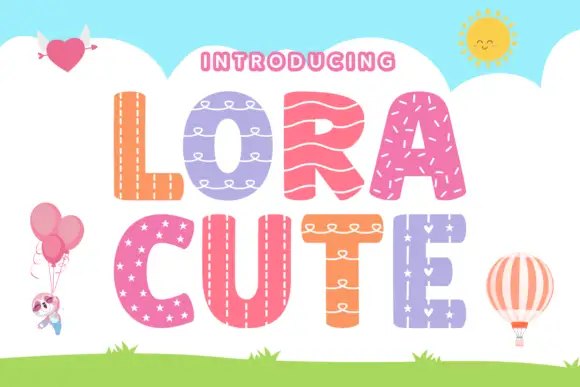
Stitched-pattern block display
Lora Cute is a patterned block display on a sky-blue ground: broad rounded capitals, each filled with a different treatment — stitching, loops, waves, stars — with a pale outline around every letter, plus small balloon, heart and sun illustrations around the edges.
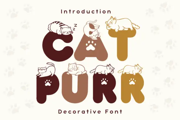
Rounded heavy capitals topped by resting cat drawings with paw-shaped counters
Cat Purr is a colour font that draws fat rounded letters in warm browns and golds, sets a white paw print in most counters, and rests a drawn cat on top of nearly every letter.
Ideas for this font
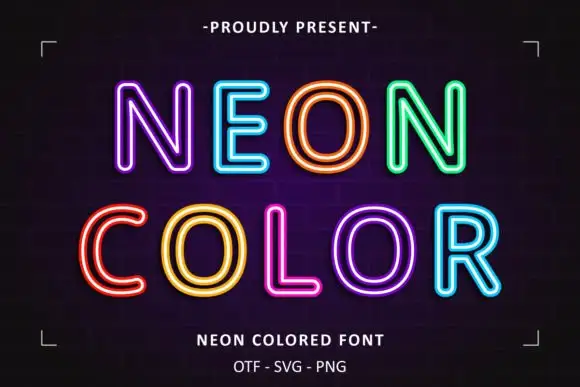
Neon double-line outline display
Neon Colored is a colour display on a dark brick ground: rounded outline capitals in bright double-line neon colours — violet, blue, orange, green, yellow, pink — with soft glow, set in two lines inside small corner brackets, with a small presenting line above and two plain lines below.
Ideas for this font
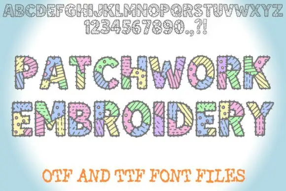
Patched block display with stitches
Patchwork Embroidery is a block display on a soft blue ground: fat capitals divided into patterned patches with short stitch marks along the joins, shown first as a full alphabet and numeral row in outline at the top and then twice at display size in pastel colours, with a plain line beneath that names the formats.
Ideas for this font
Same independent foundry
Allow optional Google Analytics to measure visits and catalogue actions. Your search words and notes are not included. Privacy & storage