Neutral Sans Workhorse

Patchwork Embroidery + Swaraga
Lets Patchwork Embroidery own the focal silhouette while handling secondary copy, sizing and subheads cleanly.
Inspect Swaraga specimenDisclosure: MakerFileHub may earn a commission from qualifying purchases via paid links on this page. How our links work.
Patched block display with stitches
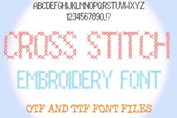
Patchwork Embroidery is a block display on a soft blue ground: fat capitals divided into patterned patches with short stitch marks along the joins, shown first as a full alphabet and numeral row in outline at the top and then twice at display size in pastel colours, with a plain line beneath that names the formats.
Paid link
Get this fontProject & layout blueprintsAt-a-glance maker compatibility
Cut solid base, outline, and shadow layers in separate vinyl colors and align on registration marks.
Visual anatomy & craft review
The plate is unusual in a useful way: the full alphabet and numerals appear in outline at the top, so a buyer can see the whole set and the join construction before looking at the display samples. The drawing is a block capital split into patches with stitch marks, so the face reads as a sewn initial rather than as a printed letter, and the patches set a large size floor because the joins close first. The pastel palette is consistent across the two display lines, which shows the colour handling. The line beneath is product copy that names the formats. It suits a card, a label and a shirt, and the alphabet row is the evidence a buyer needs about case coverage.
Decorative, patchwork, stitched, craft
Two-font hierarchy recipes
Tested contrast partners — pairing Patchwork Embroidery with grounded secondary typography.
Patchwork Embroidery + Swaraga
Lets Patchwork Embroidery own the focal silhouette while handling secondary copy, sizing and subheads cleanly.
Inspect Swaraga specimen
Patchwork Embroidery + Grandeur – Elegant Classic Serif
Grounds bold display lettering with classic typographic authority on posters, badges and apparel.
Inspect Grandeur – Elegant Classic Serif specimenPractical applications
Concrete hierarchy, scale and production guidance tailored to Patchwork Embroidery’s stroke geometry.
A patched display names the club in the lettering, and the stitch marks read as handwork rather than as a print effect. The patches read as sewn.
Hierarchy & layout recipe
A6 card: the greeting at 30 pt, the details in a 10 pt sans, and the date at 9 pt. Keep 15 mm margins, print four colours on a cream card and leave 12 mm at the foot for the club address.
Pre-production check
Check the 30 pt greeting at home-print resolution, where a stitch can close; keep the smallest patch above 1.5 mm. Confirm the details keep a 4.5:1 contrast and that the card folds flat.
A patched tag finishes a handmade present, and the pastel patches read on a kraft card where a thin face would fail. The patches read on kraft.
Hierarchy & layout recipe
Print 45 by 70 mm tags: the name at 11 pt, the year at 7.5 pt, and four colours on a kraft card. Keep 5 mm inside the die and punch the hole clear of a join.
Pre-production check
Check the 11 pt name on kraft, where a join can fill; simplify there. Confirm the year reads at arm's length and that the tags tie cleanly.
A patched display prints as fair kit, and the pastel patches stay distinct on a light shirt. The patches stay distinct. It prints as fair kit.
Hierarchy & layout recipe
Print a 240 mm chest graphic: the fair at 50 mm cap height, the year at 24 mm, and four inks on a light shirt. Keep the smallest patch at 4 mm and place the graphic 80 mm below the collar.
Pre-production check
Check the screen at actual mesh, where a 4 mm patch can fill; enlarge it. Wash-test one shirt and confirm the stitches stay visible after five cycles.
Technical & licence verification
Confirm included OTF/TTF/WOFF formats, full glyph tables and licence coverage on the live store page before batch production.
Closest visual alternatives
Matched across letterform anatomy, stroke behaviour and craft applications.
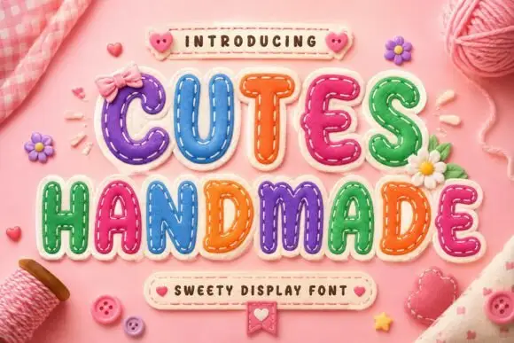
Padded letter shapes with stitch-like details
Cutes Handmade shows rounded inflated capitals outlined by small dashed stitch marks, where uneven coloured fills and highlights make the letters resemble soft fabric patches and yarn, buttons and bows fill the pink textile setting around them.
Ideas for this font
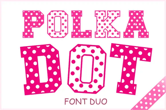
Angular slab-serif capitals alternating solid dotted and hollow dotted treatments
Polka Dot draws its capitals as octagons with the corners cut straight off, then punches a scatter of round holes through the fill so every letter looks like a punched paper tag.
Ideas for this font
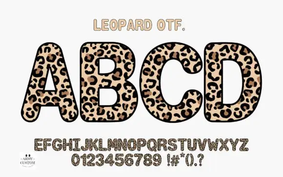
Rounded upright capitals densely filled with leopard-like rosettes
Am Leopard fills fat rounded capitals with a leopard print — a cream ground, brown rosettes with dark centres and small dashes between them — and outlines each letter heavily so a word looks like a row of spots cut out.
Ideas for this font
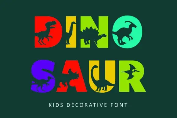
Heavy block capitals cut through by distinct dinosaur silhouettes
Dinosaur sets heavy square capitals in solid colours and cuts a dinosaur silhouette out of each letter, so a word reads as a row of coloured blocks with prehistoric animals standing in the counters.
Ideas for this font
Same independent foundry
Allow optional Google Analytics to measure visits and catalogue actions. Your search words and notes are not included. Privacy & storage