Neutral Sans Workhorse

Cute Homework + Helina
Lets Cute Homework own the focal silhouette while handling secondary copy, sizing and subheads cleanly.
Inspect Helina specimenDisclosure: MakerFileHub may earn a commission from qualifying purchases via paid links on this page. How our links work.
Rounded homework capitals with a dashed inset line and small heart details
Cute Homework is a rounded capital alphabet in which each letter carries a dashed line inset just inside its edge, so a word reads as a stitched cut-out rather than a solid block.
Paid link
Get this fontProject & layout blueprintsAt-a-glance maker compatibility
Weld or Unite overlapping script joins into one continuous vector path before sending to the blade.
Visual anatomy & craft review
The H keeps two even stems and a low bar, the O closes a round counter, the M pinches at the centre and the E carries three arms, all at a heavy even weight with fully rounded corners. The dashed inset is the defining feature: it runs parallel to the outline and turns a plain block into something that reads as sewn or cut along a guide, which is why the face suits paper-craft artwork. Small heart shapes sit between the letters in the sample and are a decoration rather than part of the font. Because the inset is fine, the face wants 24 pt minimum on print and generous size on a garment. The pale ground, the pastel fills, the stars and the small caption are presentation; the typeface is the two words.
Rounded · Dashed · Sweet
Two-font hierarchy recipes
Tested contrast partners — pairing Cute Homework with grounded secondary typography.
Cute Homework + Helina
Lets Cute Homework own the focal silhouette while handling secondary copy, sizing and subheads cleanly.
Inspect Helina specimen
Cute Homework + Raffined
Grounds bold display lettering with classic typographic authority on posters, badges and apparel.
Inspect Raffined specimenPractical applications
Concrete hierarchy, scale and production guidance tailored to Cute Homework’s stroke geometry.
The dashed inset reads as stitched card at folder size, and the rounded blocks keep a school subject label friendly at 30 pt.
Hierarchy & layout recipe
Print an A4 folder cover: set the subject at 30 pt across the upper half, set the pupil's name in a 12 pt rounded sans at the foot, and leave a 25 mm band in the middle so the folder title stays clear of the spine fold.
Pre-production check
A dashed inset under 0.3 mm fills in on a laser printer; check a proof and widen the dash gaps rather than the letters.
The dashed line survives a printed tag at 18 pt and gives thirty identical tags a hand-finished look, which is what a teacher wants on a desk set.
Hierarchy & layout recipe
Print 60 by 30 mm tags: set the child's name at 18 pt, keep the class in a 6 pt sans at the right, and leave 4 mm of margin so the rounded ends are not cut when the tags are guillotined in a stack.
Pre-production check
Guillotining a stack shifts the cut slightly; check the top and bottom tags of the pile and keep the type block inside 80 percent of the tag width.
The stitched blocks make a printed thank-you feel made rather than bought, and the rounded weight stays readable at 20 pt inside a folded card.
Hierarchy & layout recipe
Print a 148 by 105 mm folded card: set the greeting at 20 pt across the upper third, leave the lower half blank for a handwritten message, and keep 15 mm of margin so the dashes are not clipped at the fold.
Pre-production check
A fold running through a letter will crack the print; check the artwork against the crease position and shift the greeting above it.
Technical & licence verification
Confirm included OTF/TTF/WOFF formats, full glyph tables and licence coverage on the live store page before batch production.
Closest visual alternatives
Matched across letterform anatomy, stroke behaviour and craft applications.
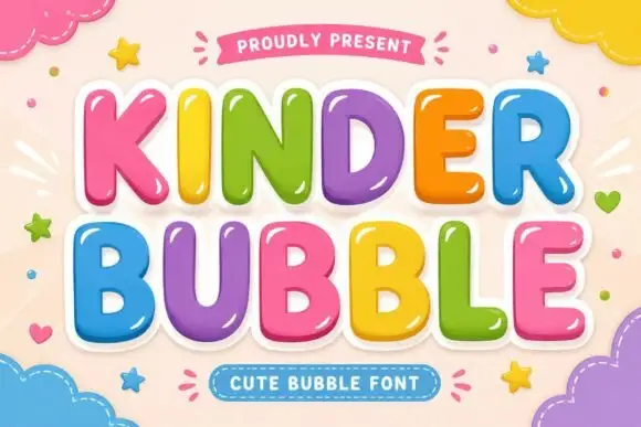
Smooth rounded bubble blocks with a glossy highlight and thick white outline
Kinder Bubble is a smooth rounded block alphabet in which every letter carries a bright highlight and a thick white outline, so a word reads as a set of glossy plastic letters.
Ideas for this font
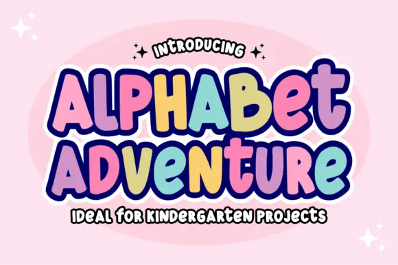
Irregular rounded blocks with a heavy outline and a rainbow of fills
Alphabet Adventure is an irregular rounded block alphabet in which the letters bounce at different heights, a heavy outline surrounds the whole phrase and each letter can take its own colour.
Ideas for this font
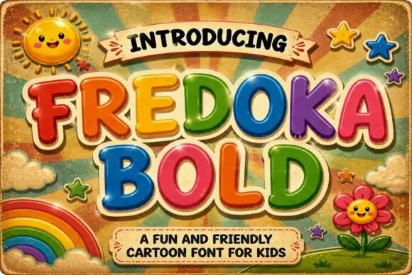
Rounded cartoon capitals in glossy colour with heavy shading
Fredoka Bold is a rounded cartoon capital alphabet in which every letter carries a glossy highlight, a darker shade along the lower edge and a thick cream outline, so a word reads as inflated toy lettering.
Ideas for this font
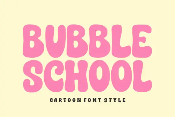
Solid bubble capitals with soft uneven contours and a heavy fill
Bubble School is a solid bubble capital alphabet in which the strokes swell, the contours wobble slightly and the fill is flat, so a word reads as thick foam letters rather than as a sticker.
Ideas for this font
Same independent foundry
Allow optional Google Analytics to measure visits and catalogue actions. Your search words and notes are not included. Privacy & storage