Neutral Sans Workhorse

Could Bee + Mansory
Lets Could Bee own the focal silhouette while handling secondary copy, sizing and subheads cleanly.
Inspect Mansory specimenDisclosure: MakerFileHub may earn a commission from qualifying purchases via paid links on this page. How our links work.
Heavy capitals combining honeycomb openings near the top with small bee silhouettes below
Could Bee punches white rounded capitals out of a honeycomb field, then fills each letter with a smaller honeycomb grid and a few tiny bees so the word looks cut from the hive itself.
Paid link
Get this fontProject & layout blueprintsAt-a-glance maker compatibility
Sturdy stroke walls and open counters weed cleanly on adhesive vinyl, HTV apparel film, and cut cardstock.
Visual anatomy & craft review
The letters are heavy and soft-cornered, the interiors a pale honeycomb of hexagons with bees scattered across them, and the dots on the i replaced by the pattern so nothing interrupts the field. A cartoon bee with blush cheeks floats to the left of the words, and the background is a warmer honeycomb at low contrast so the white letters separate without a hard edge. Two rows fill the frame, with no captions at all. Because the pattern is inside the glyph, the face reads as white shapes at a distance and as honeycomb up close, and it needs size for the hexagons to stay distinct rather than muddy.
Heavy capitals combining honeycomb openings near the top with small bee silhouettes below
Two-font hierarchy recipes
Tested contrast partners — pairing Could Bee with grounded secondary typography.
Could Bee + Mansory
Lets Could Bee own the focal silhouette while handling secondary copy, sizing and subheads cleanly.
Inspect Mansory specimen
Could Bee + Aureline
Grounds bold display lettering with classic typographic authority on posters, badges and apparel.
Inspect Aureline specimenPractical applications
Concrete hierarchy, scale and production guidance tailored to Could Bee’s stroke geometry.
The honeycomb fill says what is in the jar without a photograph, and the heavy letters stay legible on a small round label.
Hierarchy & layout recipe
Print a 55 mm round label: set the brand at 16 pt on one row, keep 7 mm of clear ground beneath before the weight at 5 pt, and keep 5 mm from the lettering to the sticker edge.
Pre-production check
Hexagons merge below 14 pt; check the printed label before the full jar run is ordered by the kitchen.
The pattern reads as a picnic theme without props, and the rounded caps keep a short greeting friendly on a folded card.
Hierarchy & layout recipe
Print a 105 by 148 mm card: set the greeting at 32 pt across one row, keep 14 mm of clear ground beneath before the details at 9 pt, and keep 12 mm of margin on each side of the fold.
Pre-production check
White lettering needs a coloured ground; check the contrast on your own printed card stock.
The cells give a candle a material reference, and the white shapes print cleanly on a kraft wrapper where a thin script would vanish.
Hierarchy & layout recipe
Print a 70 by 110 mm wrapper: set the brand at 20 pt on one row, keep 10 mm of clear ground beneath before the scent at 6 pt, and keep 6 mm of clear area where the wrapper folds around the candle.
Pre-production check
Kraft absorbs white ink; check a printed proof on the actual wrapper stock before the candle run.
Technical & licence verification
Confirm included OTF/TTF/WOFF formats, full glyph tables and licence coverage on the live store page before batch production.
Closest visual alternatives
Matched across letterform anatomy, stroke behaviour and craft applications.
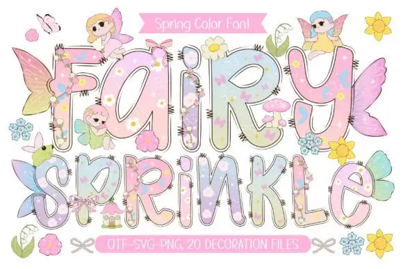
Pastel rounded letters with tiny flowers and overlapping fairy details
Fairy Sprinkle sets a spring scene in tall pastel colour-font letters, each interior printed with flowers, clouds and butterflies, each edge closed by a dashed stitch line, with small fairies perched on top.
Ideas for this font
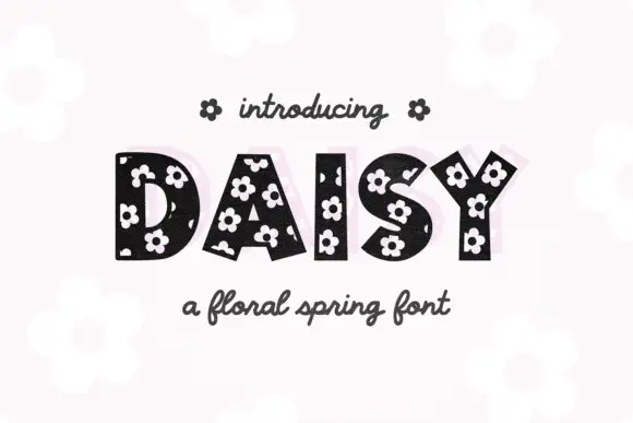
Heavy irregular capitals punctured by small pale five-petal flowers
Daisy sets black slab capitals and fills every counter and stroke with small white daisies, so the word reads as fabric printed with flowers rather than as lettering on a card.
Ideas for this font
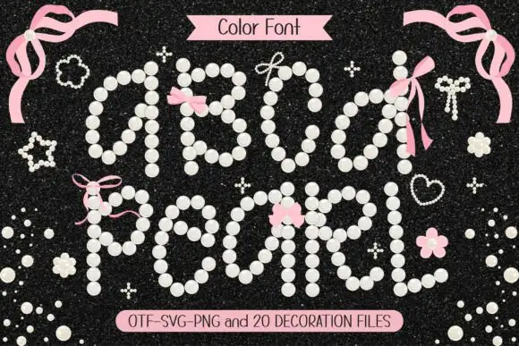
Bead-constructed colour display
Pearl is a colour display on a dark sparkled ground: every letter path built from pale pearl-like beads with small highlights, decorated with pink ribbons and pearl clusters, with a colour-font label at the head and a format list along the foot.
Ideas for this font
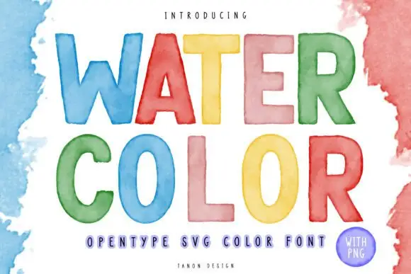
Watercolour-washed block
Watercolor is a colour display on a white ground with loose watercolour washes at the edges: simple rounded capitals, each filled with a translucent-looking wash in blue, red, yellow, pink, green or orange, with a tracked descriptor beneath and a small credit line at the foot.
Ideas for this font
Same independent foundry
Allow optional Google Analytics to measure visits and catalogue actions. Your search words and notes are not included. Privacy & storage