Neutral Sans Workhorse

Daisy + Bielchon
Lets Daisy own the focal silhouette while handling secondary copy, sizing and subheads cleanly.
Inspect Bielchon specimenDisclosure: MakerFileHub may earn a commission from qualifying purchases via paid links on this page. How our links work.
Heavy irregular capitals punctured by small pale five-petal flowers
Daisy sets black slab capitals and fills every counter and stroke with small white daisies, so the word reads as fabric printed with flowers rather than as lettering on a card.
Paid link
Get this fontProject & layout blueprintsAt-a-glance maker compatibility
Sturdy stroke walls and open counters weed cleanly on adhesive vinyl, HTV apparel film, and cut cardstock.
Visual anatomy & craft review
The word sits on white with a pale daisy field behind it, and the letters are heavy enough to hold an all-over pattern without losing their shape: the D keeps a wide bowl, the A a square apex and the S a tight spine. Each blossom is drawn at a fixed size and scattered without a grid, which stops the fill from looking like wallpaper. Thin script captions sit above and below, naming it as a floral spring font, and two small daisy glyphs frame the top line. Because the flowers are white inside a black letter, the pattern inverts if you print the face in a light colour, and the counters are the first place it fills in at small sizes.
Heavy irregular capitals punctured by small pale five-petal flowers
Two-font hierarchy recipes
Tested contrast partners — pairing Daisy with grounded secondary typography.
Daisy + Bielchon
Lets Daisy own the focal silhouette while handling secondary copy, sizing and subheads cleanly.
Inspect Bielchon specimen
Daisy + Wolles Elegant Modern Serif
Grounds bold display lettering with classic typographic authority on posters, badges and apparel.
Inspect Wolles Elegant Modern Serif specimenPractical applications
Concrete hierarchy, scale and production guidance tailored to Daisy’s stroke geometry.
The printed daisies say what the stall sells without a photograph, and the heavy letters stay clear on a small price card.
Hierarchy & layout recipe
Print a 60 by 90 mm card: set the stall name at 20 pt on one row, keep 9 mm of clear ground beneath before the prices at 7 pt, and keep 6 mm of margin so the slab ends are not trimmed.
Pre-production check
White daisies vanish on a pale stock; check a printed proof before the label batch is printed.
The floral fill carries the season on its own, and the block letterforms stay warm on a small folded spring card handed across a table.
Hierarchy & layout recipe
Print a 105 by 148 mm card: set the greeting at 30 pt across one row, keep 14 mm of clear ground beneath before the message at 9 pt, and keep 12 mm of margin on each side of the fold.
Pre-production check
The pattern closes below 18 pt; check the printed card before producing a full batch of cards.
The daisy interiors suit a botanical soap label, and the heavy slabs keep a short brand name legible on a wrapped and curved bar.
Hierarchy & layout recipe
Print a 55 by 85 mm band label: set the brand at 18 pt on one row, keep 8 mm of clear ground beneath before the scent at 6 pt, and keep 5 mm of clear area where the band wraps the bar.
Pre-production check
Fine blossoms smear on uncoated paper; check a proof on the label stock before the label run.
Technical & licence verification
Confirm included OTF/TTF/WOFF formats, full glyph tables and licence coverage on the live store page before batch production.
Closest visual alternatives
Matched across letterform anatomy, stroke behaviour and craft applications.
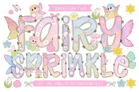
Pastel rounded letters with tiny flowers and overlapping fairy details
Fairy Sprinkle sets a spring scene in tall pastel colour-font letters, each interior printed with flowers, clouds and butterflies, each edge closed by a dashed stitch line, with small fairies perched on top.
Ideas for this font
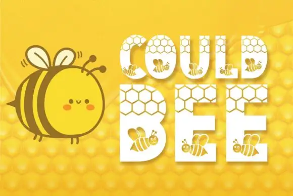
Heavy capitals combining honeycomb openings near the top with small bee silhouettes below
Could Bee punches white rounded capitals out of a honeycomb field, then fills each letter with a smaller honeycomb grid and a few tiny bees so the word looks cut from the hive itself.
Ideas for this font
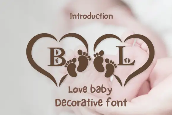
Heart-frame baby monogram
Love Baby is a monogram design on a pale blurred ground: two serif initials inside a pair of open heart outlines that meet in the middle, with paired footprint motifs set along the inner edges and a hand-lettered line beneath that names the style.
Ideas for this font
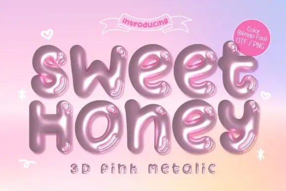
Inflated metallic colour display
Sweet Honey is an inflated colour display on a pink-to-peach gradient: rounded mixed case drawn as glossy pink metal with highlights and reflections, with small hearts and sparkles floating around and two plain lines above and beneath, one of them naming the effect and the formats.
Ideas for this font
Same independent foundry
Allow optional Google Analytics to measure visits and catalogue actions. Your search words and notes are not included. Privacy & storage