Neutral Sans Workhorse

Jeanoti + Olline
Lets Jeanoti own the focal silhouette while handling secondary copy, sizing and subheads cleanly.
Inspect Olline specimenDisclosure: MakerFileHub may earn a commission from qualifying purchases via paid links on this page. How our links work.
Broad plain mixed case shifting into a fine looped slanted ending
Jeanoti shows pale lettering over a warm blurred portrait, where the opening word uses broad near-even sans strokes with a squared J top and a wide e, before the ending rises into a large upper loop and closes with a detached oval dot and a curved foot.
Paid link
Get this fontProject & layout blueprintsAt-a-glance maker compatibility
Sturdy stroke walls and open counters weed cleanly on adhesive vinyl, HTV apparel film, and cut cardstock.
Visual anatomy & craft review
The first letters stay broad and plain, the final syllable thins and slants, one loop rises above the row and a separate dot floats free. That shift inside a single word is the character: the phrase starts as a heading and ends as a signature, which is why the sample keeps one name. The blurred portrait is styling, so test the transition on flat colour, keep 34 pt and allow 22 mm above the loop and below the foot. The loop is the piece that needs room: it rises well above the row, so 34 pt with 22 mm of clear ground above and below keeps it off the trim and out of the line above.
Broad plain mixed case shifting into a fine looped slanted ending
Two-font hierarchy recipes
Tested contrast partners — pairing Jeanoti with grounded secondary typography.
Jeanoti + Olline
Lets Jeanoti own the focal silhouette while handling secondary copy, sizing and subheads cleanly.
Inspect Olline specimen
Jeanoti + Evoire
Grounds bold display lettering with classic typographic authority on posters, badges and apparel.
Inspect Evoire specimenPractical applications
Concrete hierarchy, scale and production guidance tailored to Jeanoti’s stroke geometry.
The shift from plain to looped gives a label a signature, and the broad opening holds a two-word name at 30 pt on a card, where the fine ending supplies the flourish.
Hierarchy & layout recipe
Print an 85 by 55 mm card: set the wordmark at 30 pt on one row, keep 20 mm of clear ground beneath for the curved foot, and keep the address at 7 pt clear of the loop above.
Pre-production check
The detached dot may be a separate character; check the map before the lockup is finalised.
The mixed weight sets a portrait title, and the broad opening holds a two-word heading at 54 pt on a page, where the looped ending frames the subject.
Hierarchy & layout recipe
Print a 210 mm page: set the title at 54 pt on one row, keep 24 mm of clear ground beneath for the foot, and keep the photograph clear of the loop so the flourish reads against flat colour.
Pre-production check
A loop over a busy portrait disappears; check the page and place the title on the plain margin.
The plain opening suits a contemporary invitation, and the slanted ending gives a pair of names a finish at 28 pt on heavy card, where the fine loop stays elegant.
Hierarchy & layout recipe
Print a 105 by 148 mm card: set the names at 28 pt on one row, keep 22 mm of clear ground beneath for the foot, and keep 16 mm of margin at each end so the loop stays inside the trim.
Pre-production check
Fine endings printed at 20 pt break on textured card; check the proof and keep the names at 24 pt.
Technical & licence verification
Confirm included OTF/TTF/WOFF formats, full glyph tables and licence coverage on the live store page before batch production.
Closest visual alternatives
Matched across letterform anatomy, stroke behaviour and craft applications.
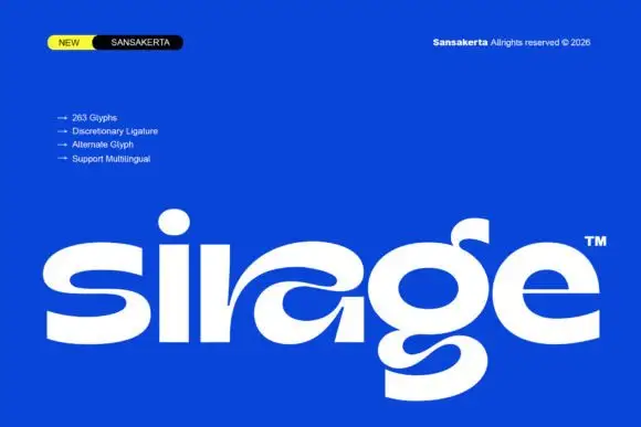
Wide display lowercase with flowing joints
Sirage is a wide display in white on a saturated blue: lowercase with a flowing a construction that sweeps through the bowl, an extended double-bowl g, thick even strokes and round terminals, set as one large word with a small badge at the top left and a list of features beside it.
Ideas for this font
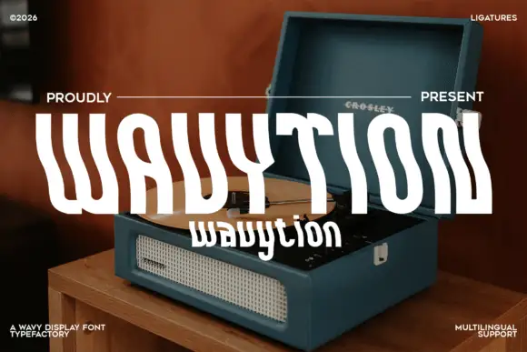
Waved condensed display
Wavytion is a waved display in white over a photograph of a portable record player: very tall narrow forms whose stems bend into broad alternating waves, so the word reads as a ribbon, with a second line in a softer wave beneath and small notes in the corners.
Ideas for this font
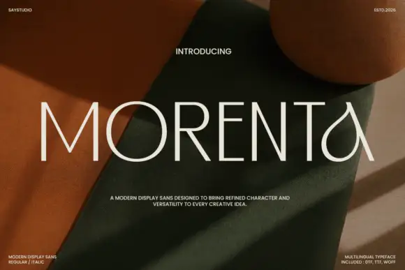
Thin straight display with teardrop forms
Morenta is a thin display in off-white over a rust and olive fabric still life: straight capitals with hairline-thin strokes, a teardrop-shaped A and a curved tail on the final letter, high contrast between the geometric stems and the curved finish, set as one large word with small tracked notes in each corner.
Ideas for this font
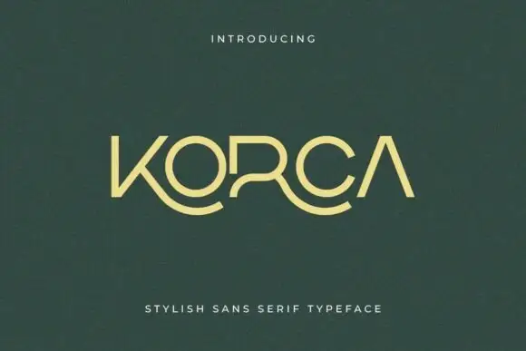
Light geometric capitals with sweeping lower K and R extensions
Korca shows a yellow-green capital name on dark green, where the O and C close as broad round forms, the A carries no crossbar and the K and R extend into long curved lower strokes that sweep beneath the neighbouring letters.
Same independent foundry
Allow optional Google Analytics to measure visits and catalogue actions. Your search words and notes are not included. Privacy & storage