Neutral Sans Workhorse

Wyndham Gothic + Swaraga
Lets Wyndham Gothic own the focal silhouette while handling secondary copy, sizing and subheads cleanly.
Inspect Swaraga specimenDisclosure: MakerFileHub may earn a commission from qualifying purchases via paid links on this page. How our links work.
Structured blackletter with fine lines
Wyndham Gothic is a structured blackletter in navy on a gold ground: slim internal lines, long y and h tails, even shoulders and a small lion ornament at the right, set in two stacked words with a bordered strip beneath carrying a plain descriptor, and a small maker mark at the upper right.
Paid link
Get this fontProject & layout blueprintsAt-a-glance maker compatibility
Weld or Unite overlapping script joins into one continuous vector path before sending to the blade.
Visual anatomy & craft review
The plate is a formal specimen on gold, and the navy on gold gives it a printed-plate quality that suits the drawing. The letters are a structured blackletter with slim internal lines and long tails, so the word reads as engraving rather than as writing, and the long y and h tails break the baseline in a way that makes a two-line setting feel designed rather than stacked. That construction sets a moderate size floor, because the slim internal lines close first. The lion, the strip and the maker mark are staging and product copy. It suits a label, a certificate and a cover for a heritage or a spirits subject.
Decorative, blackletter, structured, formal
Two-font hierarchy recipes
Tested contrast partners — pairing Wyndham Gothic with grounded secondary typography.
Wyndham Gothic + Swaraga
Lets Wyndham Gothic own the focal silhouette while handling secondary copy, sizing and subheads cleanly.
Inspect Swaraga specimen
Wyndham Gothic + Gorga
Grounds bold display lettering with classic typographic authority on posters, badges and apparel.
Inspect Gorga specimenPractical applications
Concrete hierarchy, scale and production guidance tailored to Wyndham Gothic’s stroke geometry.
A structured blackletter reads as a house with history, and the navy on a light label holds at a small die where a hairline gothic would fail.
Hierarchy & layout recipe
Print a 55 by 85 mm label: the house at 12 pt, the expression at 8 pt, and the year at 7 pt. Keep 5 mm inside the die and keep the internal lines above 0.4 mm.
Pre-production check
Check the 12 pt house on the bottle, where an internal line can fill; keep it above 0.4 mm. Confirm the 7 pt year reads on the shelf and that the label holds in a cellar.
A blackletter guide cover reads as history, and the long tails give a two-line title a designed baseline. It suits a text cover.
Hierarchy & layout recipe
Set the title at 80 mm cap height across 175 mm, the author in an 11 pt serif, and the imprint at 8 pt. Print two colours on a textured stock and keep 22 mm margins.
Pre-production check
Check the title at 80 mm, where an internal line can clot; keep the counters open. Confirm the 8 pt imprint survives lamination and that the tails clear the trim.
A blackletter certificate reads as a document, and the even shoulders hold a long pair of names at a moderate size. It reads as a document.
Hierarchy & layout recipe
A4 certificate: the title at 42 mm cap height, the names at 22 pt, the date at 12 pt, and a rule border 10 mm inside the trim. Letterpress one ink on a heavy card.
Pre-production check
Check the 22 pt names in letterpress, where a shoulder can sink; proof the plate first. Confirm the 12 pt date reads at arm's length and that the border stays even.
Technical & licence verification
Confirm included OTF/TTF/WOFF formats, full glyph tables and licence coverage on the live store page before batch production.
Closest visual alternatives
Matched across letterform anatomy, stroke behaviour and craft applications.
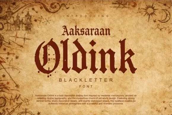
Heavy blackletter display
Oldink is a heavy blackletter in oxblood on aged parchment: mixed case with a divided O, uneven pointed terminals, dense stems and sharp spurs, set in two lines above and below a small serif line, all framed by drawn marginalia — a castle, comets and star charts — with a paragraph of description along the foot.
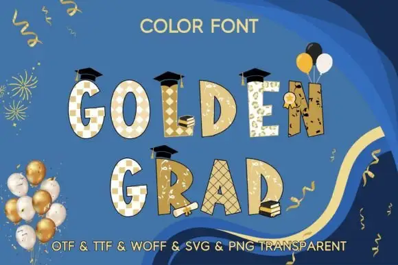
Gold-toned irregular capitals with mixed patterns and graduation accessories
Golden Grad uses uneven gold-toned block capitals with white checks, diamond shapes, botanical-like marks and fine cross-hatching, where black mortarboards sit above selected letters and books with a rolled diploma fill the lower edge.
Ideas for this font
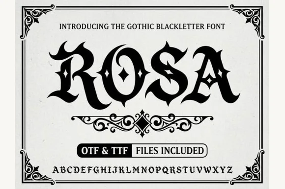
Gothic blackletter with ornaments
Rosa is a gothic blackletter display in black on white: heavy broken strokes with diamond-shaped counters, sharp spurs and a dense texture, set inside an ornamental corner frame with a scroll divider, a file badge and a complete alphabet line at the foot.
Ideas for this font
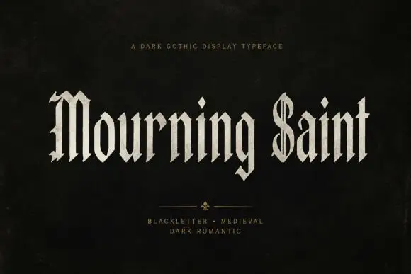
Slender blackletter display
Mourning Saint is a slender blackletter in bone on black: mixed case with a split M, a parallel-lined S, narrow bodies, sharp spurs and a tall x-height, set in two words across the sheet with a small tracked line above and two tracked lines beneath a drawn divider.
Ideas for this font
Same independent foundry
Allow optional Google Analytics to measure visits and catalogue actions. Your search words and notes are not included. Privacy & storage