Neutral Sans Workhorse

Grinched 2.0 + Cultivo
Lets Grinched 2.0 own the focal silhouette while handling secondary copy, sizing and subheads cleanly.
Inspect Cultivo specimenDisclosure: MakerFileHub may earn a commission from qualifying purchases via paid links on this page. How our links work.
Bold chunky caps with flat tops and slightly wonky weight
Grinched 2.0 is a bold capital alphabet in which the strokes stay thick and the shapes sit slightly off true, so a short word reads as a hand-cut sign rather than as a clean grotesque.
Paid link
Get this fontProject & layout blueprintsAt-a-glance maker compatibility
Sturdy stroke walls and open counters weed cleanly on adhesive vinyl, HTV apparel film, and cut cardstock.
Visual anatomy & craft review
The G closes a blunt spur, the R turns a short angled leg, the I holds a plain block, the N keeps two stems and one fat diagonal, the C cuts a shallow crescent and the H carries a bar slightly above centre, all at a heavy weight with flat, slightly uneven terminals. The wonk is the character: no stroke is exactly parallel, which gives a two-word title the look of lettering brushed on board. Because the shapes are solid and open, the face holds from 20 pt to a hoarding, and it prints in one colour. The red ground, the stacked shadow letters, the snowflake doodle and the shop credit are presentation; the green display word is the face.
Bold · Wonky · Hand-made
Two-font hierarchy recipes
Tested contrast partners — pairing Grinched 2.0 with grounded secondary typography.
Grinched 2.0 + Cultivo
Lets Grinched 2.0 own the focal silhouette while handling secondary copy, sizing and subheads cleanly.
Inspect Cultivo specimen
Grinched 2.0 + Lumera Editorial
Grounds bold display lettering with classic typographic authority on posters, badges and apparel.
Inspect Lumera Editorial specimenPractical applications
Concrete hierarchy, scale and production guidance tailored to Grinched 2.0’s stroke geometry.
The heavy wonky caps read through shop glass at 120 mm, and the flat terminals keep the sign crisp in a single colour of cut vinyl.
Hierarchy & layout recipe
Cut a 700 by 300 mm vinyl sign: set the word at 120 mm, keep 4 mm of vinyl at every stroke end, and leave 30 mm of clear glass beneath for the opening hours.
Pre-production check
A flat terminal cut narrower than 4 mm peels off glass within a week; check the vector at full size and widen the ends rather than the word.
The chunky caps hold on a small coffee bag, and the uneven weight gives a short seasonal blend name a hand-stamped feel at 20 pt.
Hierarchy & layout recipe
Print a 90 by 60 mm label: set the blend name at 20 pt in the upper half, set the roast note in a 7 pt sans beneath, and keep 6 mm from the die so the fat strokes are not clipped.
Pre-production check
A heavy word printed close to a die edge looks trimmed; check the label and centre the block rather than enlarging the type.
The bold caps read across a school hall, and the wonky baseline suits a banner assembled by hand from taped sheets at 70 mm.
Hierarchy & layout recipe
Print a two-metre banner across three A4 sheets: set the words at 70 mm, keep a 15 mm overlap between sheets, and align the flat tops along one pencil line before taping.
Pre-production check
Hand-taped sheets drift at the join; check the assembled banner and tape from the back so the faces stay aligned.
Technical & licence verification
Confirm included OTF/TTF/WOFF formats, full glyph tables and licence coverage on the live store page before batch production.
Closest visual alternatives
Matched across letterform anatomy, stroke behaviour and craft applications.
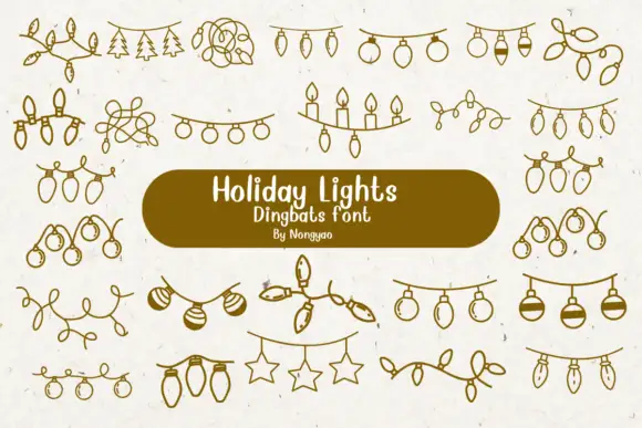
Loose line-art dingbats of hanging lights, baubles and tangled strings
Holiday Lights is a dingbat font that draws Christmas light garlands in one even line: bulb strings, loops of wire, rows of candles, hanging stars and sprigs of pine, all ready to be dropped between two pieces of type.
Ideas for this font
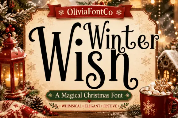
Narrow winter lettering with long inward curls
Winter Wish shows a very large narrow W beside lighter rounded forms, where the s coils inward at its foot and the final h closes on a low curled extension rather than a straight stem.
Ideas for this font
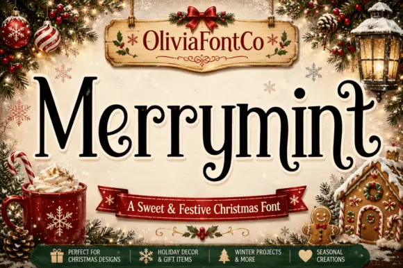
Festive serif with curled terminals
Merrymint is a festive serif in near-black on cream: a moderate-contrast serif with ball terminals that curl into hooks, a wide x-height, generous spacing and a slight bounce, framed by a Christmas still life with a banner naming it a sweet and festive face.
Ideas for this font
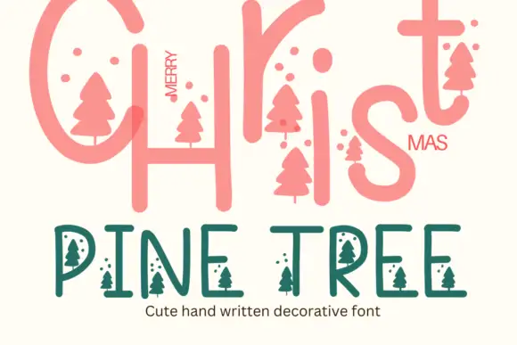
Pine tree illustrated display
Pine Tree is a seasonal decorative face in coral and green on cream: a large rounded script-style Christmas line at the top, and a lighter capitals line beneath in which small pine-tree silhouettes hang from the letters and small dots float between them, with a caption under that.
Ideas for this font
Same independent foundry
Allow optional Google Analytics to measure visits and catalogue actions. Your search words and notes are not included. Privacy & storage