High-Contrast Display Serif

Chunky Chaos + Kernova
Pairs sculptural editorial warmth with Chunky Chaos's clean modern geometry.
Inspect Kernova specimenDisclosure: MakerFileHub may earn a commission from qualifying purchases via paid links on this page. How our links work.
Chunky outlined capitals with a solid shadow companion
Chunky Chaos is a fat rounded display duo: one file draws the letters as thick outlines, a second solid file drops behind them as a shadow, and a set of doodles is drawn with the same pen.
Paid link
Get this fontProject & layout blueprintsAt-a-glance maker compatibility
Sturdy stroke walls and open counters weed cleanly on adhesive vinyl, HTV apparel film, and cut cardstock.
Visual anatomy & craft review
The cover sets CHUNKY as a green outline with empty interiors and CHAOS as solid pink sitting on a white offset, so the two words demonstrate the two files at once. Every letter is built on a near-circle: the C is almost a full ring, the K has a small waist, and the counters are tiny, which is what keeps the shapes reading as balloons instead of as letters with holes. The doodles carry the same stroke width as the outlines — a rainbow arc, a squiggle, hearts, stars, a paper plane and a small hand-drawn arrow — and the script subtitle sits between the two words in a lighter hand, so the sheet mixes three drawing weights. The logo inside the rainbow at the top is the maker's badge, not part of the alphabet.
Chunky · Outlined · Playful
Two-font hierarchy recipes
Tested contrast partners — pairing Chunky Chaos with grounded secondary typography.
Chunky Chaos + Kernova
Pairs sculptural editorial warmth with Chunky Chaos's clean modern geometry.
Inspect Kernova specimen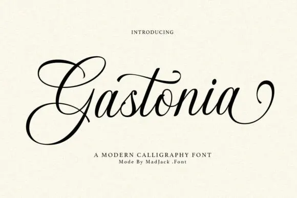
Chunky Chaos + Gastonia Script
Introduces organic movement on pull-quotes, signatures and gift tags.
Inspect Gastonia Script specimenPractical applications
Concrete hierarchy, scale and production guidance tailored to Chunky Chaos’s stroke geometry.
A fat outline with a solid shadow is the easiest shape to cut, glue or print on a party bag, and the doodles in the same weight let the whole set look drawn by one hand.
Hierarchy & layout recipe
Keep the name at 40 mm wide on the bag, place the doodles at no more than three per panel, and keep every outline at least 3 mm thick so the fold of the bag does not swallow the edge.
Pre-production check
Score lines and outline edges compete; check the shadow side of the letters against the fold before the bag is glued.
Bold rounded shapes read across a room and their empty interiors leave space for a name or a number inside the letter, which makes the chart easy to fill in by hand.
Hierarchy & layout recipe
Print the chart at A2 with the heading at 60 mm, keep the grid squares at 25 mm, and leave the outlined letters unfilled so a child can colour them in as the chart progresses.
Pre-production check
Photocopying an outline on cheap paper can fill the thin white gap between the outline and the shadow; proof one copy on the classroom machine.
The two files give an opener an outline headline and a solid one for the standfirst, so the page has contrast without importing a second typeface for a short section.
Hierarchy & layout recipe
Set the headline in the outline at 70 pt with the solid version at 18 pt for the subtitle, and keep the doodles to the margins so the reading column stays clear for body text.
Pre-production check
The outline's small counters close up when printed at small sizes; check the O and A at 18 pt before using the outline for anything below headline size.
Technical & licence verification
Confirm included OTF/TTF/WOFF formats, full glyph tables and licence coverage on the live store page before batch production.
Closest visual alternatives
Matched across letterform anatomy, stroke behaviour and craft applications.
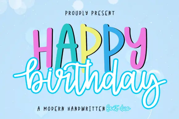
Duo pairing tall hand-lettered caps with an outlined script
Happy Birthday is a two-cut family in which tall hand-lettered capitals stand in a bouncing row and an outlined script writes the second word beneath, so a greeting reads as a decorated card from a stationery shop.
Ideas for this font

Fine looped script with heavy playful sans duo
Shortcake Strawberry puts a fine tall-looped script above a heavy irregular sans whose bowls are almost as wide as the letters are tall, on a soft pink ground.
Ideas for this font
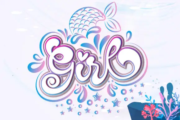
Ornamental script and decorative motifs
Girl builds a large curled capital G, a tall looped l and a heart-shaped accent over the central letters, with layered pink and blue outlines around the word and droplets, stars and a mermaid tail drawn beside it.
Ideas for this font
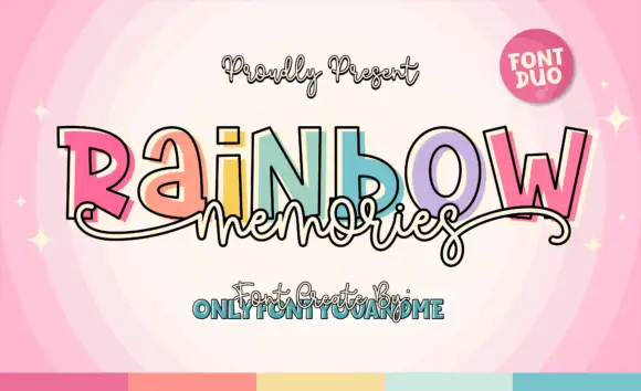
Multicolour outlined blocks with a monoline script
Rainbow Memories is a duo: a set of fat outlined capitals, each printed in a different pastel with a doubled shadow outline, and a looping monoline script that is set across them so the two voices overlap.
Ideas for this font
Same independent foundry
Allow optional Google Analytics to measure visits and catalogue actions. Your search words and notes are not included. Privacy & storage