Modern Grotesque Body

Texas College + Sailors
Creates crisp high-hierarchy contrast beneath Texas College headlines across menus, websites and labels.
Inspect Sailors specimenDisclosure: MakerFileHub may earn a commission from qualifying purchases via paid links on this page. How our links work.
Solid angular college capitals
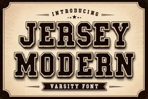
Texas College is a heavy collegiate block in dark brown on aged tan paper: wide slab-serifed capitals with squared counters, set on a sunburst within a thin double frame.
Paid link
Get this fontProject & layout blueprintsAt-a-glance maker compatibility
Sturdy stroke walls and open counters weed cleanly on adhesive vinyl, HTV apparel film, and cut cardstock.
Visual anatomy & craft review
Texas sits above College in two rows that fill the card, and both words are built from the same broad block: a thick stem, a flat slab serif at top and foot, and a counter squared off so that the O and the C read as rectangles with rounded inner corners. The spacing is tight and even, the rows hold together as a single mass, and the lettering is printed in a single dark brown on a paper ground that carries a faint radial sunburst and darker edges. Three captions sit above and below, the lower one with a small star. The face is a varsity block for apparel, pennants and signs: the weight is what makes it work, so it should be set large and in one colour, and the squared counters need watching when it is printed small.
A weathered varsity block on aged paper
Two-font hierarchy recipes
Tested contrast partners — pairing Texas College with grounded secondary typography.
Texas College + Sailors
Creates crisp high-hierarchy contrast beneath Texas College headlines across menus, websites and labels.
Inspect Sailors specimen
Texas College + Rebel Marks
Adds a warm human signature touch for 1-to-3-word callouts without competing against structured serif capitals.
Inspect Rebel Marks specimenPractical applications
Concrete hierarchy, scale and production guidance tailored to Texas College’s stroke geometry.
A heavy block reads across a field on a triangular pennant, and the aged brown on tan suits a traditional school sports day rather than a modern one.
Hierarchy & layout recipe
Print a 450 by 200 mm pennant: set the school name at 80 pt on one row, keep 18 mm of clear ground beneath before the date at 16 pt, and hold 16 mm from the widest letter to the pennant edge.
Pre-production check
A triangular trim clips the outer letters; print one pennant at the final size and check both ends before the order.
The weight survives a single-colour screen print on a mesh shirt, which is the format most school teams can actually afford.
Hierarchy & layout recipe
Print a 260 by 120 mm chest print: set the team name at 78 pt on one row, keep 20 mm of clear ground beneath before the number at 54 pt, and hold 16 mm from the outer stroke to the seam.
Pre-production check
Squared counters fill in on a coarse mesh; print one pull on the actual shirt and check the C and the E before the run.
A solid collegiate block gives a yearbook a cover that still looks right a decade later, and the tight spacing fits a long school name.
Hierarchy & layout recipe
Print a 210 by 297 mm cover: set the school name at 56 pt across two rows, keep 18 mm of clear ground beneath before the year at 26 pt, and hold 16 mm of margin on all sides.
Pre-production check
Two tight rows at cover size can look like one mass; print one cover and check the gap between the rows before the run.
Technical & licence verification
Confirm included OTF/TTF/WOFF formats, full glyph tables and licence coverage on the live store page before batch production.
Closest visual alternatives
Matched across letterform anatomy, stroke behaviour and craft applications.
Solid angular varsity blocks
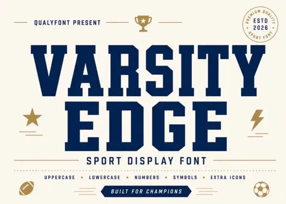
Varsity Edge is a heavyweight collegiate display: wide slab-serifed capitals with flat tops and feet, tight spacing and squared counters, set navy on cream with a set of sport icons around it.
Solid and inset-bordered college blocks
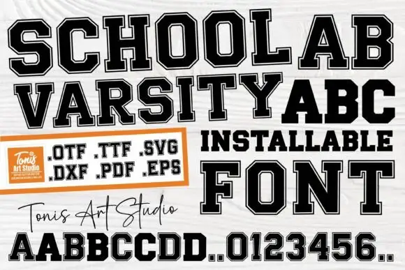
School Varsity is a college block face built as two layers, an outer black letter and a white inset, supplied as font and cut files: OTF, TTF, SVG, DXF, PDF and EPS.
Ideas for this font

Very heavy rounded sport slab capitals
Chicago Titans pushes slab weight to its limit: thick stems, counters narrowed to slots, wide flat feet and almost no space left between the letters of a word.
Ideas for this font
Very heavy collegiate slab capitals with tight spacing and flat slabs
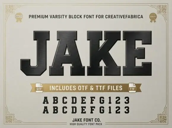
Jake is a very heavy collegiate slab in capitals only, with flat rectangular slabs, tight spacing and almost no internal space left in the counters.
Ideas for this font
Same independent foundry
Allow optional Google Analytics to measure visits and catalogue actions. Your search words and notes are not included. Privacy & storage