High-Contrast Display Serif

Bardguine Serif & Script Duo Font + Auretha
Pairs sculptural editorial warmth with Bardguine Serif & Script Duo Font's clean modern geometry.
Inspect Auretha specimenDisclosure: MakerFileHub may earn a commission from qualifying purchases via paid links on this page. How our links work.
Textured brush script paired with an italic serif in caps
Bardguine pairs a textured brush script in mixed case with an italic serif in caps, so a label can carry a written name and a formal secondary line that share a slightly worn finish.
Paid link
Get this fontProject & layout blueprintsAt-a-glance maker compatibility
Weld or Unite overlapping script joins into one continuous vector path before sending to the blade.
Visual anatomy & craft review
The script half is a connected brush hand: the capital B opens with a looped stem, the a and the r keep small bowls, the g drops a looped descender and the final e finishes in a short flick. Its edge is dry along the strokes, which is what gives the pair its printed rather than digital character. The serif half is an italic capital face with fine serifs and a slight lean, set smaller and tracked wide, and it carries the secondary words without competing. That pairing is the practical part: the script names the product and the italic states what it is, which is how a vintage label is layered. Both hold at 10 pt on a printed label. The cream ground, the dark green ink, the gold ampersand badge and the two credit lines are presentation; the duo is the two lines.
Textured · Italic · Paired
Two-font hierarchy recipes
Tested contrast partners — pairing Bardguine Serif & Script Duo Font with grounded secondary typography.
Bardguine Serif & Script Duo Font + Auretha
Pairs sculptural editorial warmth with Bardguine Serif & Script Duo Font's clean modern geometry.
Inspect Auretha specimen
Bardguine Serif & Script Duo Font + Thick Black
Introduces organic movement on pull-quotes, signatures and gift tags.
Inspect Thick Black specimenPractical applications
Concrete hierarchy, scale and production guidance tailored to Bardguine Serif & Script Duo Font’s stroke geometry.
The script names the preserve while the italic states the flavour, and the worn finish keeps a printed label from looking like a supermarket product at 12 pt.
Hierarchy & layout recipe
Print a 55 by 75 mm label: set the preserve name in the script at 14 pt, set the flavour in the italic at 8 pt beneath, and keep 5 mm of margin so the looped descender is not cut by the rounded corner.
Pre-production check
A dry brush edge printed on kraft reads as a fault; check one label on the actual stock and keep the texture light on small sizes.
The script gives a welcome board its written voice while the italic carries the names formally, which suits a period venue at 10 cm and 5 cm.
Hierarchy & layout recipe
Print a 700 by 500 mm board: set the greeting in the script at 10 cm, set both names in the italic at 5 cm beneath, and leave 10 cm of border so neither layer crowds the frame edge.
Pre-production check
A textured script painted large reads as worn paint; check the board at two metres and decide whether the wear is helping before the final coat.
The pair gives a cover a written title and a formal subtitle, and the worn finish ties the page to a story about long-established making.
Hierarchy & layout recipe
Print an A4 cover: set the title in the script at 64 pt across the upper half, set the subtitle in the italic at 18 pt beneath, and keep 18 mm of margin so the descender loop clears the trim.
Pre-production check
An italic serif set under a brush script can look mismatched; check the cover and keep the subtitle in caps, tracked wide, so the two registers stay distinct.
Technical & licence verification
Confirm included OTF/TTF/WOFF formats, full glyph tables and licence coverage on the live store page before batch production.
Closest visual alternatives
Matched across letterform anatomy, stroke behaviour and craft applications.
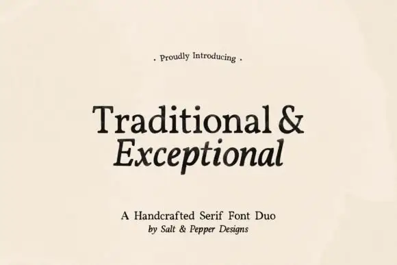
Handcrafted serif duo
Traditional and Exceptional is a handcrafted serif duo in black on cream: a roman with sturdy bracketed serifs and a slightly irregular stem, paired with an italic drawn on the same skeleton, set in two lines with a small tracked introduction and a credit beneath, so the plate reads as a bookish specimen.
Ideas for this font

Contrasting sans capitals and fine signature duo
Brown Carolina Duo contrasts broad high-contrast capitals with a much finer narrow slanted script, set dark on a plain cream field, where the capital R legs sweep below the neighbouring letters and the script carries long tails that run past the ends of both words.
Ideas for this font
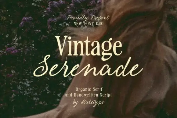
Compact organic serif paired with a long slanted handwritten script
Vintage Serenade pairs a compact organic serif with a long slanted script, so a card carries a firm printed name and a flowing second line that runs well beyond it on both sides.
Ideas for this font
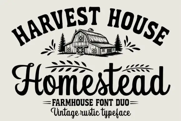
Arched rustic caps paired with a heavy farmhouse script
Homestead is a duo of an arched rustic capital alphabet and a heavy farmhouse script with curled terminals, drawn so a stacked sign reads as a hand-painted barn board.
Ideas for this font
Same independent foundry
Allow optional Google Analytics to measure visits and catalogue actions. Your search words and notes are not included. Privacy & storage



