High-Contrast Display Serif

Cronfrom + Orvelia
Pairs sculptural editorial warmth with Cronfrom's clean modern geometry.
Inspect Orvelia specimenDisclosure: MakerFileHub may earn a commission from qualifying purchases via paid links on this page. How our links work.
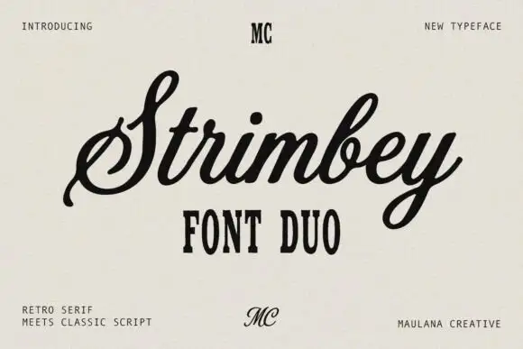
Slanted retro script paired with a wide bold sans in capitals
Cronfrom pairs a slanted retro script with a wide bold sans, so one lockup can carry a handwritten sign name and a hard-edged second line beneath it.
Paid link
Get this fontProject & layout blueprintsAt-a-glance maker compatibility
Weld or Unite overlapping script joins into one continuous vector path before sending to the blade.
Visual anatomy & craft review
The script half is a connected hand with a steady forward lean and a heavy even stroke: the capital C opens as a broad crescent, the r and the o close round bowls and the n and the f run together, with rounded terminals that keep the word friendly rather than sharp. The sans half is a wide bold capital face with flat bars, narrow counters and a heavy even weight, and in the sample it carries the second line at a larger size so the two voices balance as one mark. Because the script leans and the sans stands upright, the pair reads as a sign name over a stable base, which is how most retro lockups are built. The off-white ground, the orange script, the black sans and the four small corner captions are presentation; the duo is the lettering.
Retro · Paired · Bold
Two-font hierarchy recipes
Tested contrast partners — pairing Cronfrom with grounded secondary typography.
Cronfrom + Orvelia
Pairs sculptural editorial warmth with Cronfrom's clean modern geometry.
Inspect Orvelia specimen
Cronfrom + Easy Handwriting
Introduces organic movement on pull-quotes, signatures and gift tags.
Inspect Easy Handwriting specimenPractical applications
Concrete hierarchy, scale and production guidance tailored to Cronfrom’s stroke geometry.
The leaning script over a wide bold sans reproduces a painted fascia, and both halves read at distance when the sign is seen from the pavement.
Hierarchy & layout recipe
Set the name in the script at 18 cm on the fascia, set the second line in the sans at 10 cm beneath, and hold 12 cm of margin so the leaning letters stay on the panel.
Pre-production check
A leaning script beside a wide sans can look unbalanced; check the sign at full size and align the script's baseline to the sans, not to the frame.
The pair gives a feature both a loud headline and a hard second line, which is what a retro culture spread usually carries in one lockup.
Hierarchy & layout recipe
Set the header in the script at 52 pt on the opening page, set the deck in the sans at 16 pt, and hold 14 mm between the two lines so they do not merge.
Pre-production check
A slanted script over a wide sans at small sizes closes the gap; check the page proof and keep at least 10 mm of clear space between them.
The pair holds at small sizes on a curved label, and the wide sans supplies the product line where a script would become unreadable at 7 pt.
Hierarchy & layout recipe
Set the brand in the script at 13 pt on a 60 by 90 mm label, set the flavour in the sans at 7 pt, and leave 6 mm at the sides so the lean does not run into the edge.
Pre-production check
A curved label squeezes a leaning script more than an upright one; check a printed label on the actual bottle and increase the side margins.
Technical & licence verification
Confirm included OTF/TTF/WOFF formats, full glyph tables and licence coverage on the live store page before batch production.
Closest visual alternatives
Matched across letterform anatomy, stroke behaviour and craft applications.
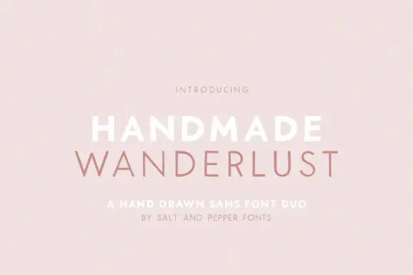
Spaced sans capitals shown in thick white and thin muted-pink lines
Handmade Wanderlust Duo shows two centred uppercase words on a soft pink background, where Handmade is white and noticeably heavier while Wanderlust beneath is thin, muted pink and more widely spaced, with slightly uneven edges and broad A and M diagonals.
Ideas for this font
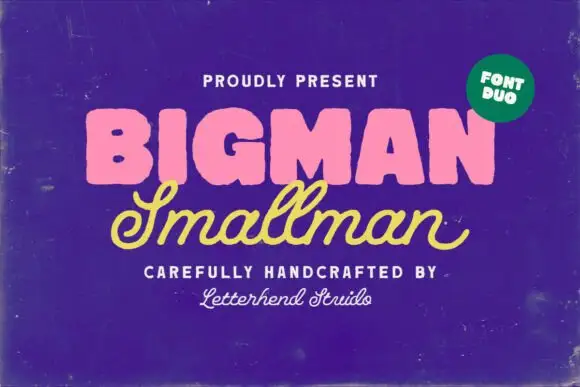
Heavy rounded block capitals paired with a slanted monoline signature script
Bigman Smallman pairs a very heavy rounded capital alphabet with a slanted monoline signature script, so the pair reads as one loud word and one quiet signed line beneath it.
Ideas for this font
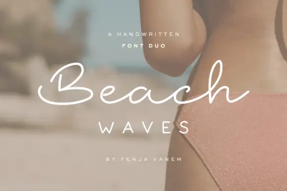
Duo pairing a brushed monoline signature with wide-tracked capitals
Beach Waves is a two-cut family in which a brushed monoline script writes one word and a wide-tracked sans sets the other, so a design gets a relaxed written line and a calm structural line from one purchase.
Ideas for this font
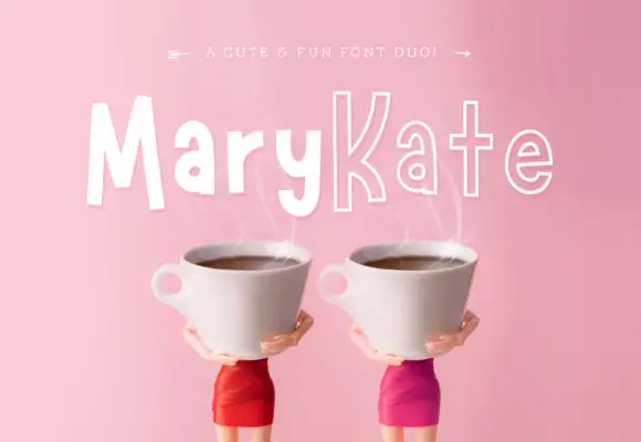
Informal solid-and-outline duo
Marykate is a two-face duo in white over a pink still life of two cups: tall informal mixed case in a solid cut for the first half of the name and a narrow outline cut for the second, with a small caption above that names the pairing.
Ideas for this font
Same independent foundry
Allow optional Google Analytics to measure visits and catalogue actions. Your search words and notes are not included. Privacy & storage