Editorial Serif Anchor

Brighton Avenue + Brenco
Anchors Brighton Avenue's fluid strokes with crisp Roman proportions on wedding suites, headers and packaging.
Inspect Brenco specimenDisclosure: MakerFileHub may earn a commission from qualifying purchases via paid links on this page. How our links work.
Heavy retro script with broad swash tails and fat curled capitals
Brighton Avenue is a heavy retro script in which each word ends in a broad horizontal swash, the capitals curl over themselves and the stroke stays fat from start to finish.
Paid link
Get this fontProject & layout blueprintsAt-a-glance maker compatibility
Weld or Unite overlapping script joins into one continuous vector path before sending to the blade.
Visual anatomy & craft review
The capital B opens as a wide looped bowl with a curled top, and the letters after it keep the same load: the r keeps a stubby arm, the i carries a round dot, the g and the h close heavy shoulders and the t is crossed low. Each word finishes with a broad swash that runs out flat and tapers to a point, which is what gives the pair its printed-sign look, and the second word in the sample carries a larger swash beneath it that acts as a base rule. Weight never thins, joins stay as fat as the stems and the terminals curl rather than stop, so the phrase holds together as one shape at banner size. The navy ground, the cream and yellow inks and the small credits are presentation; the script is the two words.
Retro · Heavy · Swashed
Two-font hierarchy recipes
Tested contrast partners — pairing Brighton Avenue with grounded secondary typography.
Brighton Avenue + Brenco
Anchors Brighton Avenue's fluid strokes with crisp Roman proportions on wedding suites, headers and packaging.
Inspect Brenco specimen
Brighton Avenue + Sailors
Keeps small-scale dates, URLs, nutrition facts and care instructions crisp and legible below script titles.
Inspect Sailors specimenPractical applications
Concrete hierarchy, scale and production guidance tailored to Brighton Avenue’s stroke geometry.
The heavy retro weight reads down a street and the swash supplies the underline a painted fascia usually needs, so no rule or border has to be added.
Hierarchy & layout recipe
Set the name at 22 cm across the fascia, keep the menu board in a plain sans at 5 cm, and hold 15 cm at each end so the swashes finish on the panel rather than the frame.
Pre-production check
A swash under a heavy script painted by hand drifts; cut a full-size template for the swash and check the taper against the panel before painting.
The retro weight suits a venue dressed in period style, and the broad swash gives a welcome board a finished base without a physical frame.
Hierarchy & layout recipe
Set the greeting at 12 cm on a 700 by 500 mm board, set both names at 8 cm beneath it, and leave 12 cm of margin so the swash stays inside the board edge.
Pre-production check
A swash that runs off the board edge reads as a mistake; check the layout at full size and shorten the swash rather than the word.
The fat retro script gives a feature its period voice, and the swash can carry the deck line beneath the headline in one piece of type.
Hierarchy & layout recipe
Set the header at 52 pt on the opening spread, keep the body in a 10 pt serif at 13 pt leading, and hold 18 mm below the swash so the columns start clean.
Pre-production check
A heavy script on newsprint fills its counters; check the press sheet and open the g and e slightly if the ink closes them.
Technical & licence verification
Confirm included OTF/TTF/WOFF formats, full glyph tables and licence coverage on the live store page before batch production.
Closest visual alternatives
Matched across letterform anatomy, stroke behaviour and craft applications.
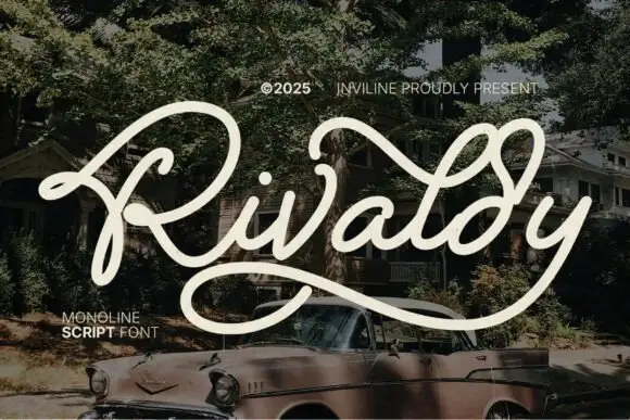
Wide looping monoline retro script
Rivaldy is a wide looping monoline retro script in cream over a vintage car photograph: a tall capital R drawn as a double loop, a light even stroke, and a descender that sweeps beneath the word and returns to the right margin.
Ideas for this font
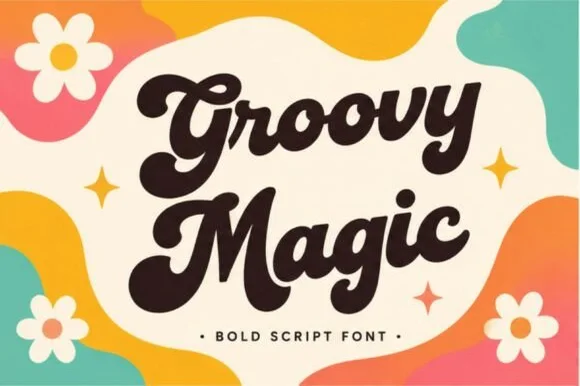
Thick 1970s brush script with swollen bowls and tight connected joins
Groovy Magic is a thick seventies brush script in which the bowls swell, the strokes stay connected and the joins carry the full weight of the stems, so a word reads as one solid painted shape.

Smooth thick monoline cursive with a long entry and a lifted exit
Honey is a smooth thick monoline cursive in which every stroke is the same weight, the entry comes in from the left and the exit lifts at the tip to the right.
Ideas for this font
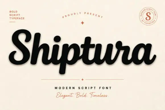
Bold connected script with a slight slant
Shiptura is a bold modern script in black with a soft shadow on cream: thick connected letters with rounded bowls, a slight rightward slant, blunt entry strokes and a small tail on the final letter, presented between two tracked capital lines and a round badge.
Ideas for this font
Same independent foundry
Allow optional Google Analytics to measure visits and catalogue actions. Your search words and notes are not included. Privacy & storage