Editorial Serif Anchor

Groovy Magic + The Lumina Awesome
Anchors Groovy Magic's fluid strokes with crisp Roman proportions on wedding suites, headers and packaging.
Inspect The Lumina Awesome specimenDisclosure: MakerFileHub may earn a commission from qualifying purchases via paid links on this page. How our links work.
Thick 1970s brush script with swollen bowls and tight connected joins
Groovy Magic is a thick seventies brush script in which the bowls swell, the strokes stay connected and the joins carry the full weight of the stems, so a word reads as one solid painted shape.
Paid link
Get this fontProject & layout blueprintsAt-a-glance maker compatibility
Weld or Unite overlapping script joins into one continuous vector path before sending to the blade.
Visual anatomy & craft review
The capital G opens as a broad looped bowl with a heavy inner stroke, and the letters after it stay fat: the r swells at the shoulder, the o closes a round counter, the v holds two deep valleys and the y drops a heavy curved tail. Weight varies only slightly — a little lighter where the brush turns — but the joins never thin out, which is what makes the word read as a single fluid form rather than a set of letters. The fit is tight, so a short word builds a dense block at 60 pt on a poster and still holds at 22 pt on a menu. Bowls are the fragile part in small sizes and the reason the face wants 18 pt minimum. The cream shape, the retro colour blocks, the flowers, the sparks and the small caption are presentation; the script is the two words.
Retro · Swollen · Connected
Two-font hierarchy recipes
Tested contrast partners — pairing Groovy Magic with grounded secondary typography.
Groovy Magic + The Lumina Awesome
Anchors Groovy Magic's fluid strokes with crisp Roman proportions on wedding suites, headers and packaging.
Inspect The Lumina Awesome specimen
Groovy Magic + Helina
Keeps small-scale dates, URLs, nutrition facts and care instructions crisp and legible below script titles.
Inspect Helina specimenPractical applications
Concrete hierarchy, scale and production guidance tailored to Groovy Magic’s stroke geometry.
The swollen bowls build a dense poster block that reads across a room, and the connected joins keep two words as one shape at 90 pt.
Hierarchy & layout recipe
Print at A2: set the event name at 90 pt across the middle, set the date in a 16 pt caps sans beneath, and keep 30 mm of margin so the heavy tail does not run into the trim.
Pre-production check
A very heavy script overprinted on a coloured ground loses its edge; check a proof on the actual stock and give the type a plain panel behind it.
The retro script gives a drinks list its period voice while the printed item names stay legible at 22 pt on a dark menu card.
Hierarchy & layout recipe
Print an A5 menu: set the bar name at 22 pt at the head, set the drinks in a 10 pt sans at 16 pt leading, and hold 14 mm between the script header and the first drink line.
Pre-production check
Heavy joins at 22 pt can merge on a dark ground; check the printed menu in the bar's lighting and raise the size rather than opening the joins.
The brush weight suits a screen print and the swollen bowls hold their shape on a coarse cotton weave at 60 mm where a thin script would sink in.
Hierarchy & layout recipe
Screen a 380 by 420 mm tote: print the word at 60 mm through a 110-thread mesh, keep the second line at 25 mm beneath, and stay 45 mm clear of the handle seam so the print does not distort when the bag is filled.
Pre-production check
A coarse weave fills the tight counters of a heavy script; check a pull on the actual bag and open the o and e if they close up.
Technical & licence verification
Confirm included OTF/TTF/WOFF formats, full glyph tables and licence coverage on the live store page before batch production.
Closest visual alternatives
Matched across letterform anatomy, stroke behaviour and craft applications.
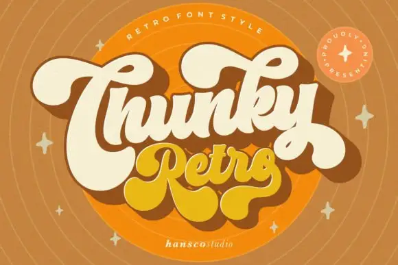
Heavy retro script with fat curled terminals and tight connected loops
Chunky Retro is a heavy script in which the strokes stay thick through every join, the loops close tight and the terminals curl into fat hooks that read as seventies packaging.
Ideas for this font
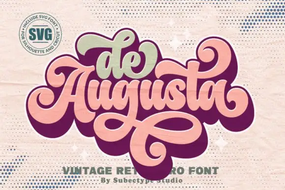
Ornate retro script with heavy joins and broad returning loops
De Augusta is an ornate retro script in which the letters stay heavy and connected, the entry strokes curl wide and a long loop leaves the word, passes beneath it and returns across, so a short name reads as a seventies badge.
Ideas for this font
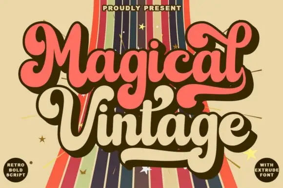
Fat retro script with extrusion
Magical Vintage is a fat retro script in salmon and cream on a striped ground: heavy connected strokes, large loops, an inline highlight and a hard extrusion behind each letter, with two round badges at the corners, so the pair reads as a seventies poster title.
Ideas for this font
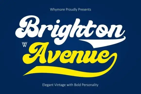
Heavy retro script with broad swash tails and fat curled capitals
Brighton Avenue is a heavy retro script in which each word ends in a broad horizontal swash, the capitals curl over themselves and the stroke stays fat from start to finish.
Ideas for this font
Same independent foundry
Allow optional Google Analytics to measure visits and catalogue actions. Your search words and notes are not included. Privacy & storage