Modern Grotesque Body

Ronsa + Corven
Creates crisp high-hierarchy contrast beneath Ronsa headlines across menus, websites and labels.
Inspect Corven specimenDisclosure: MakerFileHub may earn a commission from qualifying purchases via paid links on this page. How our links work.
Modern bold serif with diagonal swashes
Ronsa is a modern bold serif in cream over a portrait: heavy verticals, extremely thin joins, and capitals whose strokes are cut on a long diagonal, so the R and the A end in blades rather than serifs, giving the word an aggressive couture silhouette.
Paid link
Get this fontProject & layout blueprintsAt-a-glance maker compatibility
Sturdy stroke walls and open counters weed cleanly on adhesive vinyl, HTV apparel film, and cut cardstock.
Visual anatomy & craft review
The word is set across the model's face and the drawing is a display serif that has been cut rather than constructed: the stems are heavy, the hairlines are almost absent, and several letters terminate in long diagonal strokes that sweep up and to the right, which is what produces the sense of movement. The O keeps a wide, nearly circular counter while the S closes tightly, so the rhythm across the word is uneven by design, and the tracking is tight enough that the diagonal cuts nearly touch the following letter. Because the terminals are so thin, the face only works at display sizes, and the sample is honest about it by setting the word once, at hero scale, with two tiny credit lines and a round badge. The ground is a dark portrait with warm skin tones, and the cream type reads on the shadowed side of the face rather than over the highlight.
Modern, bold, dramatic, fashion
Two-font hierarchy recipes
Tested contrast partners — pairing Ronsa with grounded secondary typography.
Ronsa + Corven
Creates crisp high-hierarchy contrast beneath Ronsa headlines across menus, websites and labels.
Inspect Corven specimen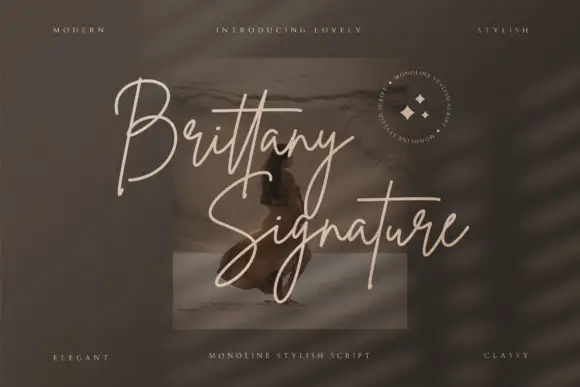
Ronsa + Brittany Signature Script
Adds a warm human signature touch for 1-to-3-word callouts without competing against structured serif capitals.
Inspect Brittany Signature Script specimenPractical applications
Concrete hierarchy, scale and production guidance tailored to Ronsa’s stroke geometry.
A cut serif gives a fashion cover its edge, and the diagonal terminals create a silhouette that reads at newsstand size where a conventional didone looks calm.
Hierarchy & layout recipe
Set the masthead at 110 pt across 210 mm, tracking at minus 15 units, over a portrait and with the model's eye kept clear of the word. Put the cover lines in a 9 pt serif at the foot and keep the whole cover to two inks.
Pre-production check
Check the diagonal terminals at 110 pt on the cover stock, where the thin ends can break on uncoated paper; specify coated stock. Confirm the cover lines read at newsstand distance and that the masthead does not cover the model's eye in the chosen crop.
A bold cut serif gives an eyewear mark a fashion register that a geometric sans cannot, and the heavy stems hold on a temple arm where the mark is only a few millimetres tall.
Hierarchy & layout recipe
Set the name at 22 pt for the box, 12 pt for the temple print and 8 mm wide for the lens cloth. Keep the diagonal terminals only above 12 pt, and always leave clear space equal to half the cap height.
Pre-production check
Check the 8 mm cloth version, where the diagonal cuts turn into a smudge; use the plain terminals for that size. Confirm the 12 pt temple print reads along the arm and that the mark holds on a dark box in one colour.
A cut serif reads as contemporary rather than traditional, which suits a ceremony styled with clean lines, and the heavy strokes hold on a large welcome board.
Hierarchy & layout recipe
Print a 700 by 400 mm board: the names at 110 mm cap height, the date in a 20 mm serif beneath, and a 3 mm rule at 25 mm from the edge. Keep the board to two colours so the diagonal cuts read against flat ground rather than a photograph.
Pre-production check
Check the diagonal terminals at banner size, where a tapering end under 1 mm disappears; thicken the ends for the large format. Confirm the 20 mm date reads at three metres and that the rule does not cross the terminals.
Technical & licence verification
Confirm included OTF/TTF/WOFF formats, full glyph tables and licence coverage on the live store page before batch production.
Closest visual alternatives
Matched across letterform anatomy, stroke behaviour and craft applications.
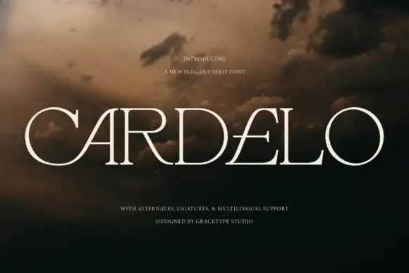
Wide elegant serif with slashed counters and fine hairlines
Cardelo is a wide elegant serif in which the capitals open generously, the hairlines stay fine and two letters carry a slashed counter, so a single word reads as a modern wordmark rather than as a title.
Ideas for this font
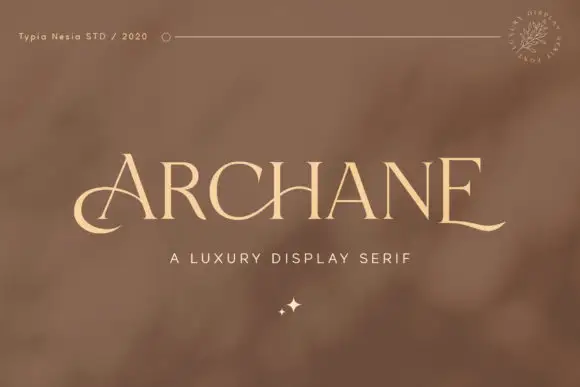
Fine capitals with a low A curl and extended final E foot
Archane shows pale high-contrast capitals on a warm brown field, where the A begins with a low curved entry, the C bowl stays open, the last E finishes with a long gently rising baseline extension and the counter spacing stays even across the row with a small sparkle mark beneath the centre.
Ideas for this font

Fine serif title with large upper and lower loops
Amilea shows pale yellow high-contrast letters with fine tapered serifs and broad rounded lowercase over a dark portrait, where a thin loop curves below the capital A and a tall upper flourish crosses the central ascender before sweeping right.
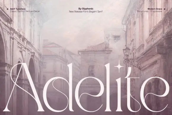
Fine tall serif with inward curls in the lowercase bowls and a crossing capital
Adelite is a fine tall serif in which the stems stretch upward, the lowercase bowls curl inward at their exits and the capital carries a long crossing extension, so a single word reads as an editorial headline rather than a logo.
Ideas for this font
Same independent foundry
Allow optional Google Analytics to measure visits and catalogue actions. Your search words and notes are not included. Privacy & storage