Neutral Sans Workhorse

Ulgiora + Inkora
Lets Ulgiora own the focal silhouette while handling secondary copy, sizing and subheads cleanly.
Inspect Inkora specimenDisclosure: MakerFileHub may earn a commission from qualifying purchases via paid links on this page. How our links work.
Chicano gothic-script hybrid with heavy flourishes and a shaded inner stroke
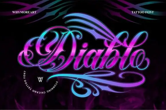
Ulgiora is a chicano-style hybrid in which a gothic skeleton is drawn as a connected script, with heavy flourishes that leave the word at both ends and a fine shaded line inside the thick strokes.
Paid link
Get this fontProject & layout blueprintsAt-a-glance maker compatibility
Weld or Unite overlapping script joins into one continuous vector path before sending to the blade.
Visual anatomy & craft review
The capital U opens as a broad wedge and the word continues in connected form: the l and the g carry tall loops, the i is drawn with a pointed stem, the o closes a narrow oval and the a finishes in a hooked tail. The shading is the technical detail — a fine line runs inside each thick stroke, which is what gives the face its engraved look at 60 pt and what fails first when it is printed small. The flourishes are separate strokes that sweep above and below the word, so a single name fills a wide format on its own. Weight is heavy in the stems with a high contrast at the joins. The dark ground, the white ink, the gold frame, the roses and the small caption are presentation; the display face is the word shown.
Chicano · Flourished · Shaded
Two-font hierarchy recipes
Tested contrast partners — pairing Ulgiora with grounded secondary typography.
Ulgiora + Inkora
Lets Ulgiora own the focal silhouette while handling secondary copy, sizing and subheads cleanly.
Inspect Inkora specimen
Ulgiora + Gorga
Grounds bold display lettering with classic typographic authority on posters, badges and apparel.
Inspect Gorga specimenPractical applications
Concrete hierarchy, scale and production guidance tailored to Ulgiora’s stroke geometry.
The chicano flourishes give a studio mark the street-calligraphy register, and the shaded strokes still read at 22 pt on a card printed on coated stock.
Hierarchy & layout recipe
Print a 90 by 50 mm card: set the studio name at 22 pt across the upper half, set the address in a 6 pt caps sans at the foot, and keep 10 mm of clearance below the lower flourish so the strokes do not touch the block.
Pre-production check
An inner shade line under 0.2 mm fills in below 20 pt; check the printed card and drop the shade on the smallest use rather than the whole mark.
The ornamented hybrid gives a feature cover its subject's voice, and the heavy stems hold at 80 pt over a photograph where a plain gothic would look borrowed.
Hierarchy & layout recipe
Print an A4 cover: set the title at 80 pt across the middle, set the standfirst in an 11 pt sans beneath, and keep 18 mm of margin so the flourishes do not run past the trim on either side.
Pre-production check
Flourishes printed over a busy image read as damage; check the cover and place the lettering on a plain band rather than on the photograph.
The heavy connected strokes print cleanly at 90 mm across a jacket, and the flourishes give a garment a hand-cut lettering look without an embroidery programme.
Hierarchy & layout recipe
Screen a 300 mm back print: set the name at 90 mm with the flourishes inside the print area, keep the shade line at 1.5 mm minimum, and stay 40 mm below the collar seam so the print clears the yoke.
Pre-production check
A shade line under 1 mm closes on a coarse mesh; check a pull on the actual fabric and print the shade as a separate screen or drop it.
Technical & licence verification
Confirm included OTF/TTF/WOFF formats, full glyph tables and licence coverage on the live store page before batch production.
Closest visual alternatives
Matched across letterform anatomy, stroke behaviour and craft applications.
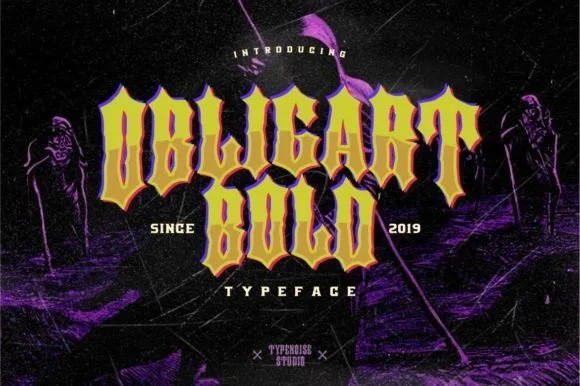
Heavy angular Chicano & street-art block blackletter
Obligart Bold is a heavy, faceted Chicano-tattoo blackletter font (not a cursive script) built from thick chisel blocks and diamond-notched stems.
Ideas for this font
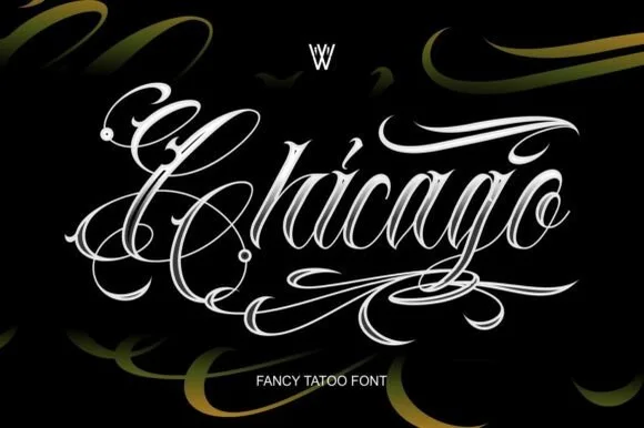
Ornate tattoo script with hatched shading and long capital flourishes
Chicago is an ornate tattoo script in which the capitals throw long flourishes, the stems carry drawn-in shading strokes and the tails curl into hooks, so a single word reads as a piece of lettering rather than as text.
Ideas for this font
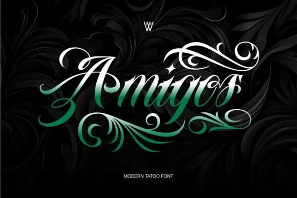
High-contrast Chicano tattoo script with lush acanthus-leaf flourishes
Amigos is a dramatic Chicano tattoo script wrapped in sweeping calligraphic plumes and acanthus-style teardrop flourishes.
Ideas for this font
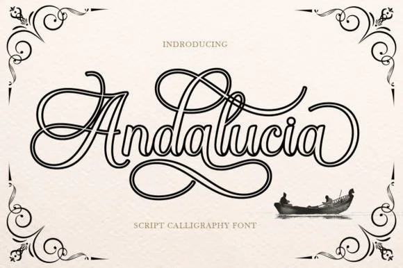
Hollow-outlined copperplate flourish calligraphy script
Andalucia Outline is an elaborate, hollow-contoured calligraphic script wrapped in multi-looped copperplate canopy and underline flourishes.
Ideas for this font
Same independent foundry
Allow optional Google Analytics to measure visits and catalogue actions. Your search words and notes are not included. Privacy & storage