Editorial Serif Anchor

Chicago + Glofi
Anchors Chicago's fluid strokes with crisp Roman proportions on wedding suites, headers and packaging.
Inspect Glofi specimenDisclosure: MakerFileHub may earn a commission from qualifying purchases via paid links on this page. How our links work.
Ornate tattoo script with hatched shading and long capital flourishes
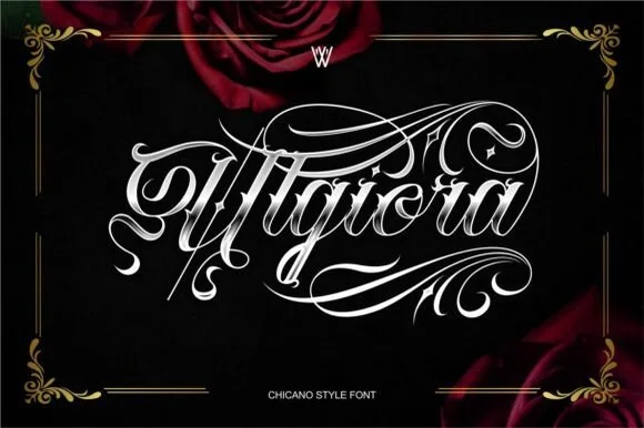
Chicago is an ornate tattoo script in which the capitals throw long flourishes, the stems carry drawn-in shading strokes and the tails curl into hooks, so a single word reads as a piece of lettering rather than as text.
Paid link
Get this fontProject & layout blueprintsAt-a-glance maker compatibility
Weld or Unite overlapping script joins into one continuous vector path before sending to the blade.
Visual anatomy & craft review
The C opens two spirals with a ball terminal, the h keeps a shaded ascender, the i sits under a drawn dot, the c turns a thin hook and the a closes a narrow bowl, all at a chisel contrast with hatched shading inside the thick strokes. The flourishes are the character: they run under and over the word and take up as much space as the letters, which is why the sample sets one word across the whole field with nothing beside it. Because the shading is drawn into the letterform, the face needs 40 pt before the hatch reads as shading rather than as a scratch, and it wants black on a light ground. The black field, the gold swooshes and the small caps caption are presentation; the tattoo word is the face.
Tattoo · Ornate · Floured
Two-font hierarchy recipes
Tested contrast partners — pairing Chicago with grounded secondary typography.
Chicago + Glofi
Anchors Chicago's fluid strokes with crisp Roman proportions on wedding suites, headers and packaging.
Inspect Glofi specimen
Chicago + Clyne Sans
Keeps small-scale dates, URLs, nutrition facts and care instructions crisp and legible below script titles.
Inspect Clyne Sans specimenPractical applications
Concrete hierarchy, scale and production guidance tailored to Chicago’s stroke geometry.
The ornate flourish reads as hand lettering from across the street, and the tattoo register gives a barber a mark with more character than a geometric sans at 80 mm.
Hierarchy & layout recipe
Cut a 500 by 200 mm decal: set the shop name at 80 mm, keep the thin flourishes at 3 mm of vinyl minimum, and leave 25 mm of clear glass beneath for the opening hours line.
Pre-production check
A flourish under 3 mm peels off glass at the first wash; check the vector at full size and thicken the tails rather than the letters.
The shading and flourishes fill a whole spread opener, and the tattoo register matches the subject of the piece at 120 pt.
Hierarchy & layout recipe
Print an A4 opener: set the subject's name at 120 pt across the top third, let the lower flourish cross the column rule by 8 mm, and set the standfirst in a 9 pt sans under the word.
Pre-production check
A flourish crossing a rule reads as a misregistration in print; check the proof and either break the rule or raise the word clear of it.
The ornate capitals give a cocktail sign a vintage saloon feel, and the chisel contrast holds 'signature cocktail' at 34 pt.
Hierarchy & layout recipe
Print an A3 sign: set the bar name at 34 pt, set the drinks in a 12 pt sans beneath with 8 mm between lines, and keep 20 mm of margin so the downward flourishes are inside the frame.
Pre-production check
A downward flourish crowded by the drink list looks accidental; check the sign and open 10 mm of space under the title.
Technical & licence verification
Confirm included OTF/TTF/WOFF formats, full glyph tables and licence coverage on the live store page before batch production.
Closest visual alternatives
Matched across letterform anatomy, stroke behaviour and craft applications.
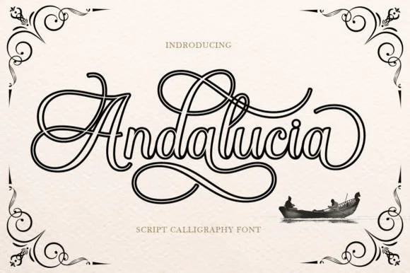
Hollow-outlined copperplate flourish calligraphy script
Andalucia Outline is an elaborate, hollow-contoured calligraphic script wrapped in multi-looped copperplate canopy and underline flourishes.
Ideas for this font
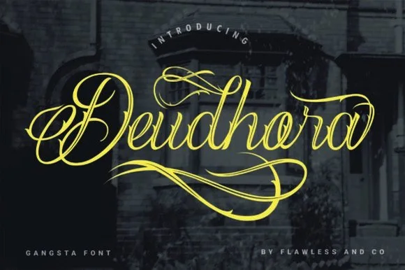
Flourished Chicano & tattoo fine-line calligraphy script
Deudhora is an expressive Chicano-inspired calligraphy script draped in sweeping gold canopy loops and double-backed underline flourishes.
Ideas for this font
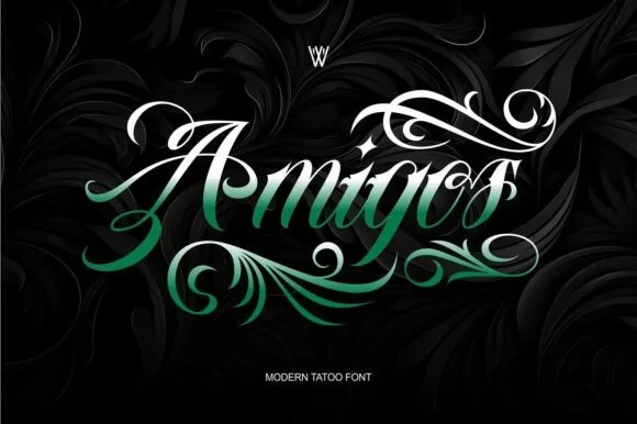
High-contrast Chicano tattoo script with lush acanthus-leaf flourishes
Amigos is a dramatic Chicano tattoo script wrapped in sweeping calligraphic plumes and acanthus-style teardrop flourishes.
Ideas for this font
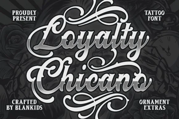
Bold beveled Chicano tattoo script with ornament extras
Loyalty Chicano is a bold, broad-nib Chicano tattoo script bundled with matching ornamental scroll extras for full chest and poster lockups.
Ideas for this font
Same independent foundry
Allow optional Google Analytics to measure visits and catalogue actions. Your search words and notes are not included. Privacy & storage