Neutral Sans Workhorse

Christmas Sprig + Mango Dream
Lets Christmas Sprig own the focal silhouette while handling secondary copy, sizing and subheads cleanly.
Inspect Mango Dream specimenDisclosure: MakerFileHub may earn a commission from qualifying purchases via paid links on this page. How our links work.
Narrow festive lettering with curled terminals and mixed capitals
Christmas Sprig sets a narrow first row and much larger capitals below, where thin curved terminals leave the ends of several letters and long curling lower strokes carry the festive tone.
Paid link
Get this fontProject & layout blueprintsAt-a-glance maker compatibility
Sturdy stroke walls and open counters weed cleanly on adhesive vinyl, HTV apparel film, and cut cardstock.
Visual anatomy & craft review
The letters compress narrow and tall, the capitals in the lower row grow well past the first-line size and the thin terminals curl outward from several letters. The size shift between rows is the character: the sample stacks a title from two scales of one voice, which is why the lanterns and greenery stay outside the lettering and no leaf is built into a glyph. Because the terminals reach out, keep 16 mm of clearance at both ends from 26 pt, and keep 30 pt before the narrow counters close.
Narrow · Festive · Curled
Two-font hierarchy recipes
Tested contrast partners — pairing Christmas Sprig with grounded secondary typography.
Christmas Sprig + Mango Dream
Lets Christmas Sprig own the focal silhouette while handling secondary copy, sizing and subheads cleanly.
Inspect Mango Dream specimen
Christmas Sprig + Gorga
Grounds bold display lettering with classic typographic authority on posters, badges and apparel.
Inspect Gorga specimenPractical applications
Concrete hierarchy, scale and production guidance tailored to Christmas Sprig’s stroke geometry.
The narrow festive letters stack a two-row title, and the curled terminals keep an A6 card seasonal, so the smaller row still needs twenty-six points to keep its counters open.
Hierarchy & layout recipe
Print an A6 card: set the first row at 26 pt, the capitals at 40 pt beneath, keep 16 mm at each end for the terminals, and set the family name at 10 pt in a serif at the foot.
Pre-production check
Narrow counters close under 24 pt; check the proof and keep the smaller row at 26 pt or above.
The festive lettering suits a gift tag, and the curling strokes stay visible at 22 pt on a 45 mm tag, kept well clear of the punched hole at the top.
Hierarchy & layout recipe
Print a 45 by 60 mm tag: set the greeting at 22 pt, keep 8 mm of clear ground beneath for the curling strokes, and keep 5 mm of border so no terminal is punched through.
Pre-production check
A terminal strike crossing the hole looks like a misprint; check the tag artwork and keep 12 mm off the punch.
The stacked rows read across a fair counter, and the narrow letters hold at 44 pt on a printed board, where the thin terminals need a full twenty-four millimetres of border.
Hierarchy & layout recipe
Print a 500 by 250 mm board: set the first row at 44 pt and the capitals at 66 pt below, keep 24 mm of border for the terminals, and set the opening hours in a 14 pt caps on a band beneath.
Pre-production check
Thin terminals at distance vanish on a fair board; check the mounted sign and hold the smaller row at 40 pt or above.
Technical & licence verification
Confirm included OTF/TTF/WOFF formats, full glyph tables and licence coverage on the live store page before batch production.
Closest visual alternatives
Matched across letterform anatomy, stroke behaviour and craft applications.
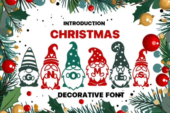
Tall patterned gnome hats above bearded figures carrying small serif initials
Christmas Gnomes draws each letter as a gnome: a striped or spotted hat becomes the stem, the beard becomes the bowl and a letter sits on the belly, so a word reads as a row of small figures.
Ideas for this font
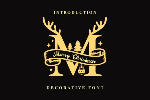
Antlered monogram with ribbon
Monogram Christmas is a monogram on a black ground: a gold serif M with branching antlers rising from the shoulders, a draped ribbon banner crossing the letter with a script greeting written along it, two small fir trees and four sparkles tucked into the negative space, and two plain credit lines above and below.
Ideas for this font
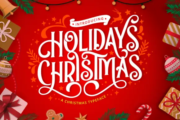
Condensed festive capitals with curled terminals and looping under-extensions
Holidays Christmas is a condensed festive display in which the capitals stay tall and narrow, the terminals curl, the strokes carry high contrast and long lower loops overlap neighbouring letters, so a greeting reads as ribbon lettering.
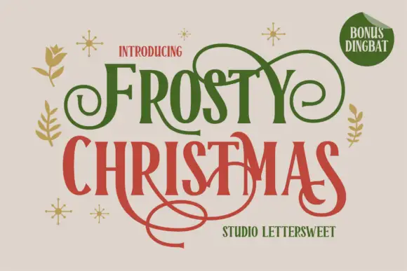
Narrow festive serifs with large looping swashes
Frosty Christmas shows tall contrast-rich letters with sharp flared ends and expansive curls in green and red on cream, where thin extensions loop above the upper row and one long swash sweeps far beneath the lower title while small botanical marks and sparkles sit around the block.
Ideas for this font
Same independent foundry
Allow optional Google Analytics to measure visits and catalogue actions. Your search words and notes are not included. Privacy & storage