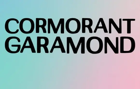
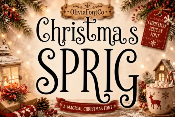
Neutral Sans Workhorse

Merrymint + Prime Nordic
Lets Merrymint own the focal silhouette while handling secondary copy, sizing and subheads cleanly.
Inspect Prime Nordic specimenDisclosure: MakerFileHub may earn a commission from qualifying purchases via paid links on this page. How our links work.
Festive serif with curled terminals
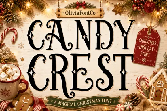
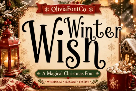
Merrymint is a festive serif in near-black on cream: a moderate-contrast serif with ball terminals that curl into hooks, a wide x-height, generous spacing and a slight bounce, framed by a Christmas still life with a banner naming it a sweet and festive face.
Paid link
Get this fontProject & layout blueprintsAt-a-glance maker compatibility
Sturdy stroke walls and open counters weed cleanly on adhesive vinyl, HTV apparel film, and cut cardstock.
Visual anatomy & craft review
The word is set once, wide, and the drawing is a warm serif: the stems are heavy, the serifs are fine, and the terminals end in balls that curl back on themselves, which gives the letters their confectionery feel. The bounce is slight and the spacing open, so the plate reads as a friendly greeting rather than a headline, and the face stays legible at card size because the counters are wide. Because the detailing sits at the terminals, the face needs a size where those curls resolve, and the specimen sets it large against a scene of garlands, a gingerbread house and a mug. The banner beneath is set in an italic serif, and the badge above the frame names the foundry in a light serif, which keeps the whole plate in one family voice.
Serif, festive, sweet, warm
Two-font hierarchy recipes
Tested contrast partners — pairing Merrymint with grounded secondary typography.
Merrymint + Prime Nordic
Lets Merrymint own the focal silhouette while handling secondary copy, sizing and subheads cleanly.
Inspect Prime Nordic specimen
Merrymint + The Avenue Editorial
Grounds bold display lettering with classic typographic authority on posters, badges and apparel.
Inspect The Avenue Editorial specimenPractical applications
Concrete hierarchy, scale and production guidance tailored to Merrymint’s stroke geometry.
A curled serif reads as festive without the cliché of a novelty face, and the open counters keep a short greeting legible at A6.
Hierarchy & layout recipe
A6 card: the greeting at 28 pt, the message in a 9 pt serif at 13 pt leading, and a 3 mm border. Keep 12 mm margins and print one ink on a cream card so the terminal curls stay crisp.
Pre-production check
Check the 28 pt greeting at home-print resolution, where a curl can blur into a blob; keep the ink dark. Confirm the 9 pt message reads comfortably and that the border clears the descenders.
A warm serif makes a seasonal product look handmade, and the same face carries the small print a label needs without a second purchase.
Hierarchy & layout recipe
Print a 60 by 80 mm label: the product at 15 pt, the weight in a 7 pt serif, and the date at 5 pt. Keep 4 mm inside the die and print two colours on a cream stock so the curls read as drawn.
Pre-production check
Check the 15 pt product on cream, where a fine serif can thin out; keep the size above 12 pt. Confirm the 5 pt date reads on the pack and that the label survives a chilled cabinet.
A curled serif gives a seasonal anthology the tone of a gift book, and the moderate contrast keeps the title legible at thumbnail size where a didone would lose its hairlines.
Hierarchy & layout recipe
Set the title at 80 mm cap height across 200 mm, the subtitle in a 12 pt serif, and the editor at 9 pt. Print two colours on a matte stock and keep the frame as the only ornament.
Pre-production check
Check the title at thumbnail size, where the curls can close up; keep the contrast high. Confirm the 9 pt editor survives lamination and that the title clears the trim by 12 mm.
Technical & licence verification
Confirm included OTF/TTF/WOFF formats, full glyph tables and licence coverage on the live store page before batch production.
Closest visual alternatives
Matched across letterform anatomy, stroke behaviour and craft applications.
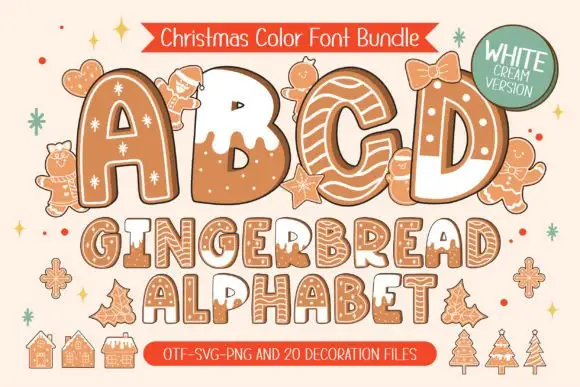
Brown biscuit-like capitals with white icing lines and dark offset edges
Gingerbread White Cream draws every capital as a biscuit: a warm ginger body, a piped icing outline, sugar dots and a white flood of icing over the top of some letters, with gingerbread men, trees and houses as extras.
Ideas for this font
Pine tree illustrated display
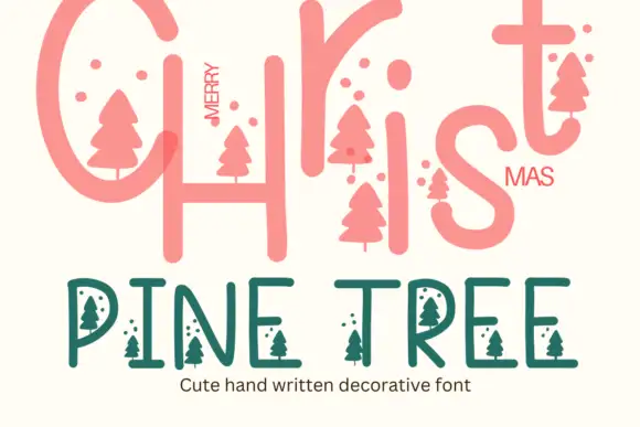
Pine Tree is a seasonal decorative face in coral and green on cream: a large rounded script-style Christmas line at the top, and a lighter capitals line beneath in which small pine-tree silhouettes hang from the letters and small dots float between them, with a caption under that.
Ideas for this font
Heavy blue-green capitals filled with pale Nordic-knit-like horizontal bands
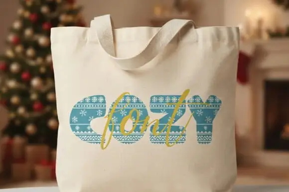
Cozy appears on a cream tote mockup as thick blue-green capitals containing horizontal decorative bands. White snowflakes, tiny repeated motifs and zigzags cross the strokes like a knitted winter pattern, and a gold script word overlaps the block title as a second, clearly different lettering layer.
Ideas for this font
Narrow winter lettering with long inward curls
Winter Wish shows a very large narrow W beside lighter rounded forms, where the s coils inward at its foot and the final h closes on a low curled extension rather than a straight stem.
Ideas for this font
Same independent foundry
Allow optional Google Analytics to measure visits and catalogue actions. Your search words and notes are not included. Privacy & storage