Neutral Sans Workhorse

Candy Crest + Memoir Slang
Lets Candy Crest own the focal silhouette while handling secondary copy, sizing and subheads cleanly.
Inspect Memoir Slang specimenDisclosure: MakerFileHub may earn a commission from qualifying purchases via paid links on this page. How our links work.
Fine Christmas capitals with curled terminals and outlined diamond accents
Candy Crest is a fine festive display in which the tall narrow capitals carry a strong thick-thin contrast, the terminals curl and small outlined diamonds sit inside selected stems and curves, so a greeting reads as decorated holiday lettering.
Paid link
Get this fontProject & layout blueprintsAt-a-glance maker compatibility
Sturdy stroke walls and open counters weed cleanly on adhesive vinyl, HTV apparel film, and cut cardstock.
Visual anatomy & craft review
The C curls both ends inward, the A carries a fine apex over heavy shoulders, the S turns through narrow joins and the diamonds appear as outlined shapes interrupting a stem rather than as separate ornaments. The internal diamonds are the character: they need their own space, which is why the sample sets a short title inside a rich scene of cookies and branches. Because the accents are small, the face wants 40 pt before the diamonds read as diamonds and not as print faults, and it cuts cleanly from three quarters of an inch of cap height. The cookie illustrations, the warm lights and the branches are presentation; the black festive title is the face.
Festive · Fine · Diamond accents
Two-font hierarchy recipes
Tested contrast partners — pairing Candy Crest with grounded secondary typography.
Candy Crest + Memoir Slang
Lets Candy Crest own the focal silhouette while handling secondary copy, sizing and subheads cleanly.
Inspect Memoir Slang specimen
Candy Crest + Orvelia
Grounds bold display lettering with classic typographic authority on posters, badges and apparel.
Inspect Orvelia specimenPractical applications
Concrete hierarchy, scale and production guidance tailored to Candy Crest’s stroke geometry.
The curled terminals set the season, and the fine contrast keeps a two-word greeting readable at 36 pt on an A6 card in one ink.
Hierarchy & layout recipe
Print an A6 card: set the greeting at 36 pt, keep the diamonds at 2 mm wide so they stay open, and keep 14 mm of clear ground beneath for a written note.
Pre-production check
Diamond accents printed under 1.5 mm fill in; check the card proof and keep the greeting at 34 pt or above.
The decorated capitals suit a tin label, and the narrow forms stay clear at 24 pt on a 60 mm round label printed in one flat ink.
Hierarchy & layout recipe
Print a 60 mm round label: set the word at 24 pt, keep 6 mm inside the die so the curls stay whole, and set the weight in a 6 pt caps along the lower curve.
Pre-production check
A curl printed across the round edge distorts; check the wrap and keep the ornament on the flat centre.
The narrow capitals fit a wrap, and the fine contrast holds the greeting at 26 pt around a printed panel in one dark colour.
Hierarchy & layout recipe
Print a 200 by 70 mm wrap: set the greeting at 26 pt, keep 10 mm of clear wrap at each end, and keep the small diamonds clear of the handle seam on both sides.
Pre-production check
A wrap crossing the handle loses part of a letter; check the template and centre the line on the visible band.
Technical & licence verification
Confirm included OTF/TTF/WOFF formats, full glyph tables and licence coverage on the live store page before batch production.
Closest visual alternatives
Matched across letterform anatomy, stroke behaviour and craft applications.
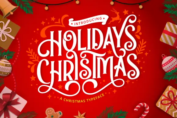
Condensed festive capitals with curled terminals and looping under-extensions
Holidays Christmas is a condensed festive display in which the capitals stay tall and narrow, the terminals curl, the strokes carry high contrast and long lower loops overlap neighbouring letters, so a greeting reads as ribbon lettering.
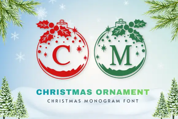
Serif initials inside round hanging ornaments with holly, stars and dotted upper detail
Christmas Ornament draws a monogram initial inside the outline of a hanging bauble, adds a cap, a sprig of holly and a scatter of stars, and lets the filled lower half of the bauble carry the shadow.
Ideas for this font
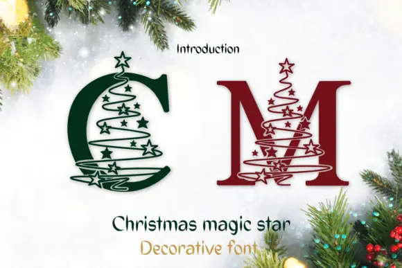
Serif C and M crossed by star-studded spiral tree outlines
Christmas Magic Star draws a serif monogram initial and winds a spiral of small stars around it, so the letter looks like a tree decorated with a garland and a star on top.
Ideas for this font
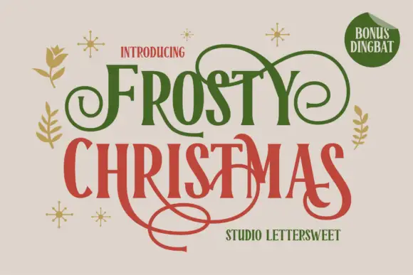
Narrow festive serifs with large looping swashes
Frosty Christmas shows tall contrast-rich letters with sharp flared ends and expansive curls in green and red on cream, where thin extensions loop above the upper row and one long swash sweeps far beneath the lower title while small botanical marks and sparkles sit around the block.
Ideas for this font
Same independent foundry
Allow optional Google Analytics to measure visits and catalogue actions. Your search words and notes are not included. Privacy & storage