Neutral Sans Workhorse

Astral Night + Monure
Lets Astral Night own the focal silhouette while handling secondary copy, sizing and subheads cleanly.
Inspect Monure specimenDisclosure: MakerFileHub may earn a commission from qualifying purchases via paid links on this page. How our links work.
Open high-contrast capitals with curled tips and angular interruptions
Astral Night is a blackletter display face drawn with rounded joins and softened corners: the broken strokes are there, but the angles are sanded down, so the word looks hand-brushed rather than cut.
Paid link
Get this fontProject & layout blueprintsAt-a-glance maker compatibility
Sturdy stroke walls and open counters weed cleanly on adhesive vinyl, HTV apparel film, and cut cardstock.
Visual anatomy & craft review
ASTRAL over NIGHT fills the card in white over a dim interior with tiles and pipes, and the letters are wide with heavy stems that curve into the arches rather than meeting them at a point, and the diamond feet are rounded off into small wedges. The counters are generous, so the word reads at a distance, and the spacing is loose enough that the two rows sit as separate lines. A small caption above names the studio and a panel below states the style. The face belongs to the softer end of the blackletter range — it keeps the silhouette but loses the aggression — which makes it usable for titles about night, myth and mystery where a metal blackletter would be too hard.
Open high-contrast capitals with curled tips and angular interruptions
Two-font hierarchy recipes
Tested contrast partners — pairing Astral Night with grounded secondary typography.
Astral Night + Monure
Lets Astral Night own the focal silhouette while handling secondary copy, sizing and subheads cleanly.
Inspect Monure specimen
Astral Night + Vanielst Elegant Serif Display Stylistic
Grounds bold display lettering with classic typographic authority on posters, badges and apparel.
Inspect Vanielst Elegant Serif Display Stylistic specimenPractical applications
Concrete hierarchy, scale and production guidance tailored to Astral Night’s stroke geometry.
The face sets a nocturnal mood without the aggression of a metal blackletter, which suits an event that families also attend, and the open counters read on a dim street.
Hierarchy & layout recipe
Print a 500 by 700 mm sign: set the tour name at 110 pt across two rows, keep 30 mm of clear ground between the rows, and hold 24 mm of border so the rounded feet are not trimmed.
Pre-production check
Pale white on a dark board washes out under streetlight; print one sign and check it at night before the set.
The rounded gothic holds a long title at jacket size and reads as atmospheric rather than as horror, which is the line a photography book has to walk.
Hierarchy & layout recipe
Print a 240 by 280 mm cover: set the title at 64 pt across two rows, keep 26 mm of clear ground beneath before the photographer credit at 11 pt, and hold 18 mm from the widest letter to the trim.
Pre-production check
White type over a photograph needs a base; print one cover and check the counters against the image before the run.
The lettering stays legible on a small label under festoon lighting, and the soft joins print cleanly at a size where a sharp blackletter would clog.
Hierarchy & layout recipe
Print a 55 by 45 mm cup label: set the stall name at 14 pt on one row, keep 5 mm of clear ground beneath before the drink at 4.5 pt, and hold 4 mm from the letter edge to the die line.
Pre-production check
Small sizes soften the joins further; print one label at the real size and check the A and the N together.
Technical & licence verification
Confirm included OTF/TTF/WOFF formats, full glyph tables and licence coverage on the live store page before batch production.
Closest visual alternatives
Matched across letterform anatomy, stroke behaviour and craft applications.
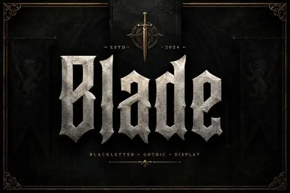
Broad faceted blackletter with deep angular counters
Blade is a heavy blackletter display face whose strokes look carved from granite: thick stems, chiselled counters, weathered edges and a fill that reads as stone rather than ink.
Ideas for this font
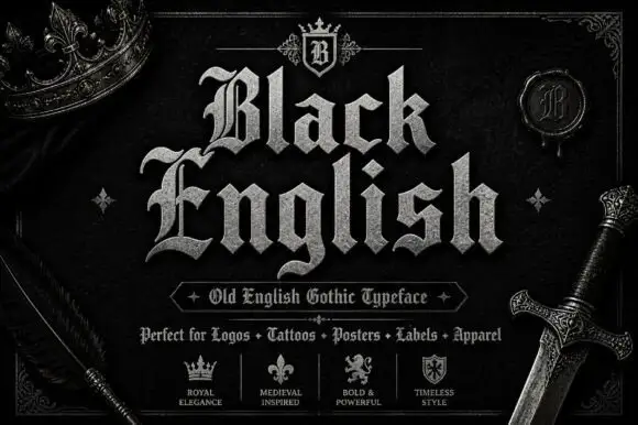
Angular blackletter with diamond-ended strokes and ornate initials
Black English shows pale Gothic mixed case on black, where angular broken bowls, pointed joins and diamond stroke endings give the lowercase a dense rhythm, the large B and E carry extra entry flourishes and a grey hatched treatment adds surface detail to the shown title.
Ideas for this font
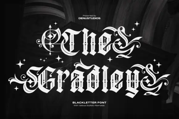
Ornate blackletter with hairline inner strokes and long curling swashes
The Gradley is an ornate blackletter display face: heavy letters with a fine inline running through the stems, long swashes on several capitals, and stars scattered between the words.
Ideas for this font
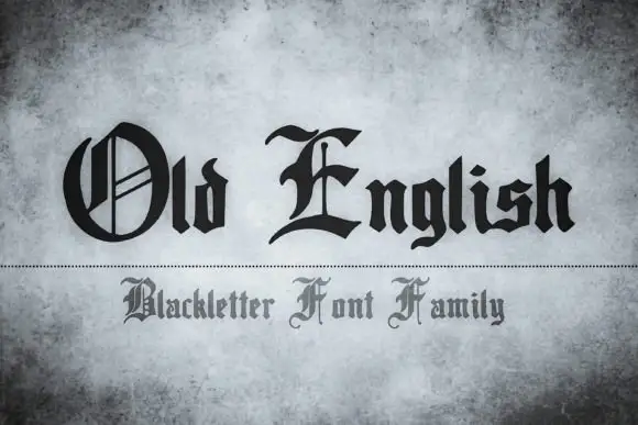
Blackletter family display
Old English is a blackletter family shown in black on a mottled grey ground: two lines in two treatments, the first with a decorated round O and a sweeping E over a compact angular lowercase, the second in a smaller and lighter cut below a dotted rule.
Ideas for this font
Same independent foundry
Allow optional Google Analytics to measure visits and catalogue actions. Your search words and notes are not included. Privacy & storage