Neutral Sans Workhorse

Hello Thick + Montreal
Lets Hello Thick own the focal silhouette while handling secondary copy, sizing and subheads cleanly.
Inspect Montreal specimenDisclosure: MakerFileHub may earn a commission from qualifying purchases via paid links on this page. How our links work.
Tall heavy condensed capitals with a fine offset shadow
Hello Thick is a tall condensed capital alphabet in which the stems are fat, the width is narrow and a fine shadow sits behind each letter, so a word reads as a printed block with depth.
Paid link
Get this fontProject & layout blueprintsAt-a-glance maker compatibility
Sturdy stroke walls and open counters weed cleanly on adhesive vinyl, HTV apparel film, and cut cardstock.
Visual anatomy & craft review
The H keeps two heavy stems and a low bar, the E carries three arms of equal length, the L keeps one arm and a full foot and the K splays from a single junction, all at a heavy even weight with squared corners and a tight fit. The condensed width is what makes the face practical: nine letters run across a modest panel at 50 mm cap height, which is why the sample uses it for a two-line lockup on a photograph. The shadow is a treatment rather than a drawn outline, so the underlying letters stay solid and legible when it is removed. Counters stay open at 30 mm and close below 14 pt. The pale photograph, the black ink, the card and the desk objects are presentation; the typeface is the two words.
Tall · Condensed · Heavy
Two-font hierarchy recipes
Tested contrast partners — pairing Hello Thick with grounded secondary typography.
Hello Thick + Montreal
Lets Hello Thick own the focal silhouette while handling secondary copy, sizing and subheads cleanly.
Inspect Montreal specimen
Hello Thick + Svara
Grounds bold display lettering with classic typographic authority on posters, badges and apparel.
Inspect Svara specimenPractical applications
Concrete hierarchy, scale and production guidance tailored to Hello Thick’s stroke geometry.
The condensed weight fits a long workshop name across a narrow plate, and the tall caps read down a corridor at 30 mm where a wider face would wrap.
Hierarchy & layout recipe
Print a 400 by 120 mm plate: set the workshop name at 30 mm on one line, set the opening hours in an 8 mm sans beneath, and keep 25 mm of border so the fixing screws miss the letters and the shadow.
Pre-production check
A shadow printed under a fixing hole looks like a smudge; check the layout against the screw positions and drop the shadow on the plate version.
The heavy condensed capitals read at 45 mm on a working apron, and the narrow width keeps a two-word kitchen name on the chest panel without wrapping.
Hierarchy & layout recipe
Screen a 250 by 200 mm apron panel: set the name at 45 mm in two lines with 10 mm leading, keep the ink off the shadow so the print stays one colour, and stay 60 mm below the neck seam so the panel does not distort in wear.
Pre-production check
Two tight lines on a coarse canvas can merge; check a pull on the actual apron and open the leading by 3 mm rather than reducing the weight.
The condensed blocks read on a small label at 11 pt, and the narrow fit lets a model code sit beside the brand on the same line.
Hierarchy & layout recipe
Print a 60 by 30 mm label: set the brand at 11 pt, set the model in a 5 pt caps sans to the right, and keep 4 mm of margin so the squared corners are not clipped by the die.
Pre-production check
A condensed block under 10 pt closes its counters; check the printed label and set the model code in the sans rather than squeezing the block.
Technical & licence verification
Confirm included OTF/TTF/WOFF formats, full glyph tables and licence coverage on the live store page before batch production.
Closest visual alternatives
Matched across letterform anatomy, stroke behaviour and craft applications.
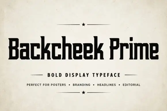
Compact squared lettering with slab-like feet and tiny clipped corners
Backcheek Prime shows heavy black mixed case on a pale paper-like cover, where the B and P have narrow rectangular counters, the c and e use squared openings, the k branches into a blunt diagonal and small clipped corners break an otherwise blocky silhouette.
Ideas for this font
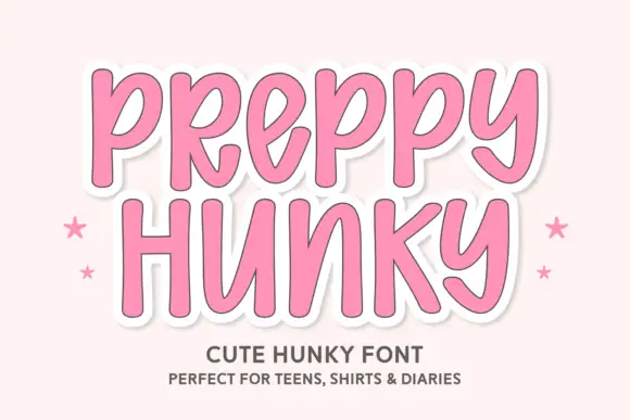
Tall rounded casual letters on a sticker ground
Preppy Hunky is a tall rounded display face in pink on a pale pink ground: fat rounded capitals with a heavy white sticker outline and a soft shadow, set over two lines with small stars at either side.
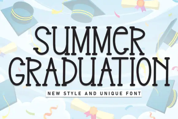
Tall quirky graduation display
Summer Graduation is a tall quirky display in near-black on a pale blue illustration: narrow letters with small flares at the stems, an open R, a curled G and a slightly irregular rhythm, set in two lines with a tracked caption beneath, so the pair reads as a graduation card rather than a formal diploma face.
Ideas for this font
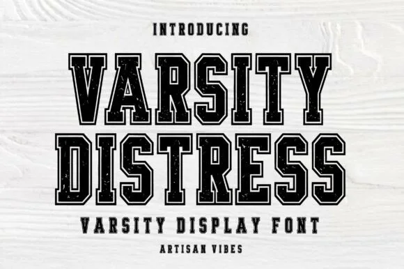
Varsity blocks with a double outline and wear
Varsity Distress is a varsity display face in black on white wood: heavy slab capitals described by a double outline, with the interior filled by a speckled, worn texture that reads as a screen printed block.
Ideas for this font
Same independent foundry
Allow optional Google Analytics to measure visits and catalogue actions. Your search words and notes are not included. Privacy & storage