Neutral Sans Workhorse

Summer Graduation + Cenura
Lets Summer Graduation own the focal silhouette while handling secondary copy, sizing and subheads cleanly.
Inspect Cenura specimenDisclosure: MakerFileHub may earn a commission from qualifying purchases via paid links on this page. How our links work.
Tall quirky graduation display
Summer Graduation is a tall quirky display in near-black on a pale blue illustration: narrow letters with small flares at the stems, an open R, a curled G and a slightly irregular rhythm, set in two lines with a tracked caption beneath, so the pair reads as a graduation card rather than a formal diploma face.
Paid link
Get this fontProject & layout blueprintsAt-a-glance maker compatibility
Sturdy stroke walls and open counters weed cleanly on adhesive vinyl, HTV apparel film, and cut cardstock.
Visual anatomy & craft review
The two words are stacked and the drawing is a tall display with small drawn features: the stems flare slightly at the foot, the R's leg opens, and the G carries a hook, which keeps the face from looking like a plain condensed sans. The rhythm is slightly irregular, so the pair reads as hand-set rather than mechanically spaced, and the narrow width lets a long word fit the plate without a second line. The counters are open, which is what keeps a tall face readable at banner size. The ground is a pale illustration of caps, ribbons and clouds, and the caption beneath sits on a white bar so it stays legible against the drawing, which is the right way to place small type over a picture.
Tall, quirky, graduation, friendly
Two-font hierarchy recipes
Tested contrast partners — pairing Summer Graduation with grounded secondary typography.
Summer Graduation + Cenura
Lets Summer Graduation own the focal silhouette while handling secondary copy, sizing and subheads cleanly.
Inspect Cenura specimen
Summer Graduation + The Avenue Editorial
Grounds bold display lettering with classic typographic authority on posters, badges and apparel.
Inspect The Avenue Editorial specimenPractical applications
Concrete hierarchy, scale and production guidance tailored to Summer Graduation’s stroke geometry.
A tall quirky display reads as a celebration rather than a certificate, and the narrow letters fit a long school name above the details on a small card.
Hierarchy & layout recipe
A6 card: the name at 26 pt, the class year at 34 pt, and the venue in a 9 pt sans. Keep 12 mm margins and print two colours on a white card so the flares stay visible at card size.
Pre-production check
Check the 26 pt name, where a flare can look like a printing artefact; keep the size above 22 pt. Confirm the 9 pt venue reads at arm's length and that the year clears the illustration by 8 mm.
A friendly display suits a graduation party better than a formal serif, and the narrow letters let the class year run large across a banner.
Hierarchy & layout recipe
Print 900 by 400 mm: the year at 150 mm cap height, the name in a 60 mm sans, and a 6 mm rule. Keep 30 mm margins and print two colours on a light ground so the drawing behind stays visible.
Pre-production check
Check the banner at five metres, where the flares can read as damage; keep them above 6 mm. Confirm the 60 mm name reads at three metres and that the rule does not crowd the descenders.
A tall display gives a leavers book a cover that feels celebratory rather than official, and the illustrated ground supplies the scene without a photograph of students.
Hierarchy & layout recipe
Set the title at 80 mm cap height across 210 mm, the year at 110 mm, and the class line in a 9 pt sans. Keep the title in the upper half and let the illustration run to the trim beneath it.
Pre-production check
Check the title at thumbnail size, where a thin flare can vanish; keep the ink dark. Confirm the 9 pt class line reads in a shop and that the year prints cleanly on the spine.
Technical & licence verification
Confirm included OTF/TTF/WOFF formats, full glyph tables and licence coverage on the live store page before batch production.
Closest visual alternatives
Matched across letterform anatomy, stroke behaviour and craft applications.
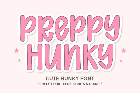
Tall rounded casual letters on a sticker ground
Preppy Hunky is a tall rounded display face in pink on a pale pink ground: fat rounded capitals with a heavy white sticker outline and a soft shadow, set over two lines with small stars at either side.
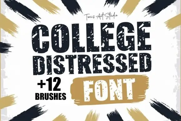
Distressed varsity block capitals with a speckled, chipped edge
College Distressed is a varsity block capital alphabet in which the slabs stay thick and the contour chips into speckles, so a team name reads as a stencil sprayed on a locker room wall.
Ideas for this font
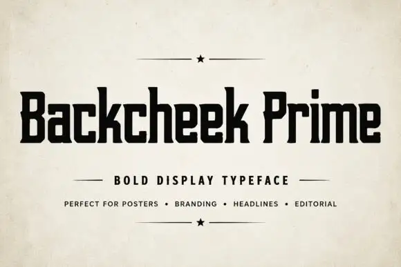
Compact squared lettering with slab-like feet and tiny clipped corners
Backcheek Prime shows heavy black mixed case on a pale paper-like cover, where the B and P have narrow rectangular counters, the c and e use squared openings, the k branches into a blunt diagonal and small clipped corners break an otherwise blocky silhouette.
Ideas for this font
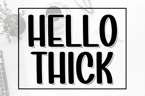
Tall heavy condensed capitals with a fine offset shadow
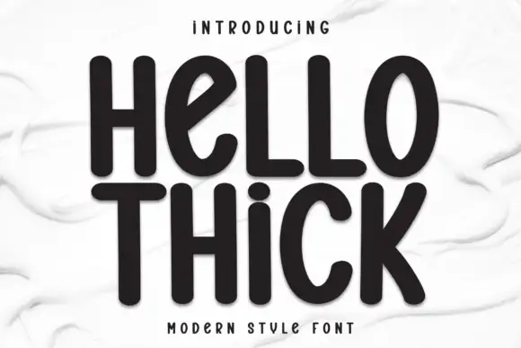
Hello Thick is a tall condensed capital alphabet in which the stems are fat, the width is narrow and a fine shadow sits behind each letter, so a word reads as a printed block with depth.
Ideas for this font
Same independent foundry
Allow optional Google Analytics to measure visits and catalogue actions. Your search words and notes are not included. Privacy & storage