Editorial Serif Anchor

Modern Farmhouse + Lumera Editorial
Anchors Modern Farmhouse's fluid strokes with crisp Roman proportions on wedding suites, headers and packaging.
Inspect Lumera Editorial specimenDisclosure: MakerFileHub may earn a commission from qualifying purchases via paid links on this page. How our links work.
Monoline brush script with bouncy baseline
Modern Farmhouse is a monoline brush script in coral on a watercolour wash: rounded strokes of even weight, tall looping ascenders on the M and the F, and a bouncing baseline that lifts and falls through both words.
Paid link
Get this fontProject & layout blueprintsAt-a-glance maker compatibility
Weld or Unite overlapping script joins into one continuous vector path before sending to the blade.
Visual anatomy & craft review
The two words are stacked and each rides its own slight wave, which is the defining feature of the drawing: the m and the o of the first word sit low, the d climbs, and the F of the second word starts below the baseline before rising, so the pair reads as a hand-lettered sign rather than a typed line. Stroke weight is constant and the ends are rounded, which makes the script friendly rather than formal, and the joins stay open enough that the word parses at a glance. The ascender loops are tall and narrow, the descender of the h is a simple straight tail, and there are no flourishes beyond the loops, so the face relies on rhythm instead of ornament. The ground is a watercolour paper texture with painted foliage at the corners, and the descriptor at the foot is spaced capitals in the same coral, which is exactly how a home-decor print is built.
Script, brushy, friendly, homey
Two-font hierarchy recipes
Tested contrast partners — pairing Modern Farmhouse with grounded secondary typography.
Modern Farmhouse + Lumera Editorial
Anchors Modern Farmhouse's fluid strokes with crisp Roman proportions on wedding suites, headers and packaging.
Inspect Lumera Editorial specimen
Modern Farmhouse + Bargain Condensed
Keeps small-scale dates, URLs, nutrition facts and care instructions crisp and legible below script titles.
Inspect Bargain Condensed specimenPractical applications
Concrete hierarchy, scale and production guidance tailored to Modern Farmhouse’s stroke geometry.
A bouncy brush script matches the hand-painted signage a barn venue already has, and the even stroke prints cleanly on a plywood or acrylic sign where a thin calligraphy would drop out.
Hierarchy & layout recipe
Cut a 600 by 400 mm acrylic sheet: the two words at 90 mm cap height, the names in a 30 mm serif beneath, and the date at 20 mm. Keep 40 mm between the script's lowest bounce and the serif line so the descenders never cross.
Pre-production check
Check the vinyl cut at full size: the loops of the M and the F must stay at least 4 mm wide after weeding, and the bounce must not push the second word into the frame edge. Confirm the 20 mm date reads from four metres.
A bouncy monoline script reads as a hand-painted sign at a glance, which is the tone a kitchen print needs without the formality of a calligraphic script.
Hierarchy & layout recipe
A3 print on textured paper: the two words at 70 mm cap height, the sub-line in an 11 pt serif beneath, and a 3 mm watercolour border at the edge. Keep the whole print to one ink so the bounce carries the design rather than the colour.
Pre-production check
Check the ascender loops at 70 mm, where a loop under 2 mm can break on a home printer; thicken the stroke for the print file if it does. Confirm the 11 pt sub-line sits outside the bounce and that the border clears the trim by 3 mm.
A bouncy script gives a small home-fragrance brand a hand-made tone that a clean serif cannot, and the monoline stroke stays legible on a small jar label.
Hierarchy & layout recipe
Print a 55 mm round label: the brand at 14 pt stacked on two lines, the scent in 7 pt sans caps beneath, and the weight in 6 pt at the base. Keep 4 mm of clear label inside the die so the bounce never reaches the edge.
Pre-production check
Check the two stacked lines at 14 pt, where the bounce can make the gap uneven and the second line look detached; adjust the leading per line rather than the tracking. Confirm the 6 pt weight stays legible on the curved glass and that the coral holds contrast on a cream label.
Technical & licence verification
Confirm included OTF/TTF/WOFF formats, full glyph tables and licence coverage on the live store page before batch production.
Closest visual alternatives
Matched across letterform anatomy, stroke behaviour and craft applications.
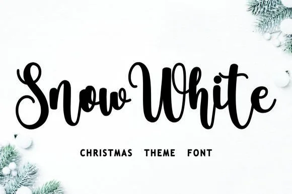
Bouncy Christmas script
Snow White is a Christmas script in black on a snowy white ground: a connected monoline hand with a pronounced bounce, tall loops on the S and the h, and a w in the first word that lifts above the cap line, framed by fir branches and baubles.
Ideas for this font
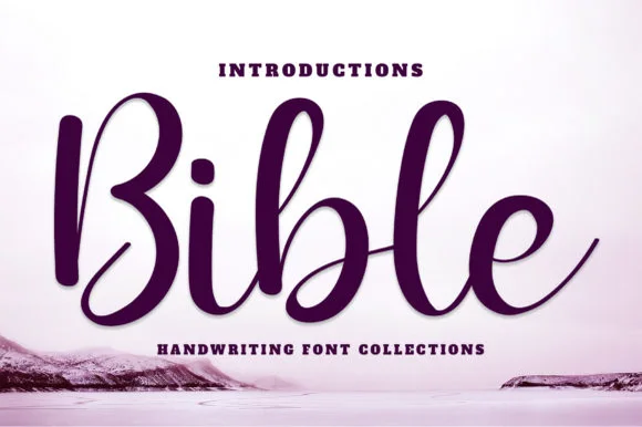
Deeply shaded upright brush-pen calligraphy script
Bible (by YanStudio) is a smooth, deeply shaded upright brush script with tall oval loops and clean, balanced baseline rhythm.
Ideas for this font
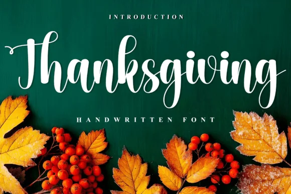
Handwritten calligraphic script with long descender
Thanksgiving is a handwritten calligraphic script in white on deep green: thick-thin strokes, tall looping ascenders, a wide entry on the T and a descender on the g that curls far below the word, with autumn leaves and berries along the foot.
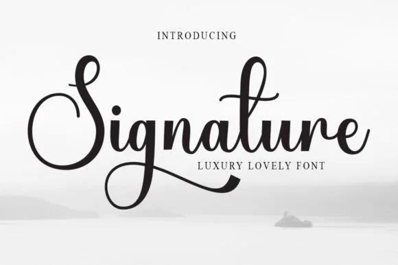
Luxury signature script with high contrast
Signature is a luxury script in black on a pale misty scene: high contrast between thick downstrokes and hairline joins, a capital S drawn as a large closed loop, and a descender on the g that sweeps back under the word in a long taper.
Same independent foundry
Allow optional Google Analytics to measure visits and catalogue actions. Your search words and notes are not included. Privacy & storage