Editorial Serif Anchor

Bad Faith + Worldstar
Anchors Bad Faith's fluid strokes with crisp Roman proportions on wedding suites, headers and packaging.
Inspect Worldstar specimenDisclosure: MakerFileHub may earn a commission from qualifying purchases via paid links on this page. How our links work.
Raw scratched thriller & punk-diary etched print (NOT cursive!)
Bad Faith is a raw, double-scratched hand-etched print font (disconnected, NOT a smooth script!) channeling thriller notes, 90s grunge zines, and indie horror!
Paid link
Get this fontProject & layout blueprintsAt-a-glance maker compatibility
Weld or Unite overlapping script joins into one continuous vector path before sending to the blade.
Visual anatomy & craft review
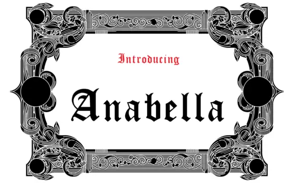
A raw scratched print shown in slate blue under a red introduction band: jittery black pen strokes sketch an uneasy, multi-pass scrawl with double-drawn interiors and disconnected joins, so the word reads as something written in a notebook under pressure rather than as a script. The strokes are deliberately uneven in weight and angle, which is where the tension comes from, and the letters stay separate, so no welding is needed. The slate frame and the red band are staging. The face is a printed scribble, not a calligraphic hand, and the plate is honest about that difference.
Scratched-note · Punk-thriller · Raw-hand-etched
Two-font hierarchy recipes
Tested contrast partners — pairing Bad Faith with grounded secondary typography.
Bad Faith + Worldstar
Anchors Bad Faith's fluid strokes with crisp Roman proportions on wedding suites, headers and packaging.
Inspect Worldstar specimen
Bad Faith + Nyxar
Keeps small-scale dates, URLs, nutrition facts and care instructions crisp and legible below script titles.
Inspect Nyxar specimenPractical applications
Concrete hierarchy, scale and production guidance tailored to Bad Faith’s stroke geometry.
The scratched multi-pass strokes capture the notebook rawness of an alt-rock record or an indie-horror title without the filtered look a texture preset gives, and the separate letters keep the title readable where a connected script would smear at small sizes.
Hierarchy & layout recipe
Set two mixed-case words at 64 to 130 pt in stark black over muted slate, manila or a Polaroid border, keep 20 mm margins, and leave 15 mm at the foot for the band name and the catalogue number.
Pre-production check
The double-scratched interior lines are for covers, zine print and DTF tees only; do not weed them in small vinyl. Proof one cover at final size to confirm the scribble stays a word and not a smudge.
A hand-scrawled line sells urgency on a printed clue card, where a tidy serif would look like the answer key, and the uneven baseline gives each note its own voice without needing a different face per character.
Hierarchy & layout recipe
A6 clue card: the note at 22 pt, the clue number in a 10 pt sans, and one ink on a manila card. Keep 15 mm margins and set a bold red geometric sans stamp header above the note.
Pre-production check
Verify the register at arm's length, since the face is a scratched print and not calligraphy; a reader should never mistake it for a wedding script. Confirm the note still reads when the card is photocopied.
A scrawled note is the cheapest way to make a themed party feel staged, and this face gives the prop the look of a message written in a hurry, which is exactly what a scavenger hunt or an escape-room invitation needs.
Hierarchy & layout recipe
Print an A5 prop sheet: the message at 20 pt on a 70 mm measure, a 9 pt date at the foot, and one ink on a cream sheet. Keep 18 mm margins and leave the corner clear for a drawn pin hole.
Pre-production check
Check the 20 pt message in hand, where a disconnected join can read as a typo; keep the wording short. Confirm the sheet takes a fold without cracking the print at the crease.
Technical & licence verification
Confirm included OTF/TTF/WOFF formats, full glyph tables and licence coverage on the live store page before batch production.
Closest visual alternatives
Matched across letterform anatomy, stroke behaviour and craft applications.
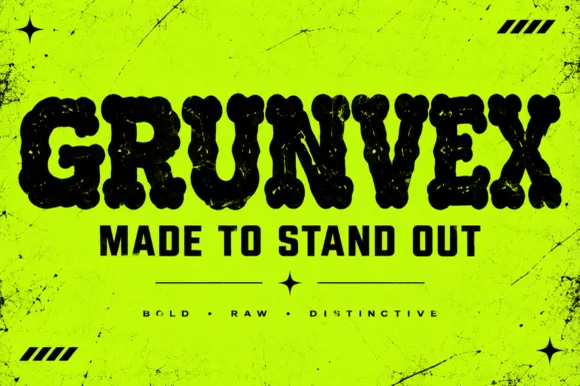
Rounded puffy street-grunge block display (OTF)
Grunvex is an ultra-heavy, puffy street-block display font combining rounded graffiti-slab silhouettes with subtle worn-ink texture.
Ideas for this font
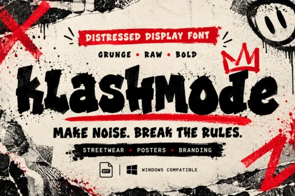
Chaotic punk-street & ransom-tilted grunge display (OTF)
Klashmode is a raw, rebellious street-grunge display font mixing chunky tilted uppercase and lowercase blocks with rough ink-stamp edges.
Ideas for this font
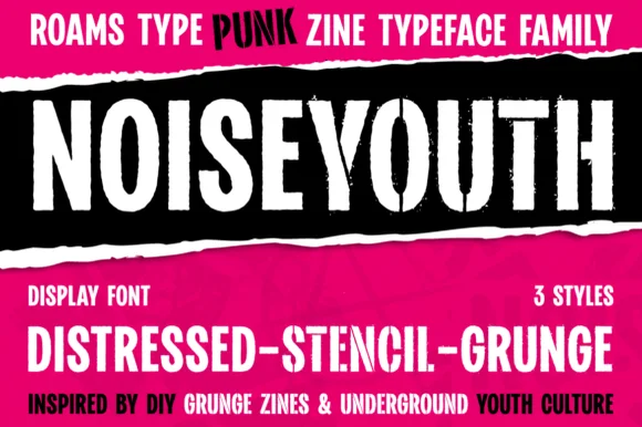
Punk zine display in three distressed styles
Noise Youth is a punk zine typeface family in white and black on magenta: tall condensed capitals shown in distressed, stencil and grunge styles, with ink bands and a caption line about DIY zines.
Ideas for this font
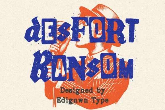
Gritty stamp-distressed mixed-typeface ransom-note font
Desfort Ransom is a rugged, ink-stamped ransom-note typeface mixing serif, sans, and reverse-tile characters with weathered woodblock grit!
Ideas for this font
Same independent foundry
Allow optional Google Analytics to measure visits and catalogue actions. Your search words and notes are not included. Privacy & storage