Neutral Sans Workhorse

Anabella + Headline
Lets Anabella own the focal silhouette while handling secondary copy, sizing and subheads cleanly.
Inspect Headline specimenDisclosure: MakerFileHub may earn a commission from qualifying purchases via paid links on this page. How our links work.
Open blackletter with a looped A and sharp narrow ascenders
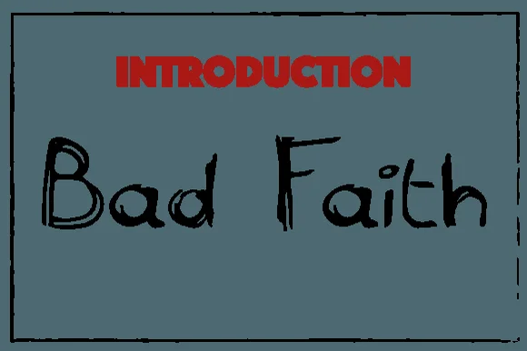
Anabella sits in black within an elaborate black-and-white frame, where the A carries a rounded upper loop and a sweeping diagonal inner stroke, the lowercase alternates between sharp narrow ascenders and open interiors, and the ornament sits in the frame rather than in the word.
Paid link
Get this fontProject & layout blueprintsAt-a-glance maker compatibility
Sturdy stroke walls and open counters weed cleanly on adhesive vinyl, HTV apparel film, and cut cardstock.
Visual anatomy & craft review
The forms stay blackletter, the interiors open wider than a dense hand, one capital loops and the ascenders cut sharp. That openness is the character: the word stays readable at small sizes where denser gothic faces close up, which is why the sample keeps a short title inside a heavy frame. Most of the ornament belongs to the border, so keep 34 pt, check the lowercase alternates and do not add more decoration around the word. The sharp ascenders are the fragile strokes: they break at about 26 pt and the looped A closes into a blob, so keep 34 pt and leave the word alone rather than adding ornament around it.
Open blackletter with a looped A and sharp narrow ascenders
Two-font hierarchy recipes
Tested contrast partners — pairing Anabella with grounded secondary typography.
Anabella + Headline
Lets Anabella own the focal silhouette while handling secondary copy, sizing and subheads cleanly.
Inspect Headline specimen
Anabella + Evoire
Grounds bold display lettering with classic typographic authority on posters, badges and apparel.
Inspect Evoire specimenPractical applications
Concrete hierarchy, scale and production guidance tailored to Anabella’s stroke geometry.
The open blackletter sets a jacket title, and the looped A carries the period detail at 52 pt on a paperback, where the wide interiors stay readable.
Hierarchy & layout recipe
Print a 129 by 198 mm paperback jacket: set the title at 52 pt on one row, keep 24 mm of clear ground beneath before the author line at 11 pt, and keep the border ornament outside the type block.
Pre-production check
Dense ornament around an open face competes; check the cover and keep the frame plain behind the title.
The blackletter gives a bag heritage, and the open interiors hold a two-word name at 22 pt on a 65 by 95 mm bag, where the sharp ascenders stay clear on kraft.
Hierarchy & layout recipe
Print a 65 by 95 mm kraft bag label: set the name at 22 pt on one row, keep 11 mm of clear ground beneath before the weight at 7 pt, and keep one flat ink so the interiors stay open.
Pre-production check
Open counters close at 16 pt; check the plate proof, hold the name at 20 pt or above and proof on the real kraft.
The period face sets a moody sign, and the narrow ascenders hold a two-word title at 50 mm on a painted board, where the looped A reads from a doorway.
Hierarchy & layout recipe
Paint a 600 by 300 mm board: set the title at 50 mm on one row, keep 22 mm of clear ground beneath before the times at 14 pt, and keep 24 mm of border so the loops are not cut.
Pre-production check
The loop fills when painted small; check the mask artwork and keep the sign at 44 mm or above.
Technical & licence verification
Confirm included OTF/TTF/WOFF formats, full glyph tables and licence coverage on the live store page before batch production.
Closest visual alternatives
Matched across letterform anatomy, stroke behaviour and craft applications.
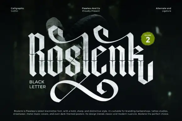
Tall calligraphic blackletter with fine waist lines and extended loops
Roslenk Volume 2 is a blackletter drawn without a single curve: every stroke is a straight cut, the joins are mitred, the spurs end in diamonds, and the last letter throws a long angular swash under the word.
Ideas for this font
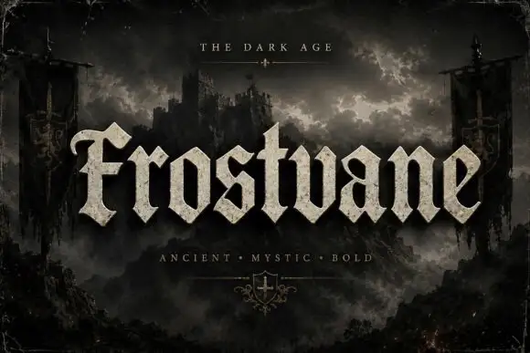
Chunky faceted blackletter with a curled F and triangular feet
Frostvane is a bold blackletter display face with wide letters, diamond-shaped spurs and a surface that looks pressed into old parchment rather than printed on it.
Ideas for this font
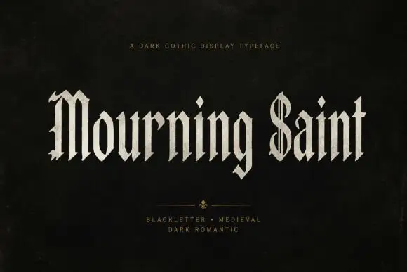
Slender blackletter display
Mourning Saint is a slender blackletter in bone on black: mixed case with a split M, a parallel-lined S, narrow bodies, sharp spurs and a tall x-height, set in two words across the sheet with a small tracked line above and two tracked lines beneath a drawn divider.
Ideas for this font
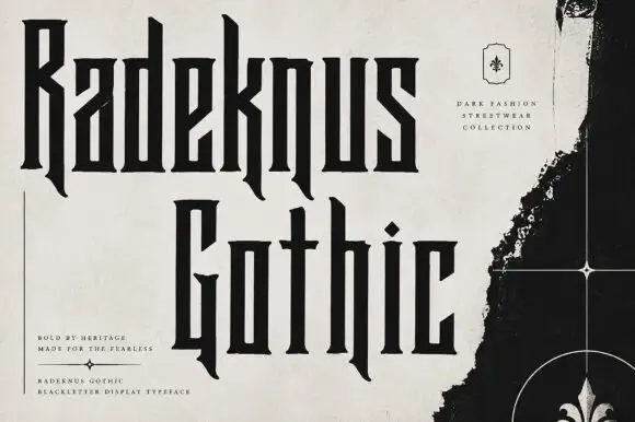
Condensed rectilinear blackletter
Radeknus Gothic is a condensed blackletter in near-black on a pale washed sheet: capitals and lowercase with rectilinear stems, hooked descending legs, sharp spurs and very narrow proportions, set in two lines beside a black fleur-de-lis panel and several small tracked lines.
Ideas for this font
Same independent foundry
Allow optional Google Analytics to measure visits and catalogue actions. Your search words and notes are not included. Privacy & storage