Editorial Serif Anchor

Quilla Aksara + Things
Anchors Quilla Aksara's fluid strokes with crisp Roman proportions on wedding suites, headers and packaging.
Inspect Things specimenDisclosure: MakerFileHub may earn a commission from qualifying purchases via paid links on this page. How our links work.
Handwritten cursive signature script
Quilla Aksara is a handwritten cursive script in coral on a scrapbook layout: a thin connected stroke with long diagonal entries, tall looping capitals, and a baseline that rises across the phrase, so the two words read as a signature written across a postcard.
Paid link
Get this fontProject & layout blueprintsAt-a-glance maker compatibility
Cut solid base, outline, and shadow layers in separate vinyl colors and align on registration marks.
Visual anatomy & craft review
The two lines are set at an angle on a paper layout, and the drawing is a fine cursive: the strokes are thin and even, the capitals Q and A open with long diagonals that cross the following letters, and the joins are continuous, so the phrase reads as one movement. The lowercase is narrow and light, which keeps the line airy, and the ending lifts into a small flick rather than a flourish. Because the stroke is fine, the face reads best above about 22 pt, and the sample uses it at display size across a photograph and a small block of descriptive text, which is how a stationery brand would show it. The palette is a single coral ink on a muted paper ground, and the layout imitates a scrapbook page with tape and a stamp.
Handwritten, cursive, thin, personal
Two-font hierarchy recipes
Tested contrast partners — pairing Quilla Aksara with grounded secondary typography.
Quilla Aksara + Things
Anchors Quilla Aksara's fluid strokes with crisp Roman proportions on wedding suites, headers and packaging.
Inspect Things specimen
Quilla Aksara + Cultivo
Keeps small-scale dates, URLs, nutrition facts and care instructions crisp and legible below script titles.
Inspect Cultivo specimenPractical applications
Concrete hierarchy, scale and production guidance tailored to Quilla Aksara’s stroke geometry.
A fine cursive signs a modern invitation without the heaviness of a formal calligraphy, and the long diagonal entries give the names movement on a plain card.
Hierarchy & layout recipe
A5 portrait: the names at 26 pt, the details in a 9 pt sans beneath, and the date at 8 pt caps. Keep 20 mm margins and print one ink on a warm white stock so the fine stroke stays crisp.
Pre-production check
Check the names at 26 pt on the card stock, where a stroke under 0.2 pt breaks; thicken slightly for uncoated paper. Confirm the 9 pt details keep a 4.5:1 contrast and that the entry strokes clear the margin by 12 mm.
A cursive signature makes a stationery studio's mark feel written, and the thin stroke reproduces well in one ink on paper products where heavier scripts look clumsy.
Hierarchy & layout recipe
Set the mark at 30 pt on the card, 14 pt on the notebook cover and 70 mm wide for a stamp. Keep the mark one colour and build a simplified version without the entry diagonals for the stamp.
Pre-production check
Check the 14 pt notebook cover, where the long entries can crowd the edge; trim them for small sizes. Confirm the stamp at 70 mm holds the thin stroke and that the mark reads on a dark cover reversed.
A cursive line gives a travel essay a handwritten voice, and the fine stroke sits quietly over a photograph without needing a plate.
Hierarchy & layout recipe
Set the quote at 32 pt over a photograph darkened by 25 percent, the attribution in an 8 pt sans caps beneath, and no rule. Keep the quote to two lines and place it on the darkest area of the image.
Pre-production check
Check the quote over the photograph, where a fine stroke disappears first on bright areas; move the type or darken the image. Confirm the 8 pt attribution keeps a 4.5:1 contrast and that the quote does not overlap a face.
Technical & licence verification
Confirm included OTF/TTF/WOFF formats, full glyph tables and licence coverage on the live store page before batch production.
Closest visual alternatives
Matched across letterform anatomy, stroke behaviour and craft applications.
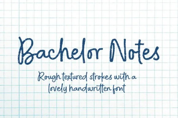
Rough felt-pen notebook & graph-paper handwritten font
Bachelor Notes is an organic, lightly-textured felt-pen handwriting font capturing real ballpoint/marker lecture notes on quad graph paper!
Ideas for this font
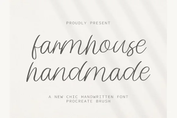
Airy tall-looped monoline handwritten script
Farmhouse Handmade is a breezy, light-stroke handwritten cursive with tall open ascender loops and relaxed baseline bounce.
Ideas for this font
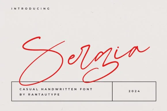
Fast slanted ballpoint signature cursive
Sergia is an expressive, fast-moving handwritten signature script with oversized sweeping initials and airy, minimalist pen curves.
Ideas for this font
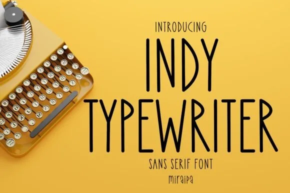
Tall condensed handwritten monoline sans serif (NOT a serif typewriter!)
Indy Typewriter is actually a tall, friendly monoline handwritten sans serif—zero serifs or mechanical slabs despite the 'Typewriter' name!
Ideas for this font
Allow optional Google Analytics to measure visits and catalogue actions. Your search words and notes are not included. Privacy & storage