Editorial Serif Anchor

Neighbor's Blanket + Aureline
Anchors Neighbor's Blanket's fluid strokes with crisp Roman proportions on wedding suites, headers and packaging.
Inspect Aureline specimenDisclosure: MakerFileHub may earn a commission from qualifying purchases via paid links on this page. How our links work.
Heavy retro script with curled capitals
Neighbor's Blanket is a heavy retro script in bright yellow with a warm offset shadow, drawn with curled ball terminals and tight interlocking bowls on a chalky black ground.
Paid link
Get this fontProject & layout blueprintsAt-a-glance maker compatibility
Cut solid base, outline, and shadow layers in separate vinyl colors and align on registration marks.
Visual anatomy & craft review
Neighbor's sits above Blanket in a fat script that interlocks: the bowls of the e and the i overlap, the apostrophe is drawn as a curled comma, and the N opens with a long spiral terminal that swings back over the word. Every letter ends in a rounded ball, the stroke is a heavy monoline with a slight swell on the curves, and the whole line leans forward. The colour is a saturated yellow with an orange-red offset shadow that reads as a two-colour print, and the ground is a chalky black surface with dust marks. Two captions close the composition, the lower naming the style and the studio. The face is a retro display script for packaging, posters and apparel: it wants size and two warm colours, and its interlocking bowls mean it should never be set tight or small.
A chunky retro script in yellow on black
Two-font hierarchy recipes
Tested contrast partners — pairing Neighbor's Blanket with grounded secondary typography.
Neighbor's Blanket + Aureline
Anchors Neighbor's Blanket's fluid strokes with crisp Roman proportions on wedding suites, headers and packaging.
Inspect Aureline specimen
Neighbor's Blanket + Montreal
Keeps small-scale dates, URLs, nutrition facts and care instructions crisp and legible below script titles.
Inspect Montreal specimenPractical applications
Concrete hierarchy, scale and production guidance tailored to Neighbor's Blanket’s stroke geometry.
The heavy script gives a themed reception its signage voice, and the yellow on black reads at the far end of a marquee where a pastel board would vanish.
Hierarchy & layout recipe
Print a 500 by 350 mm board: set the greeting at 100 pt across two rows, keep 24 mm of clear ground beneath before the names at 26 pt, and hold 22 mm of border on all sides.
Pre-production check
The offset shadow can look like a misprint on a large surface; print one board and check the shadow direction is consistent before the set.
A chunky script on a small tag gives a simple gift a considered finish, and the warm palette suits a home rather than a shop.
Hierarchy & layout recipe
Print a 40 by 80 mm tag: set the greeting at 12 pt across two rows, keep 5 mm of clear ground beneath before the name at 6 pt, and hold 4 mm from the lowest curl to the punch hole.
Pre-production check
Interlocking bowls close up on a small tag; print one at the real size, punch it and check the letters before the order.
A warm heavy script reads on a bag standing on a shelf, and the offset shadow gives a small roaster the look of a printed two-colour label.
Hierarchy & layout recipe
Print a 70 by 90 mm bag label: set the roaster name at 18 pt on one row, keep 7 mm of clear ground beneath before the roast at 5 pt, and hold 5 mm from the curl to the die line.
Pre-production check
Yellow on kraft loses its brightness; print one label on the real bag stock and check the contrast before the order.
Technical & licence verification
Confirm included OTF/TTF/WOFF formats, full glyph tables and licence coverage on the live store page before batch production.
Closest visual alternatives
Matched across letterform anatomy, stroke behaviour and craft applications.
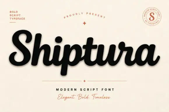
Bold connected script with a slight slant
Shiptura is a bold modern script in black with a soft shadow on cream: thick connected letters with rounded bowls, a slight rightward slant, blunt entry strokes and a small tail on the final letter, presented between two tracked capital lines and a round badge.
Ideas for this font
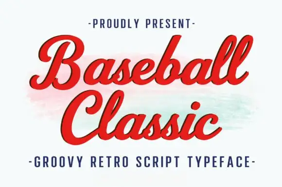
Thick retro sports script with high contrast and a lean
Baseball Classic is a thick retro sports script that leans forward, its downstrokes heavy and its joins thin, with looped capitals on both words and a small ball terminal at the exits.
Ideas for this font
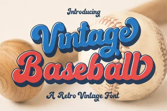
Retro layered script with an offset
Vintage Baseball is a retro script in blue and red with a navy keyline and offset: thick rounded strokes, a tight loop on the V and the B, and a shadow that sits behind each word at a fixed distance.
Ideas for this font
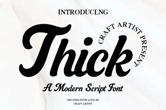
Heavy rounded retro script
Thick is a heavy rounded retro script in black on white: very fat even strokes, a capital T drawn as a wide swash that runs above the word, and a low slanted body with tight loops.
Ideas for this font
Same independent foundry
Allow optional Google Analytics to measure visits and catalogue actions. Your search words and notes are not included. Privacy & storage