Neutral Sans Workhorse

Archmage + Memoir Slang
Lets Archmage own the focal silhouette while handling secondary copy, sizing and subheads cleanly.
Inspect Memoir Slang specimenDisclosure: MakerFileHub may earn a commission from qualifying purchases via paid links on this page. How our links work.
3-style hand-drawn folk-horror & wizard serif (Solid, Outline & Textured!)
Archmage is a 3-style hand-drawn phantasmagorical serif ('Solid, Outline & Distressed') straight out of 1970s pulp sword-and-sorcery & folk-horror paperbacks!
Paid link
Get this fontProject & layout blueprintsAt-a-glance maker compatibility
Cut solid base, outline, and shadow layers in separate vinyl colors and align on registration marks.
Visual anatomy & craft review
Archmage is a hand-drawn folk-horror serif shipped in three styles: a solid cut, an outline cut and a textured cut with a woodcut grain, all on the same slightly irregular skeleton with small spurs and uneven baselines. The three styles stack, and the grain in the textured cut is drawn rather than applied. It needs roughly 30 mm for the spur and the grain to read, and it is best in one dense black on cream and newsprint, or a single dark ink with the outline left as paper on a coloured ground.
Phantasmagorical-3-style · Solid-Outline-Rough · Pulp-fantasy
Two-font hierarchy recipes
Tested contrast partners — pairing Archmage with grounded secondary typography.
Archmage + Memoir Slang
Lets Archmage own the focal silhouette while handling secondary copy, sizing and subheads cleanly.
Inspect Memoir Slang specimen
Archmage + Askinо
Grounds bold display lettering with classic typographic authority on posters, badges and apparel.
Inspect Askinо specimenPractical applications
Concrete hierarchy, scale and production guidance tailored to Archmage’s stroke geometry.
A hand-drawn folk-horror serif reads as a woodcut title rather than a modern headline, which is what a feature about rural horror wants. The grain gives the title texture at 64 pt, and the outline cut supplies a second voice in the same family without a new typeface.
Hierarchy & layout recipe
Opener 210 x 297 mm, title 64 pt with 10 mm grain clearance, standfirst 11/15 pt, body 9/13 pt, 18 mm margins. Pull quote 40 pt in the outline cut. Cover band 210 x 70 mm, word 44 pt.
Pre-production check
At 40 pt the outline cut closes and the pull quote reads as a solid barred shape. Keep the outline to 52 pt and above, set quotes in the solid cut, and proof one spread at 1:1.
A folk-horror serif reads as a hand-printed warning rather than a cartoon, which is what a serious scare event wants. The woodcut grain holds at 130 mm across a poster, and one black plus a spot colour prints the poster, the ticket and the prop labels for one night.
Hierarchy & layout recipe
Poster A2, word 130 mm with 14 mm grain clearance, times 40 mm, 20 mm margins. Ticket 100 x 50 mm, word 14 mm, 4 mm perforation. Prop label 70 x 50 mm, word 12 mm, 4 mm margins.
Pre-production check
A 100 x 50 mm ticket at 14 mm fills the spurs and the word prints as a rough black bar. Raise the ticket to 20 mm or use the solid cut, and check one ticket before the batch.
A woodcut serif gives an autumn fair the look of a printed country bill rather than a modern flyer. The grain holds at 110 mm on a poster, and the outline cut marks the prize list in the same two inks.
Hierarchy & layout recipe
Poster A2, word 110 mm with 12 mm grain clearance, details 34 mm, 20 mm margins. Tent card 105 x 75 mm, word 20 mm, 5 mm margins. Prize label 90 x 60 mm, word 16 mm, 5 mm margins.
Pre-production check
On a 90 x 60 mm prize label at 16 mm the grain becomes dirt and the word reads as a stain. Raise the label word to 22 mm or use the solid cut, and print one label before the batch.
Technical & licence verification
Confirm included OTF/TTF/WOFF formats, full glyph tables and licence coverage on the live store page before batch production.
Closest visual alternatives
Matched across letterform anatomy, stroke behaviour and craft applications.
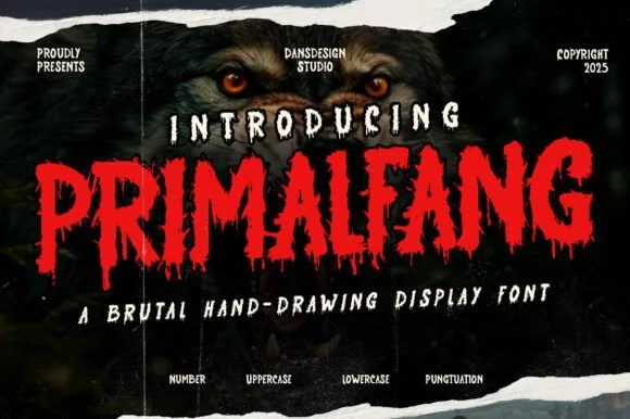
Gnarled claw-slashed horror brush display
Primalfang is a ragged, hand-brushed horror display typeface with torn upper fangs, uneven baselines, and dripping beast-claw terminals.
Ideas for this font
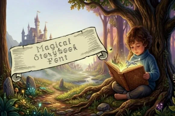
Whimsical spiral-curled hollow outline fairytale font
Magical Storybook is a delicate hollow-outline fairytale font curling storybook spirals onto open-centered uppercase and lowercase letters.
Ideas for this font
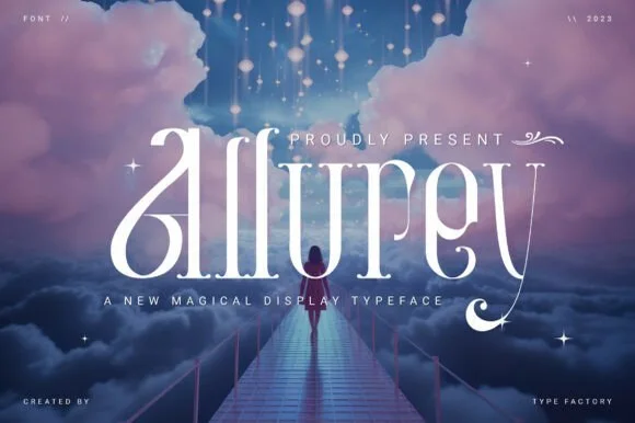
Dreamy high-contrast fairytale swash serif (Alternates & Swashes)
Allurey is a luminous, romantic fairytale display serif sweeping lush teardrop loops on 'A', 'l', and 'y' (with stylistic alternates & swashes)!
Ideas for this font
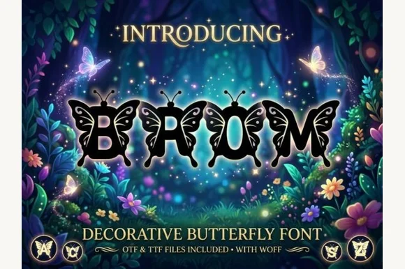
Ornate monarch-butterfly-winged fantasy alphabet (OTF, TTF & WOFF)
Brom is a magical decorative alphabet sprouting intricate monarch-style butterfly wings directly off every letterform (OTF, TTF & WOFF)!
Ideas for this font
Same independent foundry
Allow optional Google Analytics to measure visits and catalogue actions. Your search words and notes are not included. Privacy & storage