Editorial Serif Anchor

Last Dance Redux + Lumera Editorial
Anchors Last Dance Redux's fluid strokes with crisp Roman proportions on wedding suites, headers and packaging.
Inspect Lumera Editorial specimenDisclosure: MakerFileHub may earn a commission from qualifying purchases via paid links on this page. How our links work.
Slanted cinematic brush script
Last Dance Redux is a slanted brush script in white with a pink glow: fast narrow strokes with a dry edge, tight loops and underline swashes, presented as a video-store cover with neon type beneath.
Paid link
Get this fontProject & layout blueprintsAt-a-glance maker compatibility
Fine grain and micro-texture excel in 300 DPI print, sublimation, and screen print rather than small vinyl weeding.
Visual anatomy & craft review
The script is set on two lines in white, and the face is a cinematic brush: the L opens with a long entry, the a and the s are narrow, the D of Dance throws a wide bowl and the final e runs out into a thin underline that carries the same lean, while the stroke thickens and frays as a loaded brush does at speed. Beneath it the same title appears in a tall neon pink capital face, which is a second face in the mock-up rather than part of this one, and together they read as an eighties film cover. Small round stickers in blue, grey and yellow with short phrases sit around the composition, and the ground is a grainy duotone photograph. Last Dance Redux is a brush script for posters, covers, apparel and event graphics with a retro tone, and it needs a wide measure for the underlines.
A neon brush script with a retro film feel
Two-font hierarchy recipes
Tested contrast partners — pairing Last Dance Redux with grounded secondary typography.
Last Dance Redux + Lumera Editorial
Anchors Last Dance Redux's fluid strokes with crisp Roman proportions on wedding suites, headers and packaging.
Inspect Lumera Editorial specimen
Last Dance Redux + Cultivo
Keeps small-scale dates, URLs, nutrition facts and care instructions crisp and legible below script titles.
Inspect Cultivo specimenPractical applications
Concrete hierarchy, scale and production guidance tailored to Last Dance Redux’s stroke geometry.
A neon-toned brush script suits a party that starts late, and the glow treatment reads on a dark board where a flat script would recede.
Hierarchy & layout recipe
Print a 600 by 400 mm board: set the greeting at 96 pt over two lines, keep 24 mm of clear ground beneath before the names at 22 pt, and hold 22 mm of border on all four sides.
Pre-production check
A glow effect printed on a dark board can bleed; print one at the final size and check the edges before the set.
A cinematic brush script gives a club night a period identity, and the underline swash works as a graphic element on a flyer or a poster.
Hierarchy & layout recipe
Print an A2 poster: set the title at 120 pt over two lines with the underline, keep 28 mm of clear ground beneath before the date at 24 pt, and hold 24 mm of margin on all four sides.
Pre-production check
A thin underline can drop out on a dark ground; print one proof at the final size and check the tail before the run.
A brush script over a duotone photograph reads as a film title rather than a magazine headline, which is the tone a retrospective wants.
Hierarchy & layout recipe
Print a 230 by 300 mm cover: set the cover word at 88 pt over two lines, keep 26 mm of clear ground beneath before the cover lines at 11 pt, and hold 22 mm of margin on all four sides.
Pre-production check
A white script with a glow over a bright image can lose its edge; print one cover and check the contrast before the run.
Technical & licence verification
Confirm included OTF/TTF/WOFF formats, full glyph tables and licence coverage on the live store page before batch production.
Closest visual alternatives
Matched across letterform anatomy, stroke behaviour and craft applications.
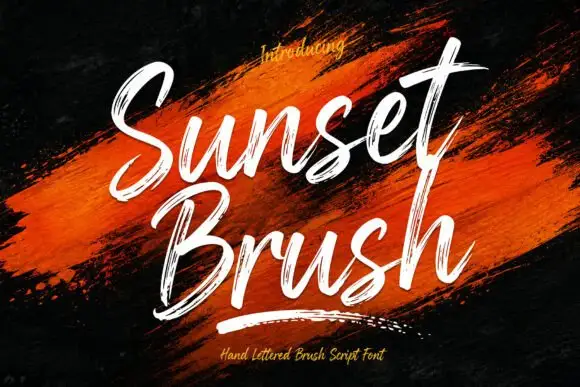
Rough brush script with a dry edge
Sunset Brush is a rough brush script in white over an orange paint smear: heavy strokes with dry, split ends, tall narrow loops and a forward slant that keeps a twelve-letter phrase moving.
Ideas for this font
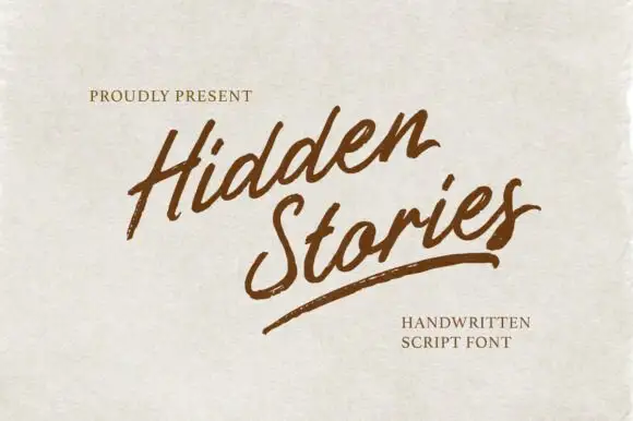
Angled brush script with dry-brushed edges and an underline swash
Hidden Stories is a dry brush script that leans hard to the right, its strokes ragged at the edges and broken where the brush lifted, with a single long underline swash finishing the second word.
Ideas for this font
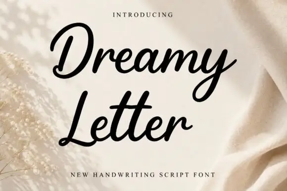
Smooth bold joined script with heavy even strokes and tight counters
Dreamy Letter is a smooth bold joined script in one even weight, with fat rounded strokes, tight counters and letters that connect without thinning, so a phrase reads as a continuous ribbon of ink.
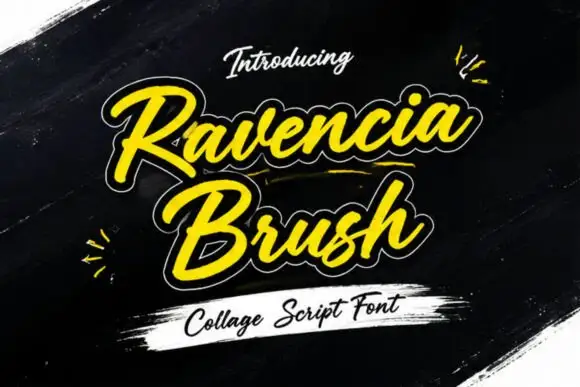
Display
Ravencia Brush is a heavy brush script with a thick monoline, a white contour cut around every stroke and a yellow fill, presented on a dark painterly ground with torn paper and paint smears.
Same independent foundry
Allow optional Google Analytics to measure visits and catalogue actions. Your search words and notes are not included. Privacy & storage