Modern Grotesque Body

Abravisma + Olline
Creates crisp high-hierarchy contrast beneath Abravisma headlines across menus, websites and labels.
Inspect Olline specimenDisclosure: MakerFileHub may earn a commission from qualifying purchases via paid links on this page. How our links work.
Uneven playful mixed case with chunky angular feet
Abravisma shows navy irregular mixed-case lettering above a coral subtitle, where letter heights, angles and widths change across the title, the A takes a long diagonal stance, rounded bowls sit beside chunky angular feet and flowers and leaves fill the surrounding arrangement.
Paid link
Get this fontProject & layout blueprintsAt-a-glance maker compatibility
Sturdy stroke walls and open counters weed cleanly on adhesive vinyl, HTV apparel film, and cut cardstock.
Visual anatomy & craft review
The letters refuse a common baseline, the feet turn angular, the bowls stay round and the widths shift from letter to letter. That uneven stance is the character: the title reads as drawn rather than set, which is why the sample leans one A far to the side. The flowers, keyboard and colour panels are cover arrangement rather than supplied art, so test the drawing yourself, keep 32 pt for the thin joints and check the randomisation is deliberate in your layout rather than expected from the file.
Uneven playful mixed case with chunky angular feet
Two-font hierarchy recipes
Tested contrast partners — pairing Abravisma with grounded secondary typography.
Abravisma + Olline
Creates crisp high-hierarchy contrast beneath Abravisma headlines across menus, websites and labels.
Inspect Olline specimen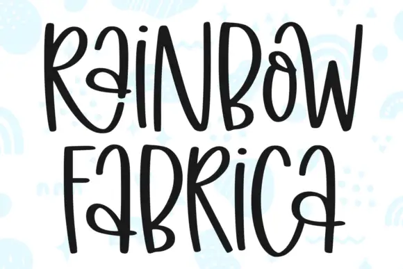
Abravisma + Rainbow Fabrica
Adds a warm human signature touch for 1-to-3-word callouts without competing against structured serif capitals.
Inspect Rainbow Fabrica specimenPractical applications
Concrete hierarchy, scale and production guidance tailored to Abravisma’s stroke geometry.
The uneven letters give a card energy, and the chunky feet hold a short greeting at 32 pt on an A6 sheet, where the mixed heights keep the row lively.
Hierarchy & layout recipe
Print an A6 card: set the greeting at 32 pt on one row, keep 16 mm of clear ground beneath before the name at 12 pt, and rotate no single letter in the file so the layout stays repeatable.
Pre-production check
Rotating letters by hand breaks the spacing; check the card and keep the unevenness inside the type itself.
The drawn letters suit a small bakery, and the angular feet hold a two-word name at 22 pt on a 60 by 45 mm label, where the uneven widths read as handmade.
Hierarchy & layout recipe
Print a 60 by 45 mm label: set the name at 22 pt on one row, keep 9 mm of clear ground beneath before the weight at 6 pt, and keep the label plain so the lettering carries all the character.
Pre-production check
Thin joints printed under 0.4 mm break up; check the plate proof and hold the name at 20 pt or above.
The playful caps read across a room, and the chunky forms hold a two-word sign at 48 mm on a printed board, where the shifting widths stay legible at distance.
Hierarchy & layout recipe
Print a 600 by 300 mm board: set the sign at 48 mm on one row, keep 22 mm of clear ground beneath before the times at 14 pt, and keep 22 mm of border so the angular feet are not trimmed.
Pre-production check
The file may not randomise automatically; check the letterforms you actually receive and set any rotation by hand in the layout.
Technical & licence verification
Confirm included OTF/TTF/WOFF formats, full glyph tables and licence coverage on the live store page before batch production.
Closest visual alternatives
Matched across letterform anatomy, stroke behaviour and craft applications.
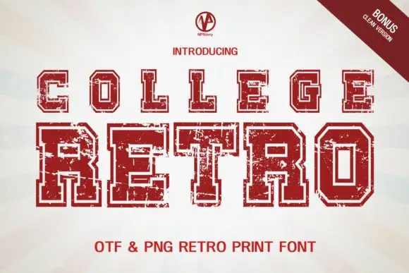
Outlined collegiate capitals with patchy interior wear
College Retro shows angular slab capitals with clipped corners in a faded red on cream, where a pale inset border traces each letter, coarse pale abrasions cut through the fill and the lower row uses substantially larger letter bodies than the upper one.
Ideas for this font
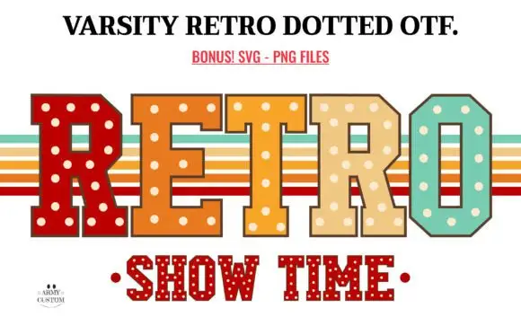
Retro dotted varsity slab
Varsity Retro Dotted is an angular varsity slab in four warm colours on white: heavy caps with chamfered corners and cream dots set into every fill, one letter per colour, with retro stripe bands behind the word and a second dotted line beneath in red.
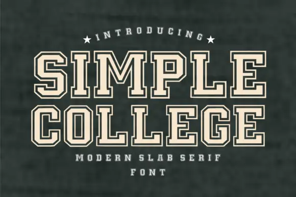
Inline college slab
Simple College is a college slab in cream with a fine inline on a dark green board: heavy caps with block serifs, a high waist and square counters, the inner line running parallel to every stroke, set on two lines with a curved label above and a tracked note beneath.
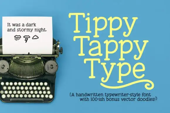
Light irregular typewriter-style slabs with rounded feet and a curled flourish
Tippy Tappy Type shows yellow mixed-case lettering on blue in three stacked rows, where broad round bowls and uneven little feet give the line a handwritten rhythm and the final row carries a long curled underline-like flourish beneath it.
Same independent foundry
Allow optional Google Analytics to measure visits and catalogue actions. Your search words and notes are not included. Privacy & storage