Editorial Serif Anchor

Maronsa + Vanielst Elegant Serif Display Stylistic
Anchors Maronsa's fluid strokes with crisp Roman proportions on wedding suites, headers and packaging.
Inspect Vanielst Elegant Serif Display Stylistic specimenDisclosure: MakerFileHub may earn a commission from qualifying purchases via paid links on this page. How our links work.
Metallic vintage script with swash capitals
Maronsa is a vintage script finished in gold on black drapery: heavy connected lower case, swash capitals on the M and the S, small drawn fleurons between the lines and sparkles catching the metallic edge.
Paid link
Get this fontProject & layout blueprintsAt-a-glance maker compatibility
Weld or Unite overlapping script joins into one continuous vector path before sending to the blade.
Visual anatomy & craft review
The name is set on two lines with the second word in capitals of the same script, and the lettering is a confident vintage script: the M of Maronsa opens with a wide swash that curls under the word, the a and the r are round, the n is narrow and the script capital S of Script answers with its own curl. The stroke carries a metallic gradient rather than a flat colour, which is a presentation choice rather than something the font does, and the drawn ornaments between the lines are separate artwork. The ground is black fabric with a sheen, and two tracked serif captions sit above and below the block. The face is a formal script for labels, invitations and packaging that have to look established: the swashes need clear margins, and the face is at its best in one rich ink at a large size rather than in body copy.
A gold script with show capitals and drawn fleurons
Two-font hierarchy recipes
Tested contrast partners — pairing Maronsa with grounded secondary typography.
Maronsa + Vanielst Elegant Serif Display Stylistic
Anchors Maronsa's fluid strokes with crisp Roman proportions on wedding suites, headers and packaging.
Inspect Vanielst Elegant Serif Display Stylistic specimen
Maronsa + Miniplate
Keeps small-scale dates, URLs, nutrition facts and care instructions crisp and legible below script titles.
Inspect Miniplate specimenPractical applications
Concrete hierarchy, scale and production guidance tailored to Maronsa’s stroke geometry.
A vintage script in foil reads as an engraved card, and the swash capitals give the names a centrepiece that a plain serif cannot.
Hierarchy & layout recipe
Print a 130 by 180 mm invitation on dark card: set the names at 28 pt on one line, keep 20 mm of clear ground beneath before the venue at 8.5 pt, and hold 18 mm of margin so the swash is not trimmed.
Pre-production check
Foil pulls fine joins on uncoated stock; proof one invitation with the finisher and check the thinnest connector before the suite.
A vintage script in one metallic ink gives a bottle the look of an old house label, and the swash capitals read across a bar at arm's length.
Hierarchy & layout recipe
Print a 60 by 95 mm label: set the house name at 17 pt on one line, keep 6 mm of clear ground beneath before the strength at 5 pt, and hold 4 mm of margin on all sides.
Pre-production check
A swash that wide can wrap the die edge; print one label on the real stock and check the first capital before the order.
A script with drawn fleurons makes a certificate look issued rather than printed, and the vintage shapes read as institutional rather than fashionable.
Hierarchy & layout recipe
Print an A4 certificate: set the heading at 40 pt on one line, keep 24 mm of clear ground beneath before the name at 17 pt, and hold 22 mm of margin on all four sides.
Pre-production check
Heavy script at forty points on a light sheet can look like a poster; print one certificate and check the proportion before the run.
Technical & licence verification
Confirm included OTF/TTF/WOFF formats, full glyph tables and licence coverage on the live store page before batch production.
Closest visual alternatives
Matched across letterform anatomy, stroke behaviour and craft applications.
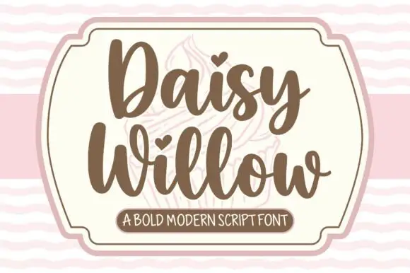
Bold modern script with heart tittles and a soft rounded baseline
Daisy Willow is a bold modern script with soft rounded strokes, generous loops and heart tittles, drawn so two stacked words sit evenly inside a framed panel.
Ideas for this font
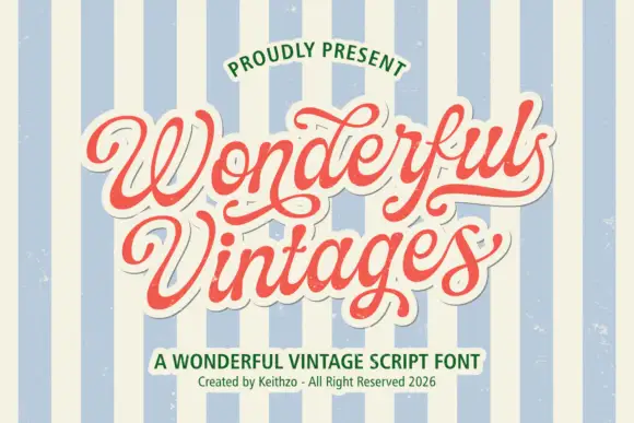
Ornate heavy vintage script
Wonderful Vintages is a plump connected retro script with ball terminals and rolling swashes, printed in coral red on a white sticker outline over a striped cream and blue ground.
Ideas for this font
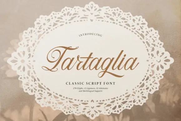
Slanted classic script with curled capitals
Tartaglia is a slanted classic script in gold-brown on a doily: high-contrast strokes, curled capitals with ball terminals and a ligature-rich alphabet, presented inside a lace oval.
Ideas for this font
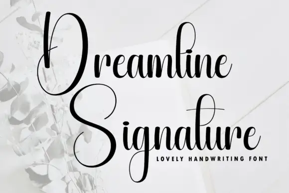
Tall narrow contrast calligraphy with double-height capitals
Dreamline is tall narrow calligraphy in which each word opens with a capital drawn at double the x-height, with fine joins and a small tightly packed lowercase beneath it.
Ideas for this font
Same independent foundry
Allow optional Google Analytics to measure visits and catalogue actions. Your search words and notes are not included. Privacy & storage