Neutral Sans Workhorse

Zaima + Bareum
Lets Zaima own the focal silhouette while handling secondary copy, sizing and subheads cleanly.
Inspect Bareum specimenDisclosure: MakerFileHub may earn a commission from qualifying purchases via paid links on this page. How our links work.
Filigree-serif ornate display
Zaima is an ornate display in gold on deep maroon: broad serif capitals with curled terminals and a symmetrical filigree strip running through the middle of every stroke, set with a drawn border, a wax seal and a quill at the head, and two plain lines beneath.
Paid link
Get this fontProject & layout blueprintsAt-a-glance maker compatibility
Sturdy stroke walls and open counters weed cleanly on adhesive vinyl, HTV apparel film, and cut cardstock.
Visual anatomy & craft review
The plate stages the face on a leather book cover, which is the honest setting for a face this formal: the letters are gold with a filigree band inside each stem, and the drawn border and seal complete the document. The drawing is a broad serif with curled terminals, so the letterforms stay readable while the ornament runs through them, which is the balance a decorative face has to hold. That construction sets a large size floor, because the filigree closes when the letters shrink, and the plate sets the word large enough that the pattern reads. The still life is staging, and the two plain lines beneath are product copy. It suits a certificate, a label and a cover for a ceremonial subject.
Decorative, ornate, filigree, formal
Two-font hierarchy recipes
Tested contrast partners — pairing Zaima with grounded secondary typography.
Zaima + Bareum
Lets Zaima own the focal silhouette while handling secondary copy, sizing and subheads cleanly.
Inspect Bareum specimen
Zaima + Resquel
Grounds bold display lettering with classic typographic authority on posters, badges and apparel.
Inspect Resquel specimenPractical applications
Concrete hierarchy, scale and production guidance tailored to Zaima’s stroke geometry.
An ornate filigree face gives a certificate ceremony, and the gold treatment can be simulated in print with a warm ochre.
Hierarchy & layout recipe
A4 certificate: the names at 40 mm cap height, the date at 14 pt, and the seal at 45 mm. Keep 20 mm margins and print two colours on a heavy card with a drawn border.
Pre-production check
Check the 40 mm names, where a filigree band can clot; keep the lines above 0.6 mm. Confirm the 14 pt date reads at arm's length and that the names clear the border by 10 mm.
An ornate label reads as a house with history, and the filigree survives a small die where a hairline ornament would not.
Hierarchy & layout recipe
Print a 70 by 95 mm label: the house at 13 pt, the expression at 8 pt, and the year at 7 pt. Keep 5 mm inside the die and keep the filigree above 0.4 mm in foil.
Pre-production check
Check the 13 pt house in foil, where a filigree band can fill; keep it above 0.4 mm. Confirm the 7 pt year reads on the shelf and that the label holds in a cellar.
An ornate face suits a ceremonial programme, and the gold on maroon pairs with a formal occasion without a second design.
Hierarchy & layout recipe
Set the title at 70 mm cap height across 180 mm, the programme details in a 10 pt serif, and the date at 8 pt. Print two colours on a textured stock and keep 22 mm margins.
Pre-production check
Check the title at 70 mm, where a filigree band can clot on a rough sheet; specify a smooth stock. Confirm the 8 pt date survives lamination and that the title clears the trim.
Technical & licence verification
Confirm included OTF/TTF/WOFF formats, full glyph tables and licence coverage on the live store page before batch production.
Closest visual alternatives
Matched across letterform anatomy, stroke behaviour and craft applications.

Celestial star-accented display
Lunar Bloom is a decorative display in gold over a purple scene with a figure holding a fan: tall contrast capitals with four-point star accents set inside the strokes and beside them, with crescents and star charts floating in the corners and a tracked line along the foot.
Filigree spiral display
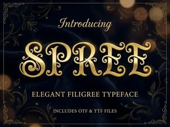
Spree is an ornate display in gold on a dark bokeh ground: high-contrast capitals with long inward spirals, curled terminal extensions and fine filigree inside the bowls, set as one word between a script introducing line and two plain lines naming the style and the formats, all inside a fine ornamental frame.
Ideas for this font
Broad blackletter with diamond shoulders
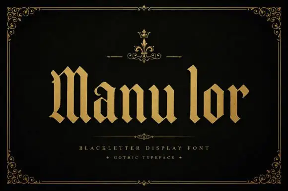
Manulor is a broad blackletter in gold on a black ground: diamond-shaped shoulders, a tall narrow l, even stroke widths and heavy bowls, set as one word between a small crown ornament above and two tracked credit lines beneath, all inside a fine ornamental frame.
Ideas for this font

Narrow Gothic strokes with curled descenders and split terminals
Kingsbridge sets silver-blackletter capitals on a dark heraldic scene, the strokes tall and angular, the K throwing a long entry swash and the g closing in a hooked tail that curls under the word.
Ideas for this font
Same independent foundry
Allow optional Google Analytics to measure visits and catalogue actions. Your search words and notes are not included. Privacy & storage