Editorial Serif Anchor

White Picket Fence + Amor Hadena
Anchors White Picket Fence's fluid strokes with crisp Roman proportions on wedding suites, headers and packaging.
Inspect Amor Hadena specimenDisclosure: MakerFileHub may earn a commission from qualifying purchases via paid links on this page. How our links work.
Condensed handwritten caps with a matching text cut
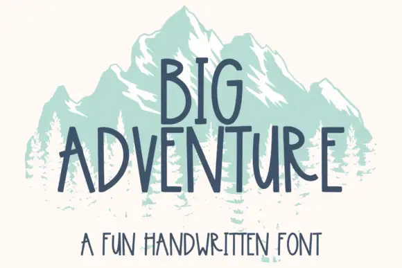
White Picket Fence is a condensed handwritten face in navy on mint: tall narrow capitals of uneven width, a monoline stroke with visible hand wobble, and a lighter lowercase cut beneath that reads as the same hand at a smaller size.
Paid link
Get this fontProject & layout blueprintsAt-a-glance maker compatibility
Weld or Unite overlapping script joins into one continuous vector path before sending to the blade.
Visual anatomy & craft review
The three stacked words are set in narrow capitals that look drawn with a fine marker: the W and the H are wide relative to the rest, the height of each letter drifts by a millimetre or two, and the strokes carry a slight wobble that no constructed sans would have. The proportions are condensed enough that three long words fit a square, which is the practical reason for the drawing, and the counters stay open because the stroke is thin. Beneath the display block, a single line of lowercase handwriting in a lighter weight names the style, and it is clearly the same hand, which shows the family is built as a pair rather than as one display cut. The ground is a flat mint with white fence panels at the sides, and the whole page uses two colours.
Handwritten, narrow, farmhouse, friendly
Two-font hierarchy recipes
Tested contrast partners — pairing White Picket Fence with grounded secondary typography.
White Picket Fence + Amor Hadena
Anchors White Picket Fence's fluid strokes with crisp Roman proportions on wedding suites, headers and packaging.
Inspect Amor Hadena specimen
White Picket Fence + Swaraga
Keeps small-scale dates, URLs, nutrition facts and care instructions crisp and legible below script titles.
Inspect Swaraga specimenPractical applications
Concrete hierarchy, scale and production guidance tailored to White Picket Fence’s stroke geometry.
A condensed handwritten face reads as a sign painted by the owner, and the narrow capitals fit a long farm name on a board without shrinking it.
Hierarchy & layout recipe
Paint a 700 by 400 mm board: the name at 70 mm cap height in two lines, the produce list in the matching lowercase at 20 mm, and a hand-drawn rule between. Keep 30 mm between the display block and the list so the wobble does not crowd the smaller line.
Pre-production check
Check the board at three metres in daylight, where a thin handwritten stroke can lose contrast on a pale painted ground; use a darker ink. Confirm the 20 mm produce list reads at arm's length and that the rule sits level with the display block.
A handwritten condensed face gives a jar the look of a kitchen label written by hand, and the narrow capitals let a long preserve name fit a small label.
Hierarchy & layout recipe
Print a 60 by 80 mm label: the preserve name at 16 pt, the date in the matching lowercase at 7 pt, and the maker's name in 7 pt caps. Keep 5 mm clear inside the die and print one ink on a cream stock.
Pre-production check
Check the 16 pt name on the label, where the narrow counters can fill; increase the stroke contrast by choosing a smoother stock. Confirm the 7 pt date reads at arm's length and that the name stays on one line at the label width.
A handwritten face is easy for young readers to distinguish letter by letter, and the condensed width lets long book titles fit a small spine label.
Hierarchy & layout recipe
Print A4 adhesive sheets: each title at 14 pt with 3 mm of clear space inside the cut line, and the reading level in the matching lowercase at 8 pt. Keep the labels to a maximum of two lines so the hand wobble does not distort the leading.
Pre-production check
Check the 14 pt label on a spine, where the condensed letters can crowd at a narrow width; allow two lines rather than shrinking further. Confirm the 8 pt level reads on a shelf and that the adhesive cuts cleanly around the wobbling letters.
Technical & licence verification
Confirm included OTF/TTF/WOFF formats, full glyph tables and licence coverage on the live store page before batch production.
Closest visual alternatives
Matched across letterform anatomy, stroke behaviour and craft applications.

Tall condensed farmhouse marker display sans (NOT a script!)
Bakery Shop is actually a tall, condensed marker print display font (zero connected cursive!) built for farmhouse canisters and chalkboard menus!
Ideas for this font
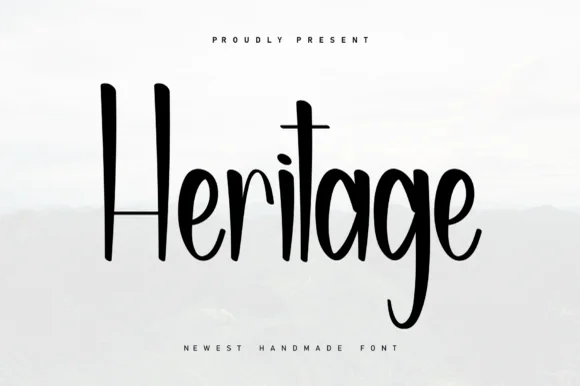
Tall condensed farmhouse marker print (NOT a serif!)
Heritage (by Berkah Shop) is actually a tall, condensed marker print font (zero serifs!) pairing towering 'H/t' stems with playful curved 'g' loops.
Ideas for this font
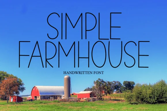
Thin tall handwritten caps
Simple Farmhouse is a thin handwritten caps face in dark ink over a bright landscape photograph: very tall narrow letters with a light even stroke, open arches and blunt terminals, set in two lines with a small tracked caption beneath, so the block reads as a hand-lettered sign on a barn.
Ideas for this font
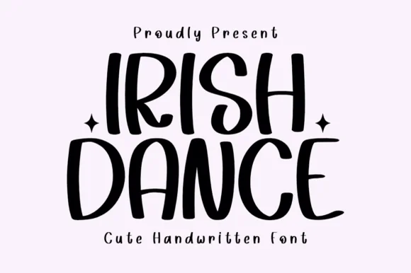
Tall bouncy farmhouse-cute marker capitals
Irish Dance is actually a clean, tall, disconnected handwritten marker font (not a cursive script or shamrock novelty)—great year-round on Cricut!
Ideas for this font
Same independent foundry
Allow optional Google Analytics to measure visits and catalogue actions. Your search words and notes are not included. Privacy & storage