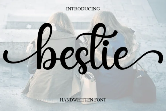
Editorial Serif Anchor

Simple Farmhouse + Papillon Serif – Elegant Modern Luxury
Anchors Simple Farmhouse's fluid strokes with crisp Roman proportions on wedding suites, headers and packaging.
Inspect Papillon Serif – Elegant Modern Luxury specimenDisclosure: MakerFileHub may earn a commission from qualifying purchases via paid links on this page. How our links work.
Thin tall handwritten caps
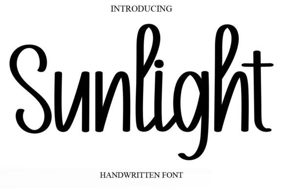
Simple Farmhouse is a thin handwritten caps face in dark ink over a bright landscape photograph: very tall narrow letters with a light even stroke, open arches and blunt terminals, set in two lines with a small tracked caption beneath, so the block reads as a hand-lettered sign on a barn.
Paid link
Get this fontProject & layout blueprintsAt-a-glance maker compatibility
Set Cricut or Silhouette operation to Pen, Foil Quill, or Laser Score — not Basic Blade Cut.
Visual anatomy & craft review
The two words are stacked and the drawing is handwriting at a light weight: the stroke is even, the letters are tall and narrow, and the arches are open, which lets a long word run the width of the plate without closing up. Because the stroke is very thin, the face needs a large size and a clean ground, and the specimen sets it over a photograph of a farm where the type sits on the sky, the calmest area of the image. The narrow width is the practical advantage: a long word pair fits a shop board or a card without a second line. The caption beneath is a small tracked caps face, and the palette is one ink plus the photograph, which keeps the plate plain rather than rustic in a costume sense.
Handwritten, thin, tall, minimal
Two-font hierarchy recipes
Tested contrast partners — pairing Simple Farmhouse with grounded secondary typography.
Simple Farmhouse + Papillon Serif – Elegant Modern Luxury
Anchors Simple Farmhouse's fluid strokes with crisp Roman proportions on wedding suites, headers and packaging.
Inspect Papillon Serif – Elegant Modern Luxury specimen
Simple Farmhouse + Noar
Keeps small-scale dates, URLs, nutrition facts and care instructions crisp and legible below script titles.
Inspect Noar specimenPractical applications
Concrete hierarchy, scale and production guidance tailored to Simple Farmhouse’s stroke geometry.
A thin handwritten caps face reads as a hand-lettered board, and the tall narrow letters fit a long shop name on a fascia without shrinking the height.
Hierarchy & layout recipe
Paint a 1,400 by 350 mm fascia: the name at 120 mm cap height, the produce in a 26 mm sans, and a 5 mm rule. Keep 30 mm margins and paint one colour on a pale board so the thin strokes stay crisp.
Pre-production check
Check the fascia at 120 mm, where a thin stroke can look fragile against the sky; keep the weight even. Confirm the 26 mm produce reads at four metres and that the rule clears the fixings.
A hand-lettered caps face suits a rustic venue without a script, and the narrow letters keep a long greeting legible on a board seen from the far end of a barn.
Hierarchy & layout recipe
A1 board: the greeting at 90 mm cap height, the names in a 36 mm serif, and the date at 22 mm. Keep 40 mm margins and paint one colour on a light board with a matte finish.
Pre-production check
Check the board at four metres, where a thin handwritten stroke can break up; increase the weight if the board is backlit. Confirm the 22 mm date reads from the door and that the greeting fits the width.
A light handwritten face reads as a personal note, and the tall letters leave room for a message in a companion serif on the same card.
Hierarchy & layout recipe
A6 folded card: the greeting at 26 pt, the message in a 9 pt serif at 13 pt leading, and a small leaf. Keep 14 mm margins and print one ink on a cream card.
Pre-production check
Check the 26 pt greeting, where a thin stroke can break on a home printer; keep it above 0.5 mm. Confirm the 9 pt message reads comfortably and that the card folds without cracking.
Technical & licence verification
Confirm included OTF/TTF/WOFF formats, full glyph tables and licence coverage on the live store page before batch production.
Closest visual alternatives
Matched across letterform anatomy, stroke behaviour and craft applications.
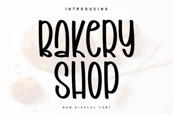
Tall condensed farmhouse marker display sans (NOT a script!)
Bakery Shop is actually a tall, condensed marker print display font (zero connected cursive!) built for farmhouse canisters and chalkboard menus!
Ideas for this font
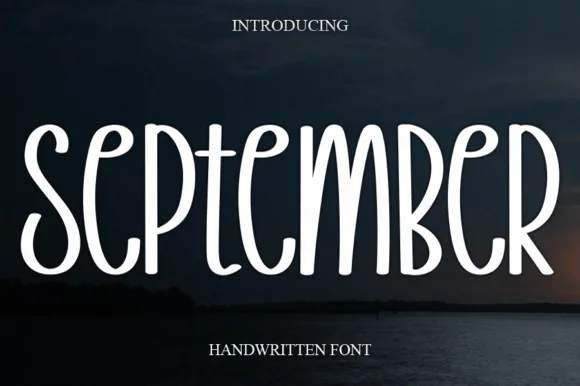
Tall narrow disconnected rounded marker capitals
September is a tall, narrow disconnected marker print font (not a connected cursive script) built with smooth, uniform rounded strokes.
Ideas for this font
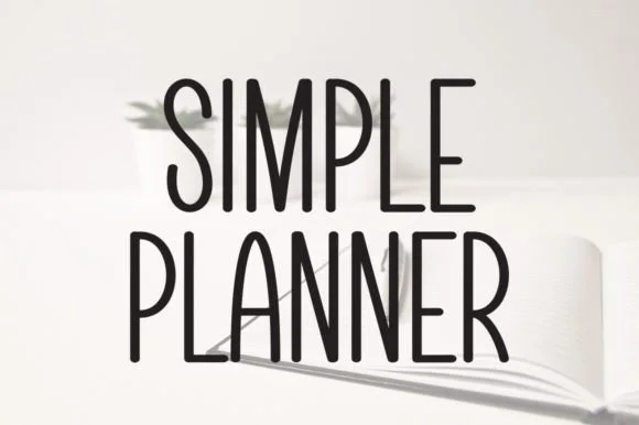
Tall skinny minimalist monoline planner caps & sans
Simple Planner is a tall, slender minimalist handwritten sans packing long headings neatly into narrow planner columns and spine labels.
Ideas for this font
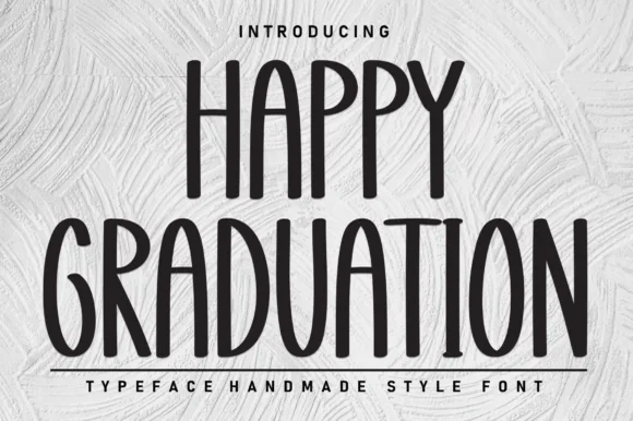
Tall skinny farmhouse marker print sans
Happy Graduation (by Berkah Shop) is a tall, narrow farmhouse print sans (NOT a slab serif!) built for vertical signs, tumblers, and ribbons.
Ideas for this font
Same independent foundry
Allow optional Google Analytics to measure visits and catalogue actions. Your search words and notes are not included. Privacy & storage