Editorial Serif Anchor

Irish Dance + Mewah
Anchors Irish Dance's fluid strokes with crisp Roman proportions on wedding suites, headers and packaging.
Inspect Mewah specimenDisclosure: MakerFileHub may earn a commission from qualifying purchases via paid links on this page. How our links work.
Tall bouncy farmhouse-cute marker capitals
Irish Dance is actually a clean, tall, disconnected handwritten marker font (not a cursive script or shamrock novelty)—great year-round on Cricut!
Paid link
Get this fontProject & layout blueprintsAt-a-glance maker compatibility
Weld or Unite overlapping script joins into one continuous vector path before sending to the blade.
Visual anatomy & craft review
Irish Dance is a tall bouncy marker face with farmhouse-cute capitals, uneven stroke ends and a hand-painted rhythm, so a word reads as a sign written on a barn door rather than as a printed headline. The bounce keeps a short phrase from being rigid, and the tall narrow caps fit a long greeting in a single line. It needs roughly 24 mm for the uneven ends to read as brush, and it is best in a warm cream on a dark ground or in one dark ink on kraft.
Tall-bouncy · Clean-marker · All-year
Two-font hierarchy recipes
Tested contrast partners — pairing Irish Dance with grounded secondary typography.
Irish Dance + Mewah
Anchors Irish Dance's fluid strokes with crisp Roman proportions on wedding suites, headers and packaging.
Inspect Mewah specimen
Irish Dance + Modern Heritage
Keeps small-scale dates, URLs, nutrition facts and care instructions crisp and legible below script titles.
Inspect Modern Heritage specimenPractical applications
Concrete hierarchy, scale and production guidance tailored to Irish Dance’s stroke geometry.
Bouncy marker caps read as a hand-painted barn sign, which is what an autumn barn dance posts at the lane end. The tall narrow forms fit the venue and the date in one line, and the uneven ends give the word warmth without a second colour.
Hierarchy & layout recipe
Poster A2, word 260 mm, details 22/28 pt, 30 mm margins and 20 mm trim. Sign 900 x 400 mm, word 170 mm, 60 mm margins. Label 70 x 95 mm, word 16 mm, 5 mm top arc and 4 mm die margin.
Pre-production check
A poster pasted on a barn wall is read from a moving car and the bounce makes the date look crooked. Set the date in a straight companion face, and check one poster from thirty metres before the run.
Hand-painted caps read as a stall that made its own sign, which is what a small Christmas market seller wants. The tall narrow forms fit a long stall name on a 600 mm board, and one cream ink on dark timber reads in low winter light.
Hierarchy & layout recipe
Sign 600 x 400 mm, word 110 mm, 40 mm margins and 20 mm frame clearance. Tag 50 x 90 mm, name 10 mm, hole 5 mm with 6 mm clear card. Letter board 600 x 400 mm, header 80 mm, rows 22 mm on a 30 mm pitch.
Pre-production check
A sign hung in a market hall faces warm lamps that yellow a cream word until it merges with the timber. Use a white ink with a dark keyline, and check one sign under the hall lighting before opening.
Bouncy marker caps read as a country party rather than a themed cartoon, which is what a rural family birthday is. The tall forms cut as a 45 mm topper with bridges that hold, and the hand-painted ends give the invite warmth without a script.
Hierarchy & layout recipe
Invite A6, word 40 mm, details 8/11 pt, 12 mm margins. Bunting 200 x 300 mm per flag, word 90 mm, 20 mm margins. Topper 130 x 110 mm, word 45 mm with 8 mm slot and 10 mm clear.
Pre-production check
A bunting flag cut from card drops the uneven stroke ends and the word reads as a plain block. Keep the ends within 2 mm of the cut line, and cut one flag before the set.
Technical & licence verification
Confirm included OTF/TTF/WOFF formats, full glyph tables and licence coverage on the live store page before batch production.
Closest visual alternatives
Matched across letterform anatomy, stroke behaviour and craft applications.
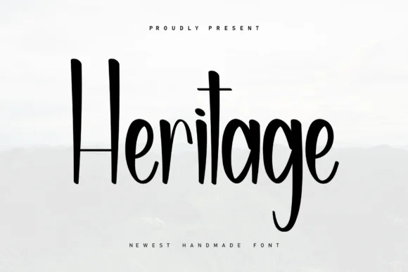
Tall condensed farmhouse marker print (NOT a serif!)
Heritage (by Berkah Shop) is actually a tall, condensed marker print font (zero serifs!) pairing towering 'H/t' stems with playful curved 'g' loops.
Ideas for this font
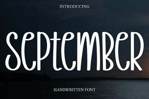
Tall narrow disconnected rounded marker capitals
September is a tall, narrow disconnected marker print font (not a connected cursive script) built with smooth, uniform rounded strokes.
Ideas for this font
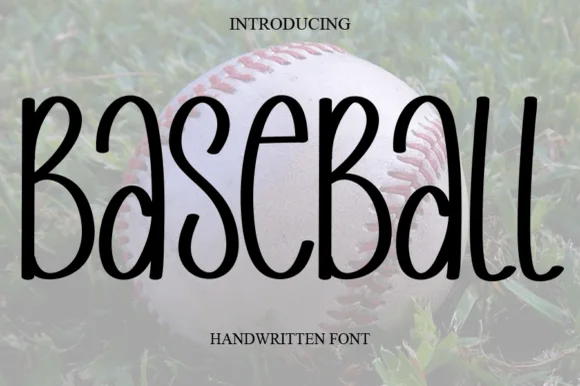
Tall skinny mixed-case farmhouse marker print
Baseball (by salma studio) is actually a tall, skinny rounded marker handwritten font—great for farmhouse crafts rather than blocky varsity jerseys!
Ideas for this font
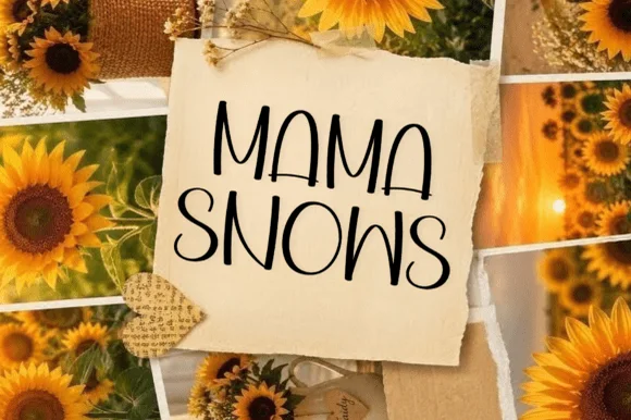
Casual tall handwritten caps
Mama Snows is a casual handwritten face in black on torn kraft paper: tall narrow caps with a light bounce, letters that vary in width, a curled S and a crossbar that overshoots, so the phrase reads as a note written on a scrap and pinned to a board.
Ideas for this font
Same independent foundry
Allow optional Google Analytics to measure visits and catalogue actions. Your search words and notes are not included. Privacy & storage