Neutral Sans Workhorse

Alexander + Monure
Lets Alexander own the focal silhouette while handling secondary copy, sizing and subheads cleanly.
Inspect Monure specimenDisclosure: MakerFileHub may earn a commission from qualifying purchases via paid links on this page. How our links work.
Heavy angular graffiti-like capitals with uneven baselines and layered outline styling
Alexander spreads broad coloured capitals across a graffiti-wall scene, where the letters lean in different directions with pointed corners and heavy curved sides, and multiple outlines stack behind the fills while gradients run through the wall behind.
Paid link
Get this fontProject & layout blueprintsAt-a-glance maker compatibility
Cut solid base, outline, and shadow layers in separate vinyl colors and align on registration marks.
Visual anatomy & craft review
The bodies stay broad and heavy, the lean varies, the corners point and the outlines repeat the silhouette. That uneven stance is the character: the word reads as sprayed rather than set, which is why the sample tilts each letter. The wall, gradients and stacked outlines are presentation evidence, so check whether a flat version of the characters exists, keep 44 pt and build any extra outline yourself in layout. The layered outline is the weak point in production: the offset shells only register if they are built in layout, and a vinyl cut of all three layers traps air between them. Cut the flat silhouette first, keep 44 pt, and test one layer before a wall.
Heavy angular graffiti-like capitals with uneven baselines and layered outline styling
Two-font hierarchy recipes
Tested contrast partners — pairing Alexander with grounded secondary typography.
Alexander + Monure
Lets Alexander own the focal silhouette while handling secondary copy, sizing and subheads cleanly.
Inspect Monure specimen
Alexander + Papillon Serif – Elegant Modern Luxury
Grounds bold display lettering with classic typographic authority on posters, badges and apparel.
Inspect Papillon Serif – Elegant Modern Luxury specimenPractical applications
Concrete hierarchy, scale and production guidance tailored to Alexander’s stroke geometry.
The graffiti caps suit a mural, and the broad forms hold a two-word title at 60 mm on a painted wall panel, where the pointed corners stay crisp with a mask.
Hierarchy & layout recipe
Paint a 900 by 400 mm wall panel: set the title at 60 mm on one row, keep 26 mm of clear ground beneath before the opening hours at 16 pt, and cut a mask rather than brushing the outline freehand.
Pre-production check
Stacked outlines are not guaranteed in the file; check a flat version before pricing the job.
The angular letters suit a shirt, and the heavy strokes hold a short name at 55 mm across a printed chest, where the uneven lean gives the row energy.
Hierarchy & layout recipe
Print a 250 mm chest panel: set the name at 55 mm on one row, keep 12 mm between letters so the outlines stay separate, and keep 18 mm of margin from the side seams.
Pre-production check
Each letter may lean differently; check the alpha before designing a level line for the shirt.
The layered look sets a market poster, and the broad bodies hold a two-word headline at 56 pt on an A2 sheet, where the pointed joins read at distance.
Hierarchy & layout recipe
Print an A2 poster: set the headline at 56 pt on one row, keep 24 mm of clear ground beneath before the dates at 15 pt, and keep the background flat so the lettering carries the energy.
Pre-production check
A gradient wall behind the type hides the outlines; check the poster and keep the field plain.
Technical & licence verification
Confirm included OTF/TTF/WOFF formats, full glyph tables and licence coverage on the live store page before batch production.
Closest visual alternatives
Matched across letterform anatomy, stroke behaviour and craft applications.
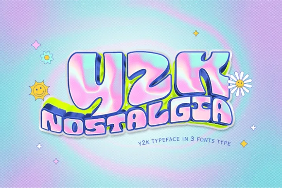
Inflated 2000s pop sticker with an outline
Y2k Nostalgia is an inflated display face in pink, blue and lilac on a gradient ground: bubble letters with a chrome sheen, a dark outline, a soft drop shadow and a white sticker border, stacked as a big lowercase word over a smaller one and sold in three styles.
Ideas for this font
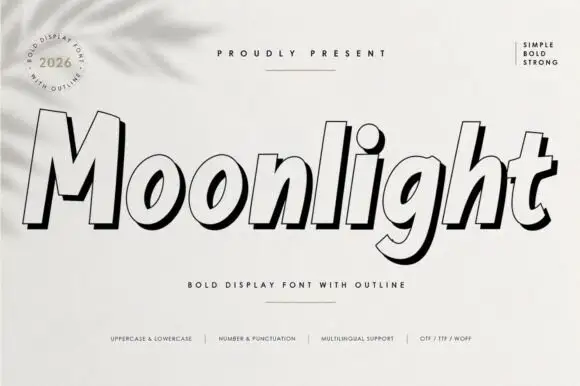
Heavy slanted display with outline
Moonlight is a forward-sloping heavy display in black on white: fat mixed-case letters drawn as a pale face with a bold contour and a black offset shadow, with a round badge at the upper left, a rule above the word and a row of tracked notes at the foot.
Ideas for this font
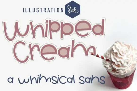
Loose rounded whimsical display
Whipped Cream Family is a loose rounded display shown in dusty rose on white: mixed case with uneven heights, broad circular bowls, an outline plus a fill variant and a loose baseline, set in two large lines with a small studio wordmark above and a second sample in a thinner cut below.
Ideas for this font
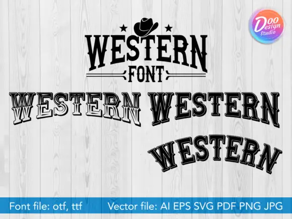
Western slab in solid and outline
Western is a western slab display shown on whitewashed boards in four treatments: a solid badge lockup with a hat and stars, a straight line in outline, a repeated word in outline and an arched line in outline, with a small studio badge in the corner and a format list along the foot.
Same independent foundry
Allow optional Google Analytics to measure visits and catalogue actions. Your search words and notes are not included. Privacy & storage