Neutral Sans Workhorse

Comic Stickers + Saltriver Grotesk
Lets Comic Stickers own the focal silhouette while handling secondary copy, sizing and subheads cleanly.
Inspect Saltriver Grotesk specimenDisclosure: MakerFileHub may earn a commission from qualifying purchases via paid links on this page. How our links work.
Soft irregular mixed-case lettering with thick faces and layered sticker-like edging
Comic Stickers combines tall COMiC forms with a lower mixed-case Stickers line, where rounded black faces with uneven widths and softly bent terminals are separated from bright offset borders by pale edging.
Paid link
Get this fontProject & layout blueprintsAt-a-glance maker compatibility
Cut solid base, outline, and shadow layers in separate vinyl colors and align on registration marks.
Visual anatomy & craft review
The faces stay thick and round, the terminals bend, the widths vary and a pale outline lifts each letter off its coloured border. That layered edge is the character: the word looks cut from stickers and stacked, which is why the sample packs the lower line tightly under the upper. Speech balloons and stars around it are artwork rather than glyphs, and the sticker effect may need to be built in layout, so test a plain single-colour version first and keep 24 pt before the small i dots fill.
Sticker · Layered edging · Irregular
Two-font hierarchy recipes
Tested contrast partners — pairing Comic Stickers with grounded secondary typography.
Comic Stickers + Saltriver Grotesk
Lets Comic Stickers own the focal silhouette while handling secondary copy, sizing and subheads cleanly.
Inspect Saltriver Grotesk specimen
Comic Stickers + Majestic Letters
Grounds bold display lettering with classic typographic authority on posters, badges and apparel.
Inspect Majestic Letters specimenPractical applications
Concrete hierarchy, scale and production guidance tailored to Comic Stickers’s stroke geometry.
The sticker lettering gives a card a playful edge, and the thick faces hold a name at 30 pt on an A6 sheet, where the offset border stays visible.
Hierarchy & layout recipe
Print an A6 card: set the name at 30 pt on one row, keep 10 mm of clear ground around it for the offset border, and set the details at 11 pt in a plain sans at the foot.
Pre-production check
The pale edging disappears under 18 pt; check the proof and hold the name at 26 pt or above.
The layered letters suit a stationery label, and the rounded faces stay clear at 22 pt on a 55 mm panel, with the i dots left whole.
Hierarchy & layout recipe
Print a 55 by 35 mm label: set the subject at 22 pt in mixed case, keep 6 mm of clear ground around the offset edge, and keep the i dots whole inside the border.
Pre-production check
Small i dots fill in when printed small; check the label and keep the subject at 20 pt or above.
The sticker treatment suits a print shop, and the thick faces read at 30 mm on a die-cut mark in two colours, where the pale edging keeps each face separate.
Hierarchy & layout recipe
Cut a 90 mm sticker: set the shop name at 30 mm, keep 5 mm of pale vinyl between the face and the coloured border, and keep the die 3 mm outside the border contour.
Pre-production check
A tight die clips the offset border; check the cut file and keep 3 mm of clear vinyl all round.
Technical & licence verification
Confirm included OTF/TTF/WOFF formats, full glyph tables and licence coverage on the live store page before batch production.
Closest visual alternatives
Matched across letterform anatomy, stroke behaviour and craft applications.
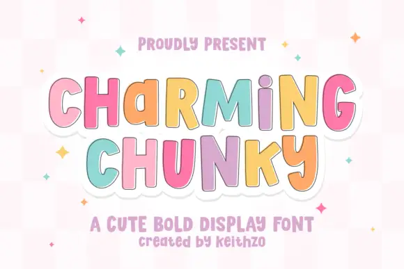
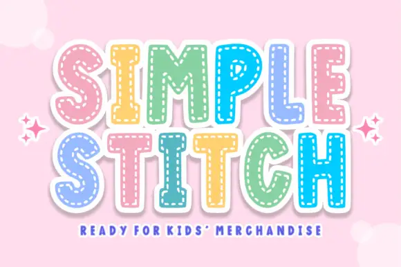
Playful upright forms with uneven mixed-case proportions and a stitched outline
Charming Chunky is a playful display face in which the letters mix capital and lowercase proportions, the heights shift and a stitched outline runs around the whole lockup, so a word reads as a cut felt shape.
Ideas for this font
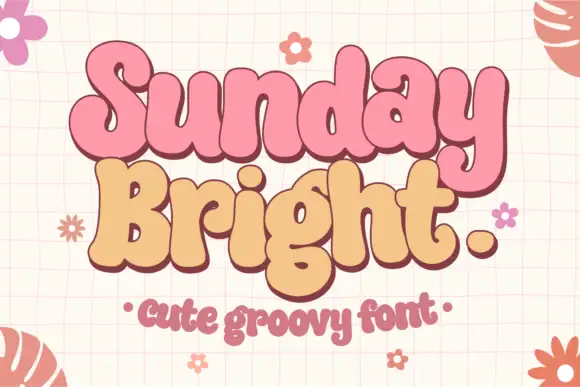
Soft joined-looking groovy forms
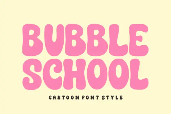
Sunday Bright is a soft groovy display in pink and cream on a pale grid: fat rounded letters that appear joined, a low waist, tall loops and a full stop drawn as a circle, presented as a pair of stacked words in two colours.
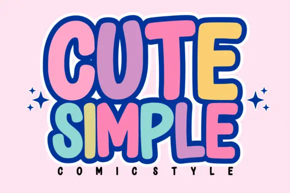
Tall rounded comic blocks with bubble outlines and per-letter colour
Cute Simple is a tall rounded comic alphabet in which the blocks stack tightly, the outlines bubble outward and each letter can take its own colour without breaking the composition.
Ideas for this font

Inflated graffiti letters with hanging drips
Mila is an inflated graffiti display face in black on a dark wall: fat rounded letters with a glossy highlight, a neon green and pink outline, and paint drips hanging from the bottom of each stroke, with a crown splat and a spray can at the edges.
Ideas for this font
Same independent foundry
Allow optional Google Analytics to measure visits and catalogue actions. Your search words and notes are not included. Privacy & storage